Does it correspond to upgrading to iOS9? Can you send a link / files?
So… what if you only want the Width to scale and not the height?
i’d like to know how to scale with the height !
i know someone whos has a computer with a 13’ screen. She doesn’t see the bottom of my animation…
Thanks
@gthroop: To scale the Width only, change this line:
var scale = Math.min(scaleWidth, scaleHeight);
to:
var scale = scaleWidth;
scale-width-only.zip (11.7 KB)
@BirdyHy: To scale based on the Height only, change the line to:
var scale = scaleHeight;
scale-height-only.zip (11.8 KB)
Thanks a lot
thanks a lot
Le Mercredi 2 décembre 2015 16h57, Daniel <support+forums@tumult.com> a écrit :
| | Daniel Team Tumult
December 2 |
| @gthroop: To scale the Width only, change this line:var scale = Math.min(scaleWidth, scaleHeight);to: var scale = scaleWidth;scale-width-only.zip (11.7 KB)@BirdyHy: To scale based on the Height only, change the line to: var scale = scaleHeight;scale-height-only.zip (11.8 KB) |
To respond, reply to this email or visit Proportionally scaling a Tumult Hype document based on the browser width in your browser.
Thanks, I did this to the last three lines of the scaleSite function, but your right, no need for the Math with no calculation on that line.
var scale = Math.min(scaleWidth);
    var left = (containerWidth * scale < parentWidth) ? ((parentWidth - (containerWidth * scale)) / 2) + 'px' : '0px';
    //var top = (containerHeight * scale < parentHeight) ? ((parentHeight - (containerHeight * scale)) / 2) + 'px' : '0px' ;
Hopefully it works! Thanks for the help.
A post was merged into an existing topic: Resizing Entire Page by Width
I use Hype 3 Pro for lots of small animations, banners, affects. I sure would like to utilize proportionate responsive scaling for more than one Hype Doc Iframe on a single page.
You have been so kind to write the javascript for a single hype doc. on a single page. But is there anyway you could write some new JS that with (documentation) where you can assign and target different Iframe containers?
Please see http://bahamaboatworks.com.
You will note that the main slider works great. But I would like to do some simple mouseover animations for the 3 model graphics below. (34, 37, 41)
This JS scaling feature is incredibly important based on all the seemingly new device sizes using Responsive layouts.
Hype 3.5 allows for this scaling without code. (well, for everything except the main document container).
If you need to responsively scale specific elements (including iframes), use the new ‘Zoom contents’ checkbox with the flexible layout options. This works well when applied to a group containing all the elements you wish to scale. You must first check the scaling checkboxes in the Scene Inspector for these options to become available:
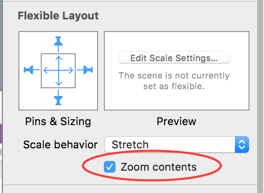
Using ‘Shrink to Fit’ as the Scale Behavior will ensure that your group always stays within the boundaries of the window.
Thanks for the reply Jonathan, I am familiar with grouping and new zoom content feature which is all great. Back to the number one issue! Height of any hype doc or Iframe simply cannot be resized via Auto or Proportionate setting. It will always maintain the px height dimension of either the hype doc or the outer div. These stacked divs need to resize by height and % so that they can respond as a true responsive layout to accomodate cascading text, etc underneath. The JS code seemed to be the only resolve for this. But as soon as you have one main hype doc, any additional animations will not resize.
See: http://bahamaboatworks.com/index_2.html
And note the “Bahama 34” mouseover vs the others.
Unless I’m missing something incredibly obvious, It seems like the only possible way to get a hype doc or Iframe to function with proportionate scaling within a responsive container width (%) and constrain the height is to either create 20 flexible layouts… OR include 20 media queries in CSS, OR use the javascript. However, if you use the JS provided…you can only use one hype ani per page.
Does anyone have JS or know how to target multiple container names in order to utilize multiple hype ani’s in same page?
I do not know JS, and unfortunately this is exactly why I learned Hype.
Stephen made mention that this can be done…HOW?
Has anyone found a solution for scaling a drag event proportionally as the HTML container is scaled? Using the jquery code later in this thread, I was able to cause a height and width scale adjustment for my entire document for browser resizing - and it works great! The only problem I have remaining is that the main part of the animation uses a slider handle with an “on-drag” horizontal action. If the document is scaled down or up, the distance required to move the slider through it’s full range becomes disproportionate. Any thoughts for someone who’s coding experience is limited to copy/paste guess/check haha?
Hi. Not sure if this is exactly Hype related.
As stated above I’m using the javascript outlined in this thread to make my Hype content responsive within an iFrame.
I’m having trouble on iOS (works perfectly on desktop)
If I reset Safari iOS, empty cache and clear history the page loads fine and the iframe Hype content is responsive. When I reload the page the iframe is not responsive and the content is cutoff.
Please any help would be greatly appreciated as I’ve been researching this for sometime.
(iOS is up to date)
Thank you!
When it loads incorrectly I’m getting this error:
TypeError: null is not an object (evaluating ‘iFrame.setAttribute’)
global code
This is coming from my CSS file. I cannot figure out how to fix this.
Thanks
Matt
Hi Matt
That error is related to “IFrame”. When the code comes to this line it cannot find the object iFrame. Either it hasn’t been set as a variable or it does not exist. Look for the code line that has “iFrame.setAttribute…” in your functions and check whether you have assigned a variable “iFrame” to some object (I’m guessing an iframe you are using) by getting that object by ID or a Class.
Without seeing your code we’re kinda flying blind as to what you’ve done. 
I built some javascript for a from scratch javascript build that works like a charm, never needing more than one layout, unless you of course want another one. I am sure it is applicable to Hype.
I am about to implement it on the current Hype doc I am using.
I base the entire ratio off of the initial design and the relation of it’s width to the width of the viewport. Then I apply this ratio to every movement/ font / position across the board. I am mainly using hype as a tool to allow for some tricky animations that would be more complex to do by hand, but that I can still integrate with a primarily code driven experience. I have recently begun to implement Canvas within my Hype docs and am planing on using D3 soon in there as well.
Hello @jonathan,
I created a presentation in Hype that provides navigation with arrows (right and left), to which I applied the passage to the next / previous slide by pushing (left to right / right to left).
On each page of the presentation there are some persistent symbols.
I would like the presentation to automatically adjust to the size of the browser, so I initially used the method you described above.
The problem is that in this way, when moving from one slide to another by pushing (left to right / right to left), the persistent symbols no longer remain fixed, because they are part of the group of slide elements.
Is there another way to automatically adapt the presentation to the resizing of the browser?
Thanks in advance for your attention and for any advice
try pasting this to the headsection:
<script>
  function layoutRequest(hypeDocument, element, event) {

   	var hypeDocEl = document.getElementById(hypeDocument.documentId());

    //returns [{name: xxx; height:xxx; width:xxx; breakpoint: xxx}, ...]
    var _layouts = hypeDocument.layoutsForSceneNamed(hypeDocument.currentSceneName());
    //current Layoutname
    var layoutName = hypeDocument.currentLayoutName();

    //get data for current Layout -> {name: xxx; height:xxx; width:xxx; breakpoint: xxx}
    var res = null;

    for (var i = 0; i < _layouts.length; i++) {
      var Obj = _layouts[i];
      if (Obj.name === layoutName) {
        res = Obj;
        break;
      }
    }


    if (res) {
	var wWidth =  window.innerWidth ||  (window.document.documentElement.clientWidth || window.document.body.clientWidth);

	var baseLayoutWidth = res['width'];

	var scaleFactor = (wWidth/baseLayoutWidth);
	hypeDocEl.style.position = 'absolute';
	hypeDocEl.style.transformOrigin = "left top";
	hypeDocEl.style.WebkitTransformOrigin = "left top";
	hypeDocEl.style.msTransformOrigin = "left top";

	hypeDocEl.style.transform = "scaleX(" + scaleFactor +  ") scaleY(" + scaleFactor + ")";
	hypeDocEl.style.WebkitTransform = "scaleX(" + scaleFactor +  ") scaleY(" + scaleFactor + ")";
	hypeDocEl.style.msTransform = "scaleX(" + scaleFactor +  ") scaleY(" + scaleFactor + ")";
    }


hypeDocument.relayoutIfNecessary()

    return false

  }

if ("HYPE_eventListeners" in window === false) {
  window.HYPE_eventListeners = Array();
}
window.HYPE_eventListeners.push({
  "type": "HypeLayoutRequest",
  "callback": layoutRequest
});
</script>Maybe these templates will help...
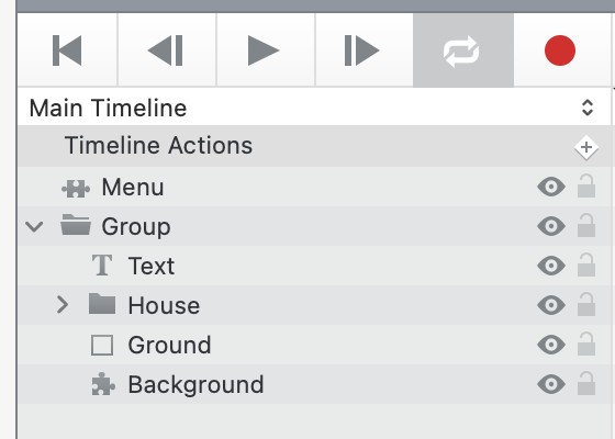
#22 "Menu"
https://photics.com/free-template-tuesday-22-tumult-hype-menu/
#31 "Navigating"
https://photics.com/free-template-tuesday-31-tumult-hype-navigating/
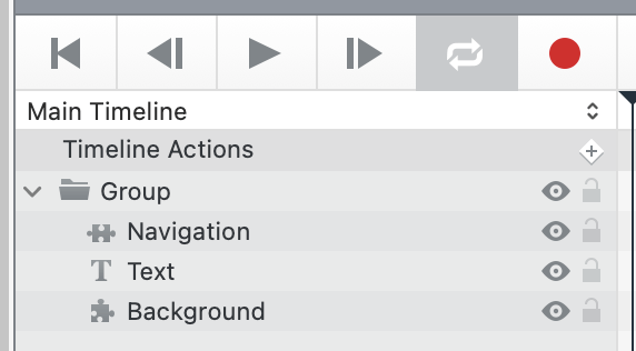
Since it's a presentation, and if you're using a scene size with a 16:9 ratio, the "Navigating" template might be what you're trying to do. By using a "Group" to group all of the elements, using Hype to scale those elements will automatically shrink or scale the elements to fit the available space.
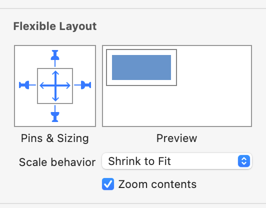
Groups are elements too. The can "Zoom contents".
Where this gets tricky is if you don't always want a fixed ratio view. What if you want the presentation to work on an old 4:3 monitor, or maybe a 16:10 Mac Laptop? If you're not OK with Black bars on the sides, or cutting off part of the scene on the sites, then you need to mix things up... either with multiple groups or elements outside the group.
That's why I mentioned the "Menu" template too. It looks nice when it's 16:9, but not so good when it's outside of that range. However, the menu stays at the bottom. So, the challenge for you, if you're looking for design perfection, is to figure out how those empty spaces should be filled.
What happens if you move the elements outside of the group? A persistent symbol can have its own "Scaling behavior".
This is an older thread. You can see how the recommended technique switched from a custom code solution to Hype's new element scaling feature. At least, I usually just chuck elements in a group and then scale the group. If your scene is too complicated for that, then maybe multiple scaling groups will create the scaling arrangement that you're looking for.
