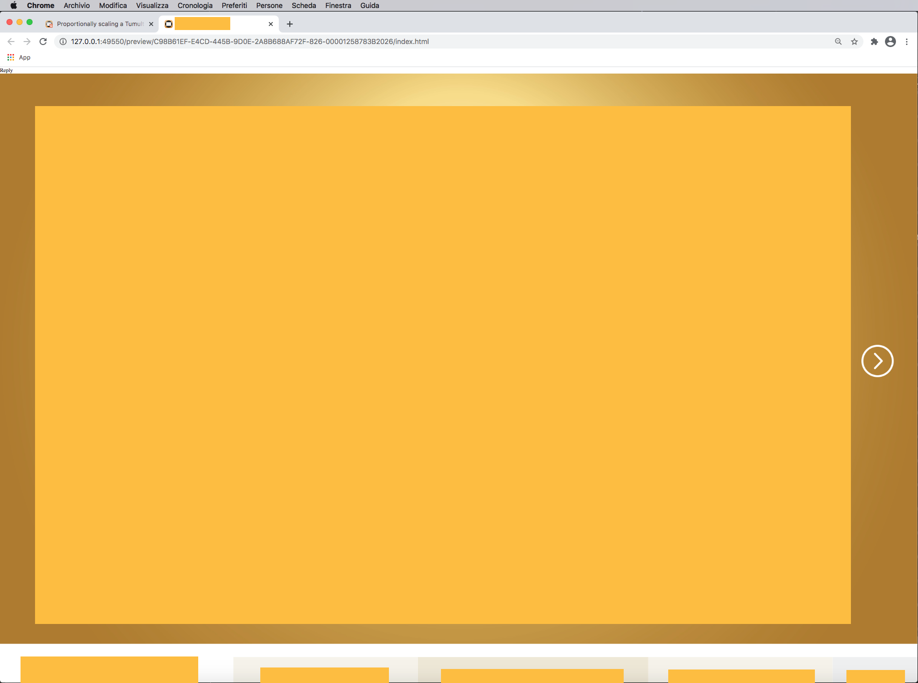
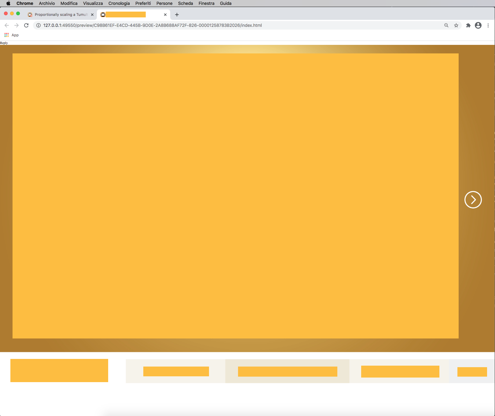
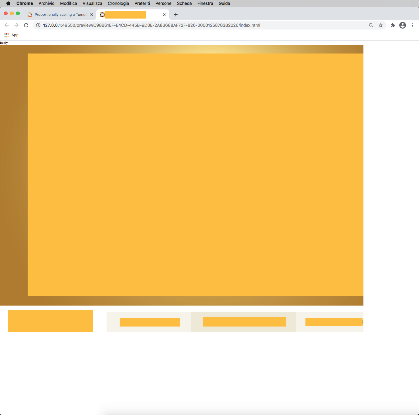
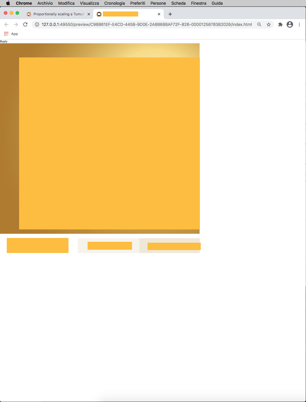
I tried to past the code to the headsection, and this is what happens when I start the preview and try to resize the browser window (the size of each image corresponds to the size of the browser).
In any case, by reducing the browser height, there is no resizing.
If I reduce the browser width:
in case 1 the width is respected but not the height (the basic menu is partially cut).
I designed a really small Ivón 50x50 hoping that I could scale it up. Most of it is created with the vector tool. I do have some text that is text within hype. Although I’m thinking that I’ll convert that to SVG In another app and import to resize appropriately.
After attempting to scale the animation with the responsive settings. The resulting scene is still blurry, I have it embedded in Blocs. When the safari tab goes into the background it becomes a much higher resolution without pixelation.
What am I doing wrong? What is the best approach, I plan to design several of these animations and want to scale them up from 50x50 to 300x300 and more in the future.
Working for me with purely vector elements. If you scale a group it will not work because a group is a container (DIV in HTML) and it has height and width. You could use a transformation on a group (scaleX, scaleY).
Ahhh, yeah I have a lot of elements grouped. Also getting a blur when transforms are applied under some conditions. Thanks @MaxZieb. Will try a version ungrouped and see!!
Understanding groups as DIV containers, I was able to get it to respond correctly based upon the browser width. The remaining question I have is in regards to a change in orientation of a group.
In the first example, I have no rotation on the grouped element. The animating lines are a duplicated set within another group. You can see here the resolution is clear:
In this second animation, I rotated the top element of lines 180 degrees on the X axis and both sets become blurry. I notice that a warning shows up regarding IE 9 not displaying correctly, although I am previewing in Safari.
Is this a bug? Is this not possible to do right now? Am I doing something wrong?
This isn't really a bug per se; unfortunately browsers have different render modes they can use -- they can either (1) re-render contents to the new container size, or (2) they can scale the contents like a bitmap.
Hype tries its best to make sure that the first technique is used when possible, but properties, like a 3D transformation typically are going to put it in the second mode.
Without seeing the document itself it is hard to offer specific advice, but two things you can try:
unchecking "Use WebKit graphics acceleration" in the Document Inspector and see if that makes a difference
It looks like you might be using a scale; you could try something where you make the initial element much bigger so when it scales it has more bitmap data to work with.
You're welcome to post a sample zip of the .hype document.
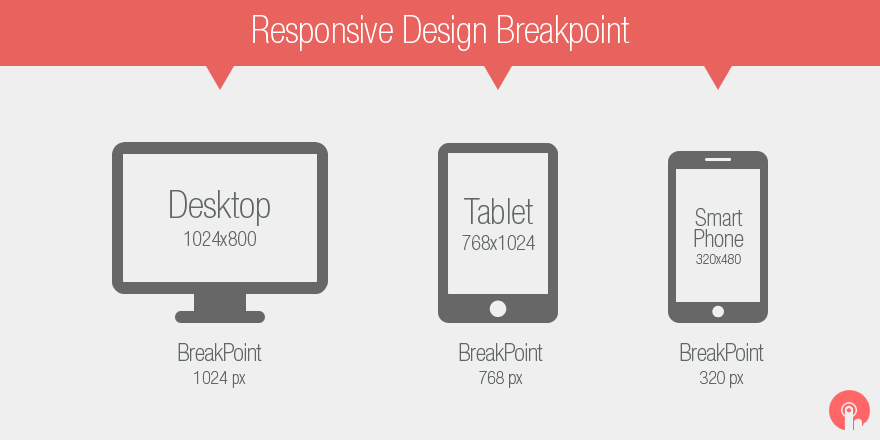
Hi, I think it is necessary to have a perspective of the devices to be used and the screens to locate the breakpoints.
(I am a non-programmer graphic designer, so my language is totally visual and when I set parameters I understand things more)
Please correct me as I may be wrong more than my language is not English
Breakpoints
320px 480px: Mobile devices
481px 768px: iPads, Tablets
769px 1024px: Small screens, laptops
1025px 1200px: Desktops, large screens
1440px 900px
1680px 1050px
1920px 1080px: Desktop
2560px 1440px: iMac +
Thanks @Jonathan, this explains a lot. I was able to re-conceptualize a few things with this in mind. Unfortunately,
didn't work. It seem's to keep getting blurry. At this point, it's probably just going to be the most time efficient to recreate it flipped the way I want it to show up.
If I have any further problems, I'll do as you suggested here.
Thanks for the clarification about the rendering with the browsers!
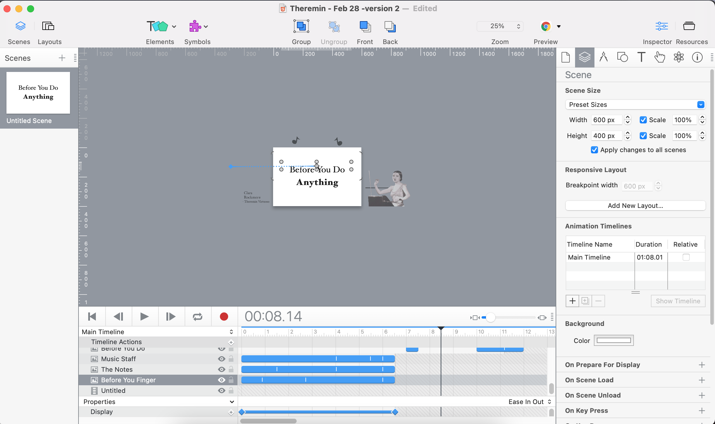
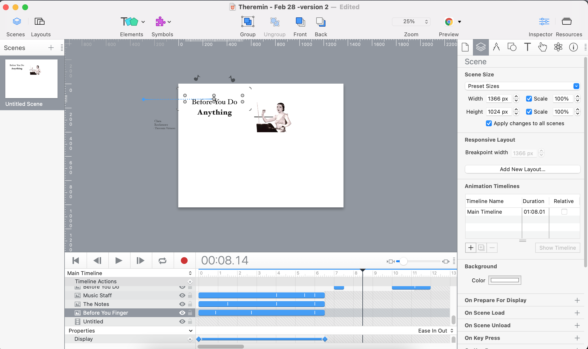
I accidentally created a hype file with the wrong size Scene Size. I meant to make it an IPad Pro 12.9" size (1366px by 1024px). Instead I made it default to 600px by 400 px. I tried the 'Zoom Contents' method above to resize it but for some reason was unable to get the images (all the text are image files imported from Illustrator) to resize correctly.
Does anyone have any suggestions for getting the images to resize to IPad size and have the text and images stay centered?
Thanks,
Alex S
Below are the hype file, screenshots, and the video:
that's misunderstanding ... the script is meant for postprocess and not for an hypefile itsself. and also the two formats do not share the same aspect ratio -> so a proportional scaling will not fit the new dimension anyway.
From the editor, if you multiple-select elements and resize them, they will all resize proportionately together. But there are some caveats you may run into like font sizes do not grow or keyframes for width/height are offset and not scaled.
If you're interested in a quick fix, you could use one of two techniques:
Make the scene your desired size, group the elements all together, and then apply a scale transformation to everything
Keep the scene size at 600x400, group all the elements together, adjust the group size so it perfect fits the size of the scene, and then apply flexible layout settings to zoom contents on the group, along with a scale behavior. This is akin to what the script does, so like @h_classen says the proportions being different means it will be letterboxed or grow beyond the bounds depending on the behavior you choose.
Otherwise you may just need to adjust each element for the new size or be very judicious in applying flexible layout settings to each element to get them to reposition/resize when run.
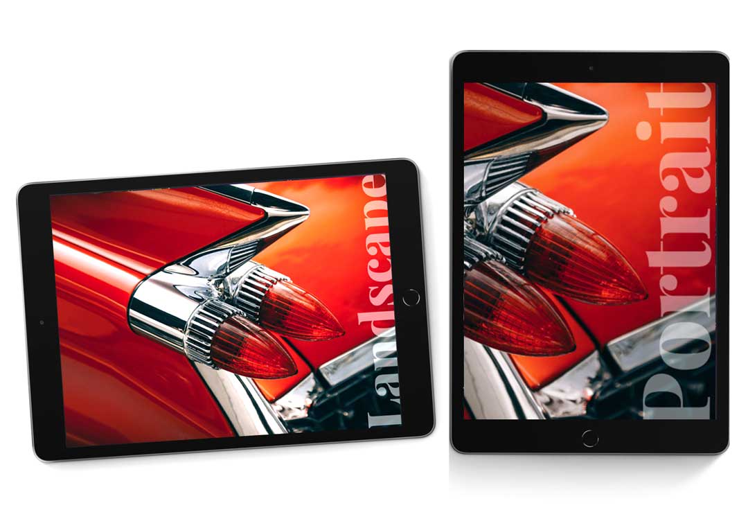
Greetings, here is a small exercise with the problem presented. I think I fixed it, it kept the size of the app (600px X 400px) and created a document with a setup for any iPad model, which is tested on my iPads (old, middle and new models I own). I'd like to know any feedback from the gurus out there about the issue and my solution.
• Remember to work with the law of proportions (basic concept design)
• Remember to know which device/platform you are designing for. (Landscape vs Portrait)
• There is also the option for it to adjust/adapt to any iPad size maintaining proportions but presenting only 1 "view" (no landscape & portrait, only 1) (not shown in this exercise).
• In this exercise I made symbols (individuals with set ups for landscape & portrait) attached separately.
Note: respect the breakpoints these are valid for iPad models
Respectfully for all Code Gurus, this is made code-free which I think personally is the true essence of this software for us designers.