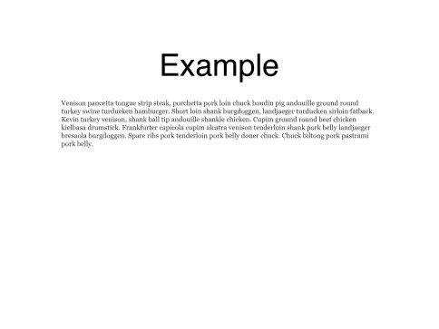
Using max-width like in this example does not work because when zooming, the CSS transform scale(x) is applied and it does not change the height and width value.
(Is there a way to limit scaling of width/ht of elements?)
Or am i missing something?
I know I could create more layouts but it can add a lot of work on our project. Limiting the zoom to a scale of 1.5 could be a good workaround.
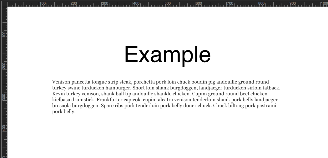
And when looking the page in fullscreen mode on a 1920x1200 display, the container is automatically scaled by a factor of about 2.2 using CSS: transform: ... scaleX(2.19) scaleY(2.19);...
I’m wondering if you would know a “simple” way to tell Hype not to scale that container to more than 1.75 for instance ?
Otherwise, the only way that I see is to create and maintain another layout for bigger displays.
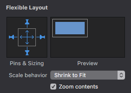
…the more i look into it the more it seems that it would require another parameter in Hype “Flexible layout” section. Since, CSS does not seem to have a max X and Y scale properties.