Hello.
I have created a desktop version of a presentation that fits perfect with the width 100% for tablets portrait and landscape and desktop version. So I don't need to adapt the content again for those sizes.
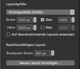
But I have also created a layout for mobile version that I want to be shown only for a maximum 667 px width and from that size up to keep only the main version.
The challenge is that as I create only two versions I will have the mobile version till the 1300 px, the size of the desktop version and not till 667 px size, so I will see the mobile version till 1300 px, equal what device it is in use.
So, I need your support to load a mobile layout only till 667 and the tablet version after that size, without changing the 1300 px size of the main screen.
Thank you for your support!
Ionut
p.s.
I have checked to find the answer on the forum but what I have found was not exactly what I need it (Responsive layouts, distinguish portrait and landscape - Optimizing for Responsive - Limit maximum zoom (scale) on a element using "flexible layout" and "Zoom contents" - Multiple monitor project? - Mobile instead of desktop version on a laptop display)