Hi there
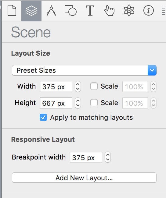
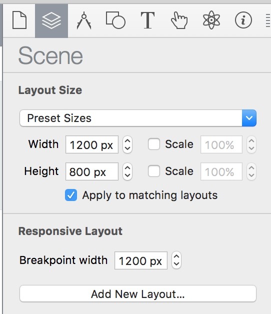
I have just created a small website with two layouts. One for desktop (1200x800 px / breakpoint: 1280 px) and a mobile version (375x667 px / breakpoint: 768 px). These are both standard layouts from Hype Pro itself.
When loading this website on my MacBook the mobile version shows instead of the one created for desktop computers. The resolution of the laptop display is 1200x800 px, which is exactly the same I got on the desktop layout.
On my Mac Mini (23-inch: 1920 x 1200) px), the desktop version is loaded as it should be. What is wrong with my layouts? I do not exactly understand the thing with breakpoints. Is the mistake lying there? I appreciate every input. Thanks!