I am interested to create a hype version of the shown Codepen example. I thought it would be cool to somehow create a dynamic layout were the various rectangle shapes move around and adapt to the width of the browser window size and shape by dynamically repositioning the boxes into space optimized row and columns. I have seen some CSS examples but still learning about mixing CSS with Hype and JavaScript.
Can this be setup to work on one scene with a number of misc boxes and/or maybe multiple scenes could show up on one large scene where the scenes adapt to the browser window size.
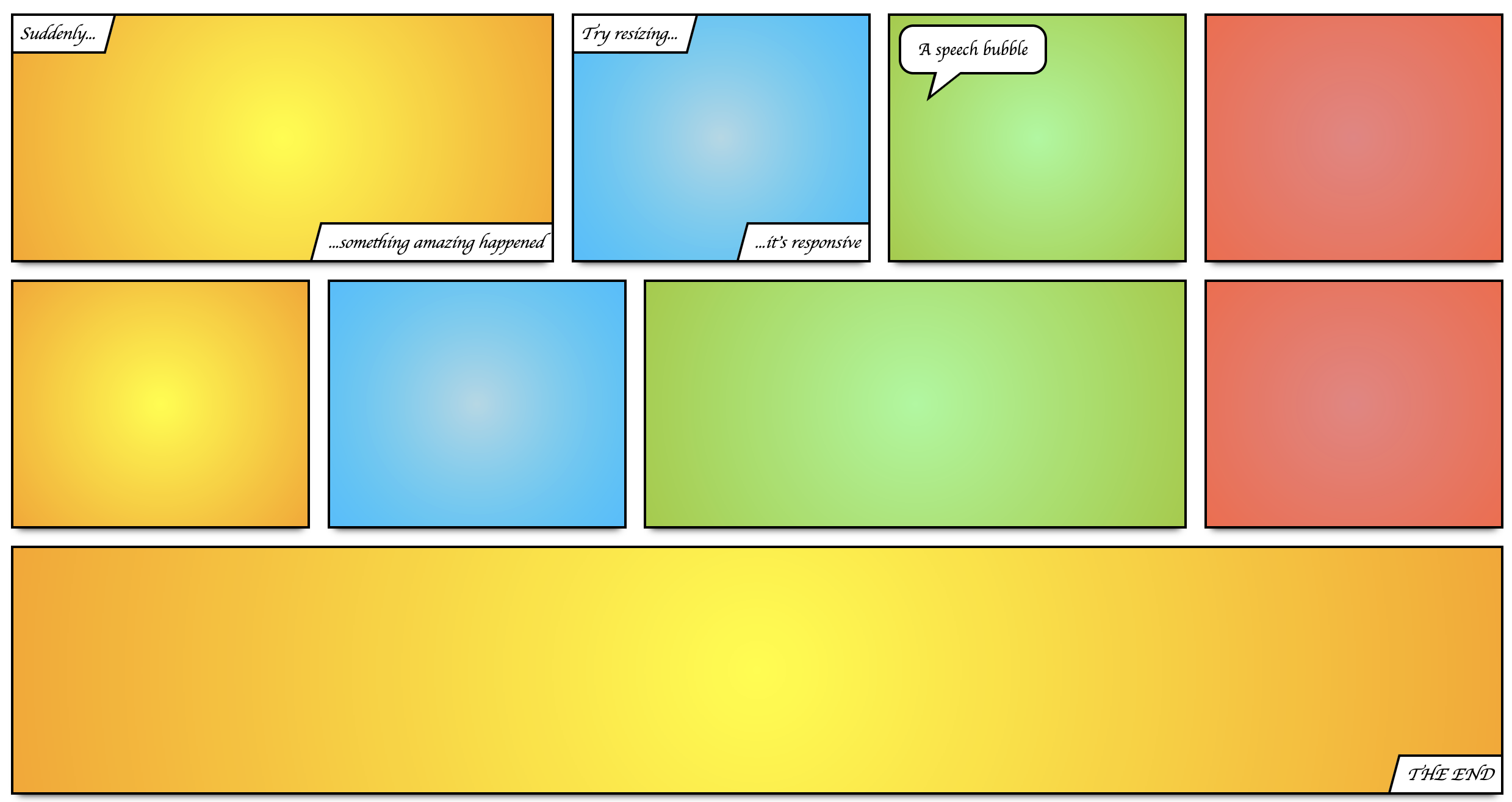
It may not be an exact match, but in general you could probably get away with this type of layout just using Hype's Flexible Layout combined with Responsive Layouts. Here's an example I see that looks somewhat similar and uses both techniques jointly:
If you actually want to use the CSS flexbox constructs in conjunction with Hype, that is a little trickier. Often these need parent/child relationships that Hype prefers to manage itself, and then also Hype really wants everything to have absolute layouts.