Understanding responsive fullwidth behaviour

Hi!

I have been a frontend dev for many many years now, but i have some problems making respnsive sites using Hype 3.

Here’s what i did:

There’s a layout saying 1200px to 1600px, and a “custom” 1600px and up. Both layout has fullwidht elements (video bg, rectangles on top, etc).

Preview on both cases show non fullwidth results.

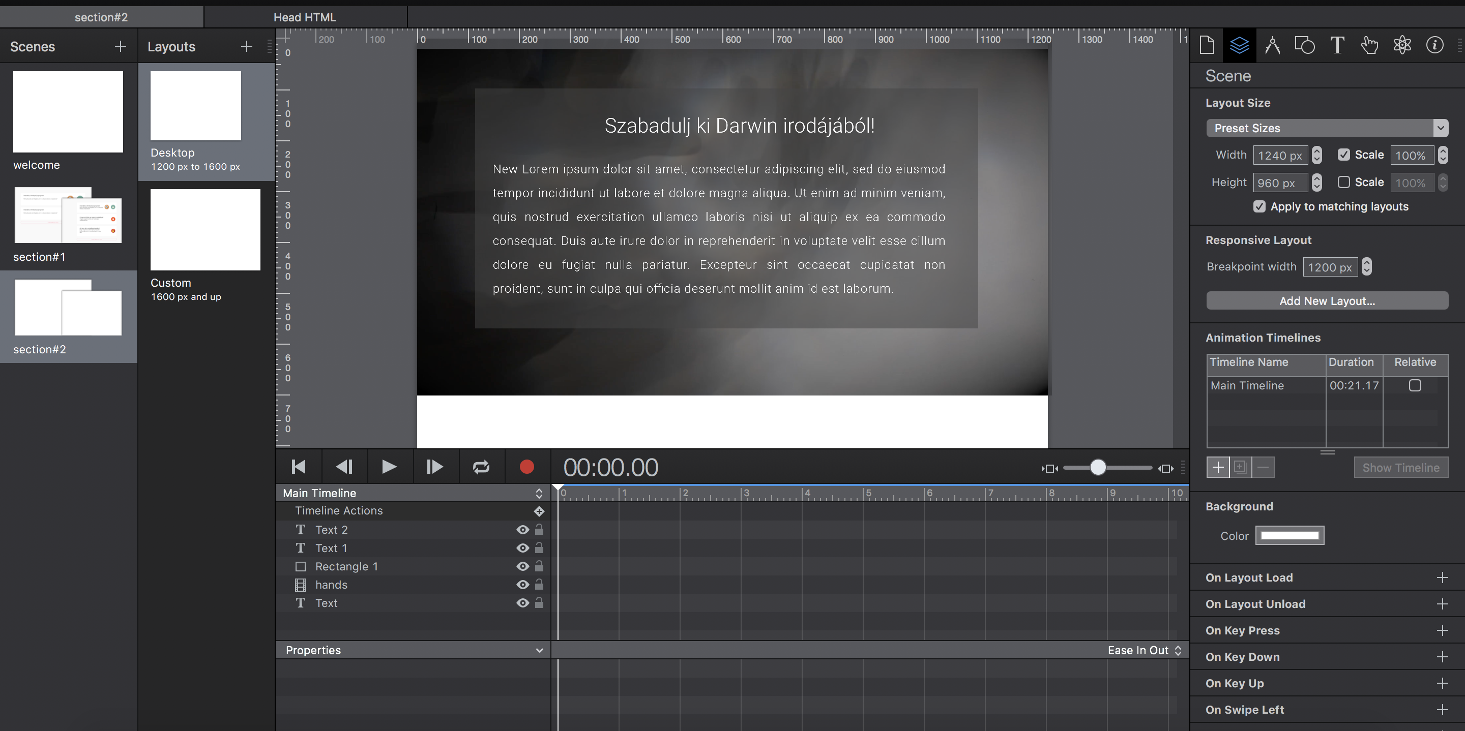
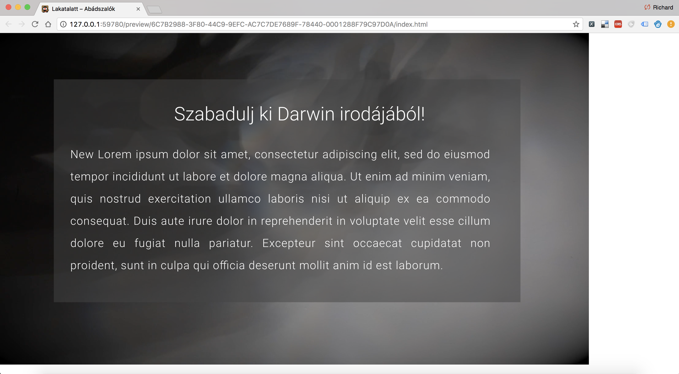
On the first scene’s layout settings’ (the 1200px to 1600px) width is set to 1240px, and the scale 100% is checked. The result on lates 13inch mac pro (both safari & chrome) is that the elements are not fullwidth.

Any idea how can i make true fullwidth content?

Thank you in advance.

The way I would handle this specific layout is to make the background image scale to fit the available space (pinned and scaled on all sides with ‘Expand to Fill’, but make your text box and text box background only set to pin to the left, top, and right so that it stays in the center top of the page.

To get your background image to fit the available space, adjust your scene size to match the image size.

This page shows how to work with Flexible Layout: http://tumult.com/hype/documentation/3.0/#flexible-layout

If you can share your document I can show you what I mean if that doesn’t make sense.

5 posts were split to a new topic: Jump to Top on Scene Change