Just a quick tip on customising Symbol instances on a scene.
Here we have two of the same symbol on a scene. The symbol represents a loading spinner.
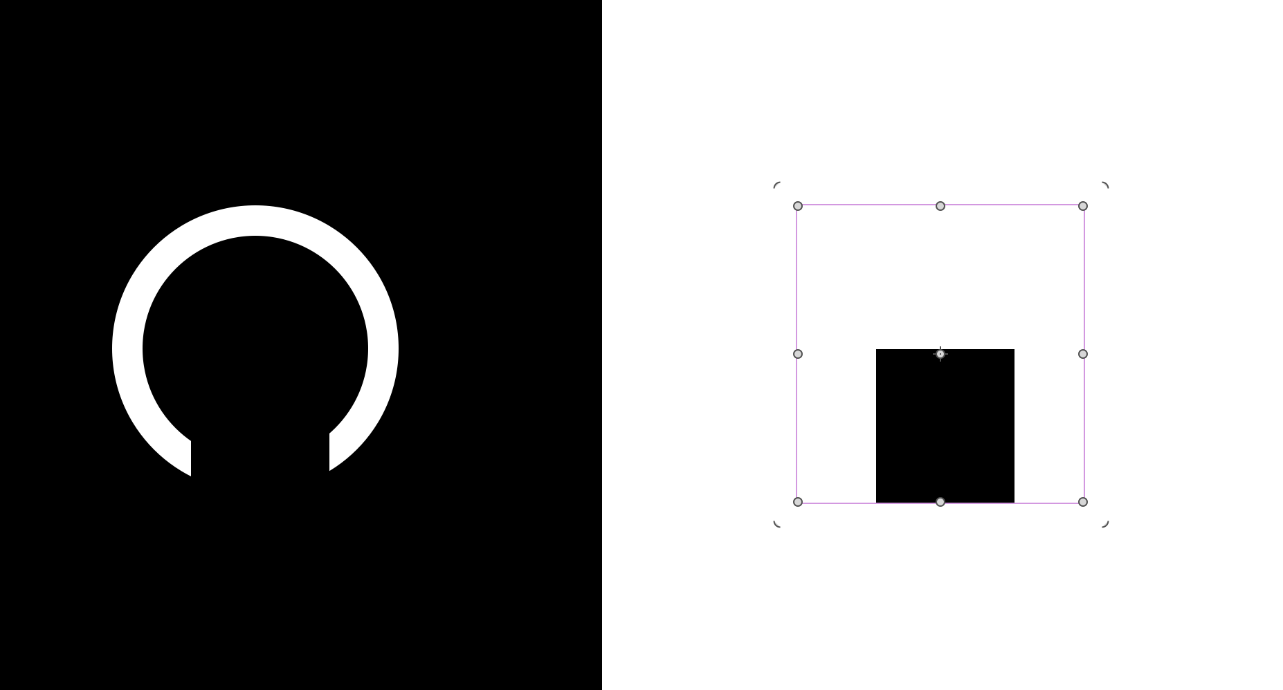
( The one on the right is exactly the same as the one on the left. The only difference and not related to the symbol is there is a white Rect behind the symbol to give a white background. )
Simple step 1,
Give each element within symbol is given a class name.
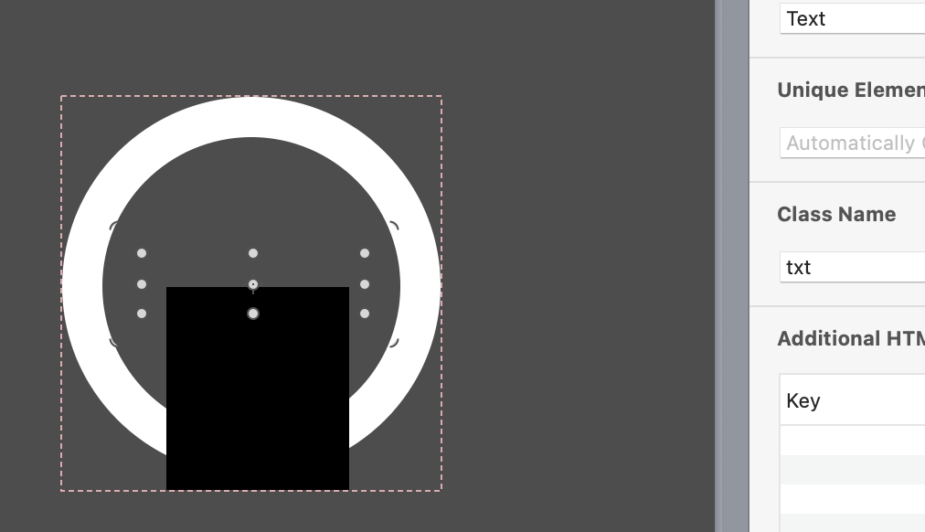
The Text box class name is txt
The outer Ellipse class name is ring
The Rectangle class name is spinner
Simple step 2,
Give the symbol instances them selves, an additional attribute to use as an css selector.
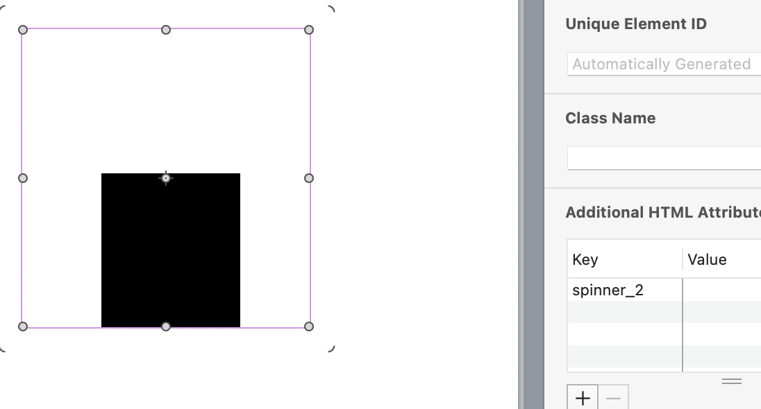
The left symbol instance gets spinner_1. the right one gets spinner_2.
No need to add a value.
simple step 3,
Add the css to the head file.
The idea is to use the addition attribute as the parent selector and cascade down to the target child element via its class name.
<style>

	 /*. Symbol 1 */

	[spinner_1]  .spinner  {

		background-color:  black!important;

	}

	[spinner_1]  .ring  {

		border-color:  red!important;

	}


	[spinner_1]  .txt::before  {

		content:  "One Sec.."!important;
		color: white!important;

	}

	/*. Symbol 2 */

	[spinner_2]  .spinner  {

		background-color:  white!important;

	}

	[spinner_2]  .ring  {

		border-color:  purple!important;

	}

	[spinner_2]  .txt::before  {

		content:  "Loading.."!important;

	}

	</style>
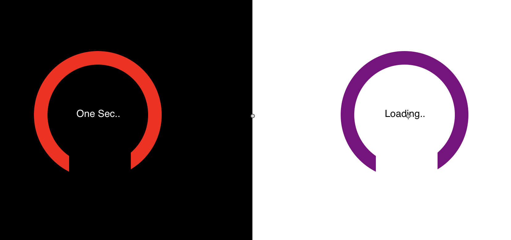
The result is :
Bonus tip is the construction of the spinners them selves. 
Vector Shapes in a symbol Instance.
We can also affect a Vector shape using the same simple css
i.e Fill, Stroke.
Keeping with the spinner theme. In this example we include css access to the Vector shape's path and fill property. The Stroke and other properties would (not tested them all ) likely be similar in syntax.
		/* Vector Symbol 1 */

	[vSpinner_1]  .ring svg path {

		stroke:  purple!important;

	}

	[vSpinner_1]  .txt::before  {

		content:  "Getting There.."!important;
		color: white!important;

	}


		/* Vector Symbol 2 */

	[vSpinner_2]  .ring svg path {

		stroke:  orange!important;

	}

	[vSpinner_2]  .txt::before  {

		content:  "Here We Go.."!important;
		color: black!important;

	}
--
Here we have the new spinner symbol with a disappearing line animation.
The Ring element is now a Vector shape and we change its stroke (Border) colour per instance.
spinners_example 2.hypetemplate.zip (35.9 KB)
For more complex control of other properties other than css, don't forget that you can use