It was the file I “learned” pinning from some years back and it is completly and unesseary complicated. It actually makes you believe that building a flexible grid is about using pins and alternating them from right and left. Also with 1000+ downloads I am a bit worried that we are not the only ones that got it wrong.
Makes sense! So if you keep the layout as is maybe then change the icon the moment proportional scaling is activated. So we would see a pin if proportional scaling is not activated and a little spring the moment proportional scaling is activ! This would be the case on each axis… giving the user quality visual feedback.
Another great thing would be to have a numerical value on each spring(%) or pin (px). This communicates the math behind it (found in the documentation). If there isn’t space in the IDE or this is to distracting then maybe as a hover value (tooltip).
I made this template a long time ago and it always worked fine @MaxZieb I'll take a look! to see if you can make a template that works the same way.
Thanks
I am not saying that it is not working. It is just unnecessary complicated. So, your challenging me?!
I was also using this approach. But as I said, in a workshop some fresh eyes on this revealed how this extra steps are actually not needed (meaning all the pinning to get columns). Nothing personal.
in layouts with fixed height the pins are not useful in several cases, I used pins only for the responsive behavior of the image set. I’ll try on layouts with variable height, in this case the behavior depends also on the pins.
Perfect! Much appreciated and that is how collaborative constructive feedback could always make life better (but often stays a missed opportunity). Love the update! I hope this will make things much easier down the line for new Hype users. I was so confused about the pins I even started this ridiculous project around my misunderstanding.
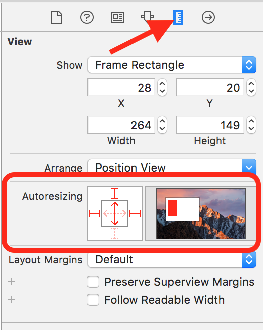
I haven’t opened the file yet as I am still not at my desk. Telling from the pinning preview graphic you are still using nested groups? You don’t need them either! In most cases one layer of groups should be enough like with the images as they need a group if you use pinned images and need to hide the group overflow. You can even avoid groups and pinning altogether on images if you use regular backgrounds.
Here is a version with a pretty flat structure concerning groups. A matter of taste and the naming is certainly not ideal… but just to make the point clear with an example.
Here is another version using symbols so the content is synced across all layouts. Sometimes this might not be desirable as one wants to set different font styles per layout*. But just to test responsive symbols. A little hack for the text width was necessary and therefore the iPad Landscape layout is the best to edit the symbols (meaning without Hype showing wrong bounding box handles on the text inside the symbol).
Interesting. I’ve done some experiments for editing columns in the past but the CSS solution, for text only, is the best. I use it in some projects to use only one symbol in all layouts.
Okay I see what you are doing there. The "Font adapted"is the most interesting, but has a hidden layer with media queries. I would avoid that if possible! Just put it in your head and use classes. Also then you can add the class to the symbol in each layout as Hype already has a media query with it the layouts. So using Media queries is double the effort.
Thats what I meant when saying …
So you only need to say something like in Head HTML…
.tabletLandscape .headline {
   /* CSS here */
}

.tabletPortait .headline {
   /* CSS here */
}

.phone .headline {
   /* CSS here */
}
Then assign each of these classes (tabletLandscape, tabletPortait or phone) in each layout to the symbol (from the outside). No need for Media queries.

 , if it’s possible to improve the template I will. I don’t remember how I did it, it’s been too long!
 Template page updated