Hello...
i want to make a html5 banner for on my website..with a little animation init..
I started very easy, only a text which comes floating in..
Without responsive it works..
but with responsive settings in Hype...it won't work ( see attach)
For importing html5 into the Wordpress I use the hype plugin..
When I upload my animation as a .oam is see this code in the plugin
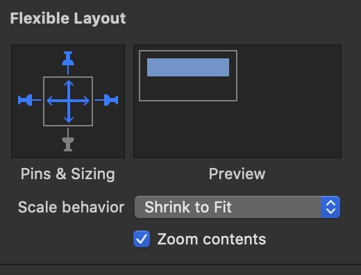
Typically the issue is that if you are using a flexible layout with a scale set on the height value, this may collapse down to 0 pixels if there’s not an explicit height on some parent element. The two solutions are:
Uncheck the height scale in the scene/layout editor so it does not use flexible layout on height
You can use a 100% height scale and thus shrink to fit, but as you discovered you would need a container DIV to have a specific height. Basically you need to make the fitting container yourself if you don't want an explicit height.
Hype doesn't have a mode where it only looks at width or height to try to derive the other value, though we have it filed to investigate adding this feature due to the issues with embedding in wordpress.
oke thanks, I'm not a code guy...
so the easiest way for me is by the hand of tutorial?
our site has to be seen on phone, iPad and screen...
maybe I can make a div with specific height in Wordpress...I hope for every device a specific height...(I'm gonna search and let you know)
There's some information about how to work with responsive height documents in the 'responsive document tips' section here: Tumult Hype Animations Wordpress Plugin
For your case, adding an additional CSS class would help you set a minimum height for your document.