I’ve stumbled into a bit of problem with iPhone XS Max Portrait mode displaying ads that are not meant for portrait mode. There was an ad I did 600x400 with a second breakpoint of 300x250 for smaller display devices. iPhone XS Max displayed the ad in its entirety in portrait mode of 600x400 which was meant for landscape which is understanble since its packs more pixels but not its earlier predecessors with a smaller resolution display. It be nice if we had mobile breakpoints based on what device(s) and what to show in portrait for that device vs the specifying the dimensions - meaning if there’s a way to force iPhone XS Max to show in portrait mode a 300x250 breakpoint variant?
Safari doesn’t have a tab for iPhone X and XS Max.
While I can add a layout size it doesn’t necessarily mean I’d get the layout I’m looking to get when in portrait orientation.
@h_classen I’m not sure what you mean. The underlying issue is not adding breakpoints but forcing a breakpoint to show on a specific device when in portrait but for all other devices it’s fine.
Thanks Max, would this apply to one device or many display devices? My problem is IPhone XS Max shows 600x400 in portrait orientation when It should be at 300x250 this needs to be forced to 300x250. How does one go about setting it up?
You’d look for a JS based rule to identify the devices needed and then you return the layout you want. Look at the example. I can’t write code as I am on the road.
If it needs to be self contained in the ad (meaning without reliance on HTML head then maybe put the code on scene load and trigger/broadcast an resize event window.dispatchEvent(new Event('resize')); manually…
An document loaded function handler in the GUI would be great @jonathan (document panel maybe)
BTW LayoutKit is not battle tested in the sense that it delegates the rule into hypeDocument and that might not be defined before the first trigger occurs. Best combined with document load therefore. A manual event trigger should solve it or your example combined with the polyfill should be actually good as it does it all in head html. I’ll look into it if there can be a better solution for the future… or anybody else got a great idea?
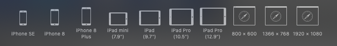
Note that the 8 Plus has the same portrait width of the Xs Max/Xr of 414px, and the iPhone 8 is the same portrait width of the iPhone X at 375px. The devices are strictly taller and the X/Xs/Xs Max use a 3x devicePixelRatio.
I think what @h_classen is asking here is what breakpoint width are you using? As you can use a 300x250 layout but set the breakpoint to be 415px, it would sound like that may satisfy your needs to show a smaller at when the width is smaller than the iPhone X* models?
But the question is what are your breakpoint width settings? (See the Layout/Scene Inspector's Responsive Layout section)
Yes, the change at breakpoint width is not device specific. If you want to use the 300x250 layout for everything that is under 600px wide, then you can set the breakpoint widths accordingly.
