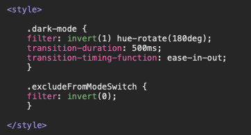
I recently posted a short video tutorial on my YouTube channel demonstrating how to implement a simple dark-mode in Hype apps with minimal overhead. This method utilizes two CSS filter effects (i.e., invert & hue-rotate) and is achieved with a modest amount of JS/CSS.
Hi, thanks for the solution. I added a transition-duration in the CSS code and it looks quite nice, but I get the issue is that it works only in one direction (light>dark). After the second click the transition doesn't work. Do you have any suggestion how to fix that?
I can't see any obvious cause for this from the code snippet you posted, but just in case there is something else going on, you should post a full Hype project file.
Here is the full project file. It includes a minor edit including where transition lines were added to the CSS. The strange thing is that in Light mode, the behaviour is correct. However, in Dark mode, the transition doesn't play during the colour inversion, but when resizing the window, you can see the transition applies to the background size and the toggle button position.
You want to run the dark-mode class to switch modes and then run it backwards to reverse the effect. I'm not sure you can do that. You may need to have a separate class for each direction.
Thank you for the solution. Now the transition works properly both ways. The only issue left is the relocation of the background and the button while resizing the window. I am not very skilled at creating code, but it would be great if I could get help blocking this function for the position and size unaffected and work just on colors.
Thanks again!
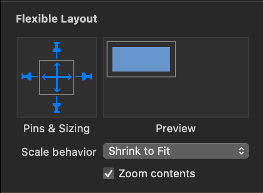
In Hype, you don't need any additional "code" to create a document that is centered and scales proportionately (without any element shifts). Hype can do that natively.
Simply group everything in a scene into a scene container and configure that container with the flexible layout panel like this: