Hi all, I am trying to get a button to act as a toggle and when clicked, it will display symbols with a class of "office" but for the life of me and ai I can not get this to work. Can anyone take a look at see if I am even close? I am hoping to get this working and then be able to expand on it by adding labels and more locations etc.
dang! I hadn't even considered that, appreciate it, that's a lesson learned for me! I do that in other web project, hadn't considered it here
Thank you.
Sorry Kalle, I'm sure that was clear as mud lol. So I am hoping to get the button to work as a toggled state, like a check mark, so if it's selected, it stays on, then it can be deselected. Hopefully that makes more sense.
BTW, except for the "toggle state" I have this thing heading in the right direction now, I have tested adding more locations and it's just great thank you.
Alright, then you first need to say goodbye to the hype button hover effect. I have now used a regular rectangle that functions as a button. There is now a function 'mouseOver 'for the hover effect and a function 'mouseOut'. The variable 'toggleStatus' is initialized in mouseOver. It changes its value on Click to '1'. Depending on its value (0/1), the button responds.
And of course, you don't need the queries in the click function anymore because you don't want to switch back...
In this adaption. I have set a rect to change opacity when the toggle happens.
The mouse over and out colour is on the containing group.
Here is a multiple one.
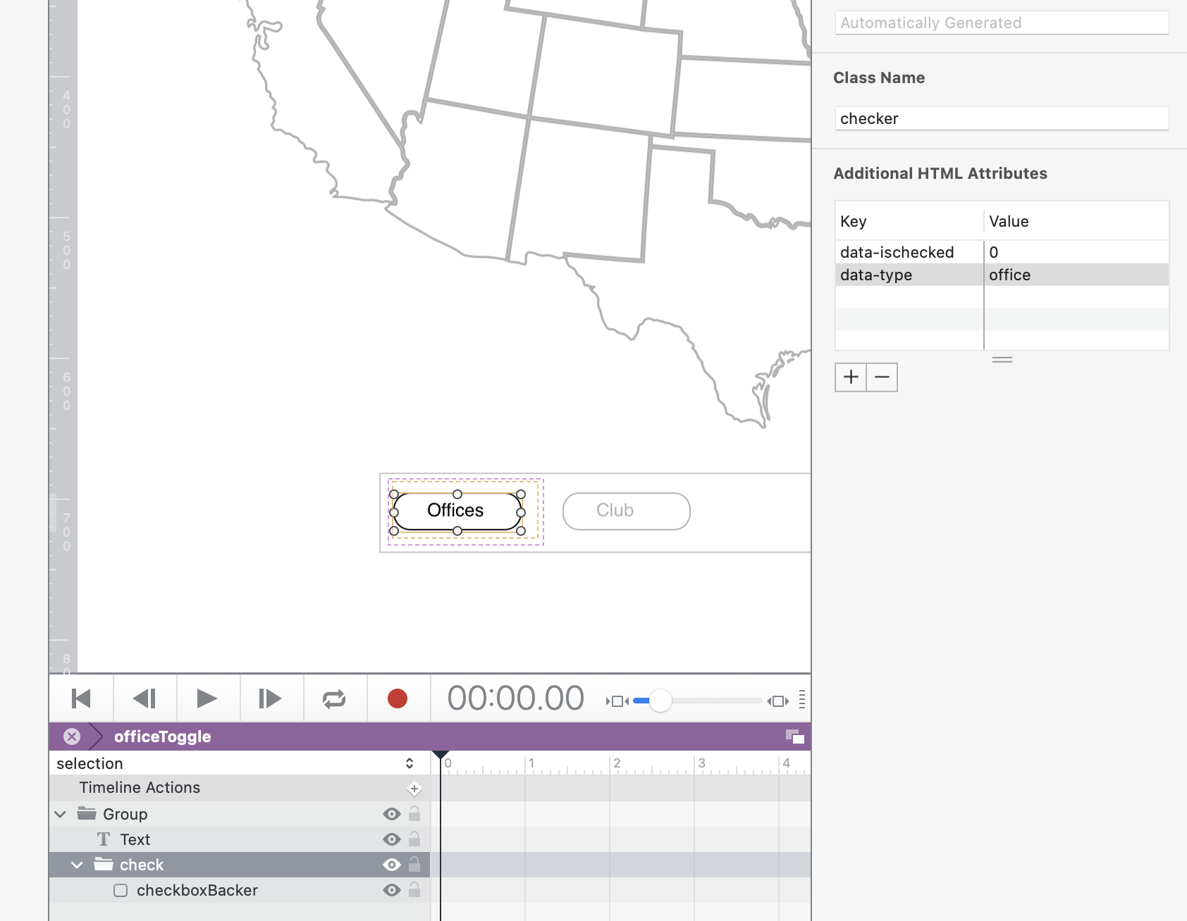
We duplicate a toggle symbol change its text label name, and give the 'check' group another additional attribute data-type which reflects the class names of the dots.
I have been playing around and running with the first version from @ktewes I imagine I have made this harder than it needs to be, but what do you all think? (If you don't mind taking another look)
Yet another version. I would approach it like this: display type (office or innovation), click status, and button color are defined as HTML attributes on the button. This version also takes into account the original requirement that the button should no longer be clickable after the first click (if I understood this requirement correctly).
 Just keep it simple. And - did you look at the console? You would have seen an error message...
 #1] HELP! My Map Doesn’t Work! (Managing Map Layers With HTML, CSS, and JavaScript)