2 posts were merged into an existing topic: Topics on time triggers
The "Controlling" template is online...
It is in response to this thread...
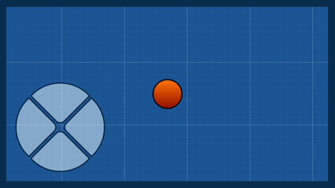
Instead of a game competition, something more casual was planned. That means no prizes. Instead, there's a gift for everyone that wants to make games with Hype. It's called the Photics-Physics-Bridge. By adding this JavaScript library to your project, the gap between Matter.js and Hype's Physics API is bridged. In other words, it becomes easier to make games with Hype.
That's what this week's template is all about. It shows how to make a four-way controller with Hype, by using the PPB.
If you do make a good game with Hype, starting from April 20, 2021 until October 20, 2021, can show it off in the Year of Fun ![]()
2 Likes
Just a heads up, while working on the App version of A Book About Hype, I updated the "Origin" template...
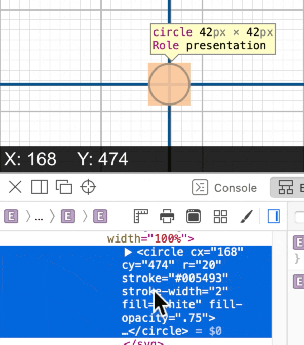
I realized that the previous method that I was using to animate the crosshair was excessive. I switched it to use SVG animation — much easier.
1 Like
The “Looking” template was updated. It's much cleaner and more modern now. Also, the YouTube video is online.
 [Hype #2] The “Looking” Template (When Is It Necessary To Write Your Own Code?)
1 Like
This post is to let you know that some of the earlier templates have been updated recently. In particular, the first "fps" template was updated.
It didn't have the optional duration value, which lets the needle in the FPS gauge move more smoothly. Also, it's better coding to use innerText instead of innerHTML, when possible.
This is next video for Photics.TV, but it's not ready yet. Meanwhile, I lost track of which other templates were update. HEH! So, see Photics.com for the latest versions of the templates.
Also, @jonathan, I noticed a problem…
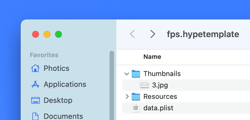
It looks like a thumbnail images is included in the Template. This doesn't seem like a good idea. The screenshot is bigger than the rest of the template. So, for these free Hype templates, I've been manually removing the thumbnail images from the updated templates.
1 Like
This is a cache, so it is a disk space vs. performance issue. If thumbnails are not included then scenes need to be fully loaded and rendered when the document opens. This can potentially take a lot of time, CPU power and RAM, so we favor maintaining a cache. You're welcome to delete the thumbnails if you do not want to incur the costs of disk or transfer.
That's too bad. This seems like it could be a user preference, or even one of those cool terminal commands.
1 Like
Maybe try an Automator Folder Action that runs a script to rm *.hype/Thumbnails/* or something like that.
Hah, those two little characters look so innocent and they are so long as you know how to use them.
If you are not familiar with its usage and there is a small typo, it could lead to very unexpected Permanent Deletions. (even for the familiar )
Personally I would use something like this which moves them to the Trash bin.
1, find Finder items
- set where to look
-set kind is other and to Hype Document Template
2, Get folder contents
3, Applescript
- will filter and move to trash.
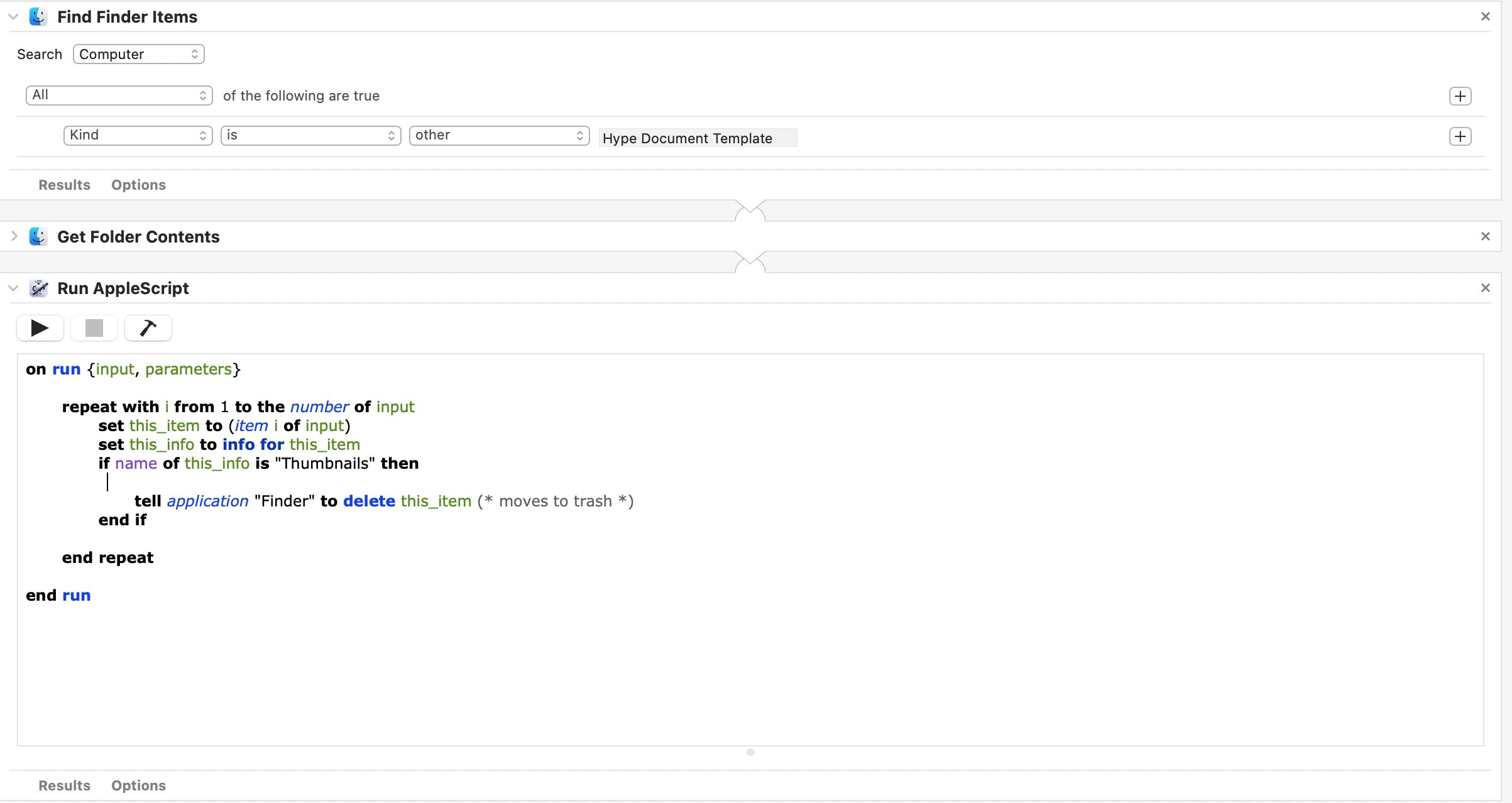
on run {input, parameters}

	repeat with i from 1 to the number of input
		set this_item to (item i of input)
		set this_info to info for this_item
		if name of this_info is "Thumbnails" then

			tell application "Finder" to delete this_item (* moves to trash *)
		end if

	end repeat

end run
2 Likes
Just a heads up! I didn't forget about the Tumult Hype series of videos on Photics.TV. I'm planning to launch the “Captials” video on Veterans Day, since that template has a big American flag. 
UPDATE: The video is scheduled to launch on 2021-11-11T13:00:00Z and here's the link…
The “Capitals” template was updated too.
- Uses Hype's customData API instead of “window” Global Variables
- Switched one stray innerHTML to innerText
- Changed hover style, as it was blurry in Safari when scaled
1 Like
The “Multilingual” video should be on Photics.TV soon. In preparing for the video, I updated the code.
3 Likes
Recently I got a comment on my YouTube channel which suggests that I've been making too many video game videos. ![]()
So…
Are you interested in another Photics.TV video about Hype?
- Yes, I would watch that!

- Nah, I already know everything about Hype.

0
voters
2 Likes
Unanimous, huh? Well, it looks like I should make a new Hype video. ![]()
I also got a new comment on one of the previous videos that asks a good question. The answer is best delivered as a new Hype Template.
@jonathan — If you get around to updating Hype again… ![]() …here's something that should be really easy to add that would make Hype more useful in creating card games…
…here's something that should be really easy to add that would make Hype more useful in creating card games…
-webkit-backface-visibility: hidden;
backface-visibility: hidden;
You might even be able to drop the “webkit” prefix eventually too. The next major version of Hype should drop support for Internet Explorer 6-9. Therefore, the browser support is excellent…
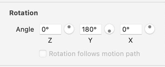
Basically, what that does is hide elements when they're flipped upside-down… such as with Y rotation…
More info here…
That CSS style is perfect for cards games, as it can be used to create a nice card flipping technique. That's a big part of what the next template and video is about.
2 Likes
It so happens we have another bug relating to backface-visibility so that might bump this up. (but that said, I'd like to consider how this will add extra UI complexity for something not frequently changed, so it may be harder than just adding a checkbox).
Well, I found a bug. Apparently it doesn't work well with scaling. It will make enlarged elements look blurry.
Perhaps it could be an “Advanced” section that expands because I don't use “Rotation follows motion path” often either. I don't think you have an interface type like that already though.
Something like Apple's Numbers… Cell… Fill…
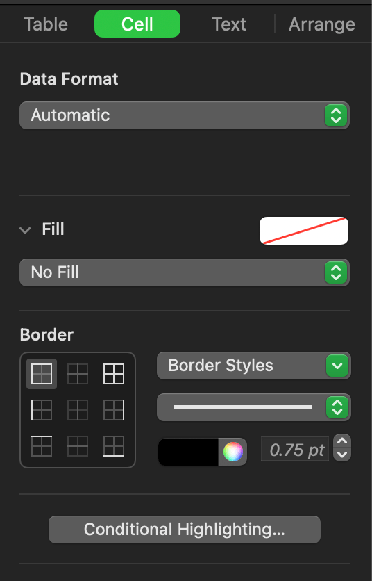
I'm not sure if that's possible to nest checkboxes within collapsible sections though. ![]()
1 Like
This doesn't surprise me. There's a minefield of things that will change rendering modes (not to mention fighting Hype's own choices on trying to force render modes to avoid certain rendering bugs...). You can try toggling Use WebKit graphics acceleration/position with css left/top and see if that coaxes anything better.
1 Like
I already converted the Hype document size to 4K. Now it will likely scale down. If you're using 8K monitors to play a card game full screen… that's not supported. ![]()
…but I tested it out anyway. The scaling was still blurry.
Also, I just realized that "rotateY" is not supported with hypeDocument.setElementProperty().
It might depend on the "pipeline" for when/where it is being scaled. You're welcome to send a zip that repros the issue if you want which might help me figure out a workaround hopefully for such a feature (just note there's a good chance there's not a solution ![]() )
)
The design part of the project is working now. I solved the card flipping issue by switching to CSS positioning and I solved the blurry problem by making the scene size 4K and scaling down.
I'll send over some templates though, as that information might lead to improving Hype. I'm not sure where the blurriness is coming from.
3 Likes
Interesting! ![]()
I didn't realize that so much time had passed since the poll was created. ![]()
Anyway, a new Hype template is online…
A video is on the way too. There will be a separate topic about that. Basically, it's part Whisk and part Hype, as a vanilla JavaScript of “Web #10” is available too.
One of the things I noticed while making the video was that Whisk would have been a lot better with tabs. Switching between HTML, CSS, and JavaScript didn't look as nice as Visual Studio Code. But, I think it can still work with just Whisk if the CSS and JavaScript is added to the main HTML file.
I still prefer Visual Studio Code for code formatting too… as it smites those pesky tabs and the way it shows invisibles is not so dark. (If there's a way to auto format code, I'm not seeing it. Also, I didn't see how to make invisibles lighter.)
Something like…
rgba(128,128,128,0.25)
But with previewing, Whisk was pretty sweet. It was nice to have a browser, with an inspector, and the HTML page all together. I could show what happened when classes were added or removed, which was nice way to show how classList.toggle works.
1 Like