but in the phones (Android Chrome, MIUI Android Browser, iOS Safari) doesn’t work in the proper way:
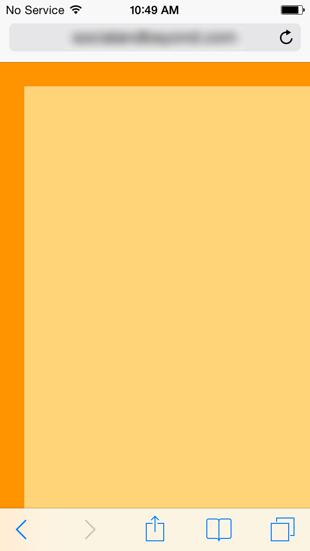
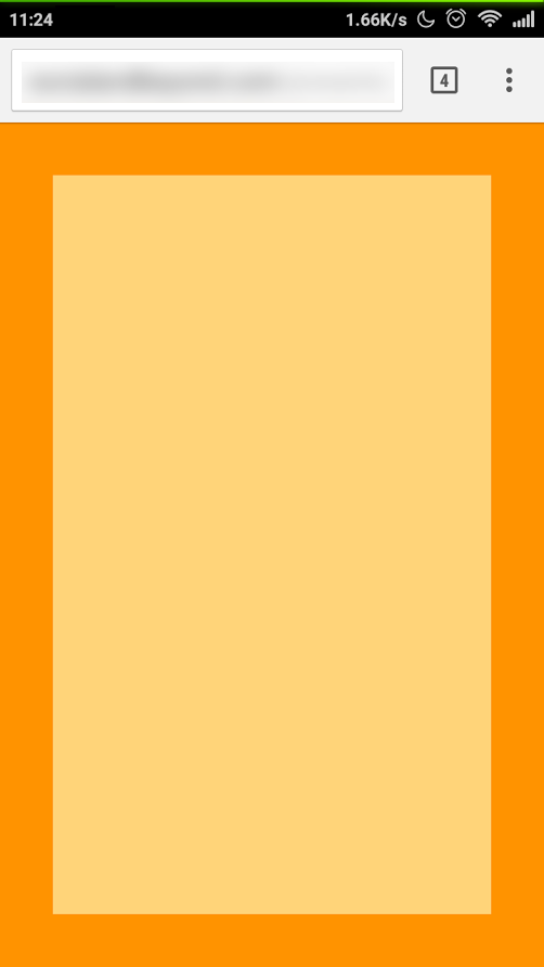
the right and bottom sides don’t remain attached to the borders!
The funny thing is, if I use a smaller layout (1024x632 px), it works like a charm! But of course I need to work with FullHD layout…so is not a solution!
I just found a workaround: if the first slide is smaller (with the option “Apply changes to all the scenes” deactivated) and onLoad I jump immediately to the second slide (FullHD size), it works as I expect!
Anyway, it seems a bug to me, so I hope you can fix it soon. =)
Firstly, Can you not edit your first post to make it one complete post now?
Also, I believe the problem here is the viewport. On mobiles (namely iPhone as that’s the only one i can test it on right now) if the viewport is bigger than 1300px (1280) it cannot view the whole document in portrait therefore left to right scroll. Landscape no problem.
Nope, I’m using the JS/CSS3 trick to scale everything depending to the screen size…for the moment I use the workaround, but to me looks like a bug or “unexpected behaviour”.