It is crazy - I worked after looking video tutorial!
One example is working - now I would like to change file - but even I made in same way is not working
I give up in this moment - I spend 2 hours for no result.
javascript code is to see - in example one is working - other example no
It should be work also for flexible layouts…
So I cannot work with hype. In this case the second animation looks better if drawing window - all elements stay in their positions - at first animation: elements are not always on their positions and are moving.
Perhaps I’ll try Adobe Animate CC or embedding with Iframe (but this solution is not my favorite).
Hey @rose_puc, as Jim mentioned, the issue is that the container you’re placing your Hype document into needs to have a minimum height. When you have a height set as a percentage, the height becomes 100% of 0px, which means that your document won’t appear. So, you could either set a minimum height for that container (by setting min-height:400px or something appropriate on your Hype div) or build your layout so that it doesn’t need a responsive height.
Tagging onto an old conversation here...I've been continually updating a Hype doc used as a homepage carousel for years now. I want to freshen our homepage and make this carousel take the entire width and height of any screen and layer underneath my header/nav.
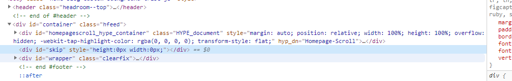
I have a new Hype doc that has height and width scaling selected, everything pinned correctly, and it looks great in browser previews and in Reflect. I'm dropping it into a container div with a min-height of 568px (although I also tried min-height:100%). Sadly, all that shows is the occasional half-second transition between scenes, and those are zoomed WAY in, causing the height to jump momentarily to 3000px+.
Here's my working doc in Dropbox so you can see what I have set. (it's larger than allowable for upload here). Thanks for any ideas!
Since Hype will handle the height of the Hype div, I think you can get away with just having your 'width' scaling checkbox checked. Then, you just need to make sure you build your document so that content doesn't crop in a way that is disruptive. It looks like you've made some considerations already (for example the symbol in the lower left, pinned to the corner).
Because you know you want that to always push down other content below it based on the layout sizes you've chosen, I don't think you want a flexible height? Or it's possible you want to setup a max-height in some cases?
So @Daniel and @h_classen, you're both right. I enclosed my doc in a 100vh div (maybe unnecessarily, but just to be safe) and also removed height scaling BUT changed my large-screen size to 1920x1080 instead of 1200x675 (which is still 16:9). That's at least got me to full-screeniness, and I can continue to tinker on it (and tinker on the non-Hype elements like the menu).
if you disable responsiveness for the height the hypedoc will take the absolute height from its setup -> not responsive (means the layouts keep there height).