Hi
Have a web app which have mobile portrait layout and desktop landscape layout.
When testing it on desktop in mobile screen size portrait view works but when testing it on a mobile device portrait view does not work.
Is this because I have video in it which not displaying full video size?
It is because you have the Viewport width setting (in the Document Inspector’s Mobile Options area) set to Document Height. This means the effective width of the device is actually set to the height, which will be greater than the 441px breakpoint you have set (even the first iPhone is 480px tall).
You’ll want to change this setting to Device Width.
Thanks. So simple to fix
1 Like
Have another question, app works well from server:
But when embedded into a Hubspot page sizes are changing especially in mobile view especially video shrinks:
https://blog.feliway.com/?hs_preview=WgyttnkT-15296958671
Even though have protect from external styles selected.
Have tried a number of different flexible layouts, placements and constrained proportions but can’t get the video not to shrink in mobile.
Any thought on how to fix?
It’s really hard to diagnose an issue like this without seeing a document, but it looks like you have a height set to 100% for your layout, which is likely part of the issue. It works well on its own since the width and height corresponds to the browser’s viewport. When embedded, you have to consider the theme, its mobile layouts, and all the different ways that they work together.
To make things a little more predictable, you can uncheck ‘height’ in the document inspector which will have the shown layout to snap to only the layouts you define as ‘layouts’ in Hype.
When creating a layout with flexible elements, in the majority of cases the best tip is to make a group containing everything, and have that scale up and down in that layout.
OK document set for width but see what you saying.
Here is the document:
https://we.tl/t-2ytfNN6XKst
Anything you can do to help is appreciated.
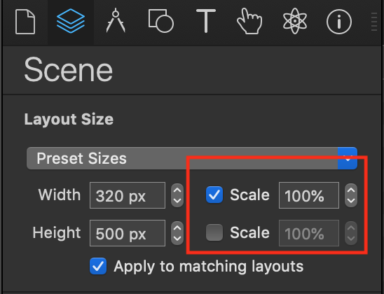
It looks like this document is set to have scaling checked in the 'height' dimension still. Can you adjust your document to have these settings in both your layouts?
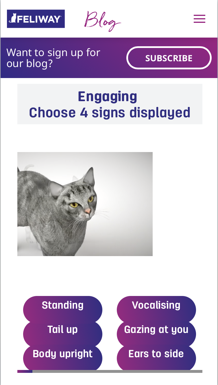
Then replace it on the page and see how it looks: Cat Body Language - Take the Test!