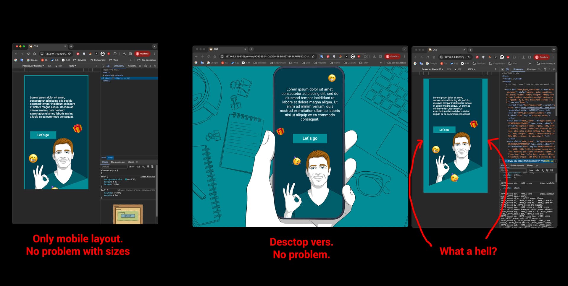
I'm creating a website (desktop and mobile versions). I made a mobile version and watched it on my iPhone. Everything looked good. Added a desktop layout. After that, the mobile version shrank on the sides. Here is a piece of my project. If you remove the desktop layout, the mobile version becomes normal in size. How it works? I tried changing the breakpoint, preset sizes, flexible layout. Nothing helps.
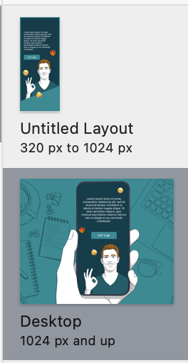
I suspect you may want to adjust the Breakpoint Width in the Responsive Layout section of the Scene Inspector for the Desktop layout to 321px. You currently have it at 1024, which means it will not kick in until that amount, so it will show your mobile size for anything smaller.
See the labeling in the layouts which indicate where they will be shown:
It sounds like you want Desktop to be anything greater than 320px, correct?
Hello Jonathan!
I don`t understand why so large margins on the right and left in the mobile version.
When I remove the desktop layout, the padding disappears. I can't figure out where I'm making a mistake.
how to get rid of these margins on the edges in mobile vers?
When using responsive layout the Mobile Options for Initial scale 1.0 is checked. This controls the zoom level. If it is not checked, then the browser will use the viewport size (the document width). Since the layout may be changing, it would not make sense to use a viewport size that may no longer apply at runtime, which is why there's not a way to uncheck this with responsive layout.
However if you only have one layout, it is more likely you always want it to fill the screen - the viewport size is the same as the animation. So for a non-responsive layout document, this is unchecked.
If you want the same behavior (that there are always margins), then you can check this box when you only have one layout.
However, this sounds like the opposite of what you want .
You could try manually removing this directive from the exported HTML, but I'm not sure this will necessarily get what you want when using responsive layouts.
Instead, it would make sense to use the Flexible Layout system to stretch the way you want at smaller sizes.
 .
.