Hi everybody, i have a little problem: i'm making a prototype for iPad, but i havn't an iPad... so to solve this, in Chrome i went on Inspection > Toggle device toolbar > i set my customized dimension of iPad (1149 x 834) and it works.
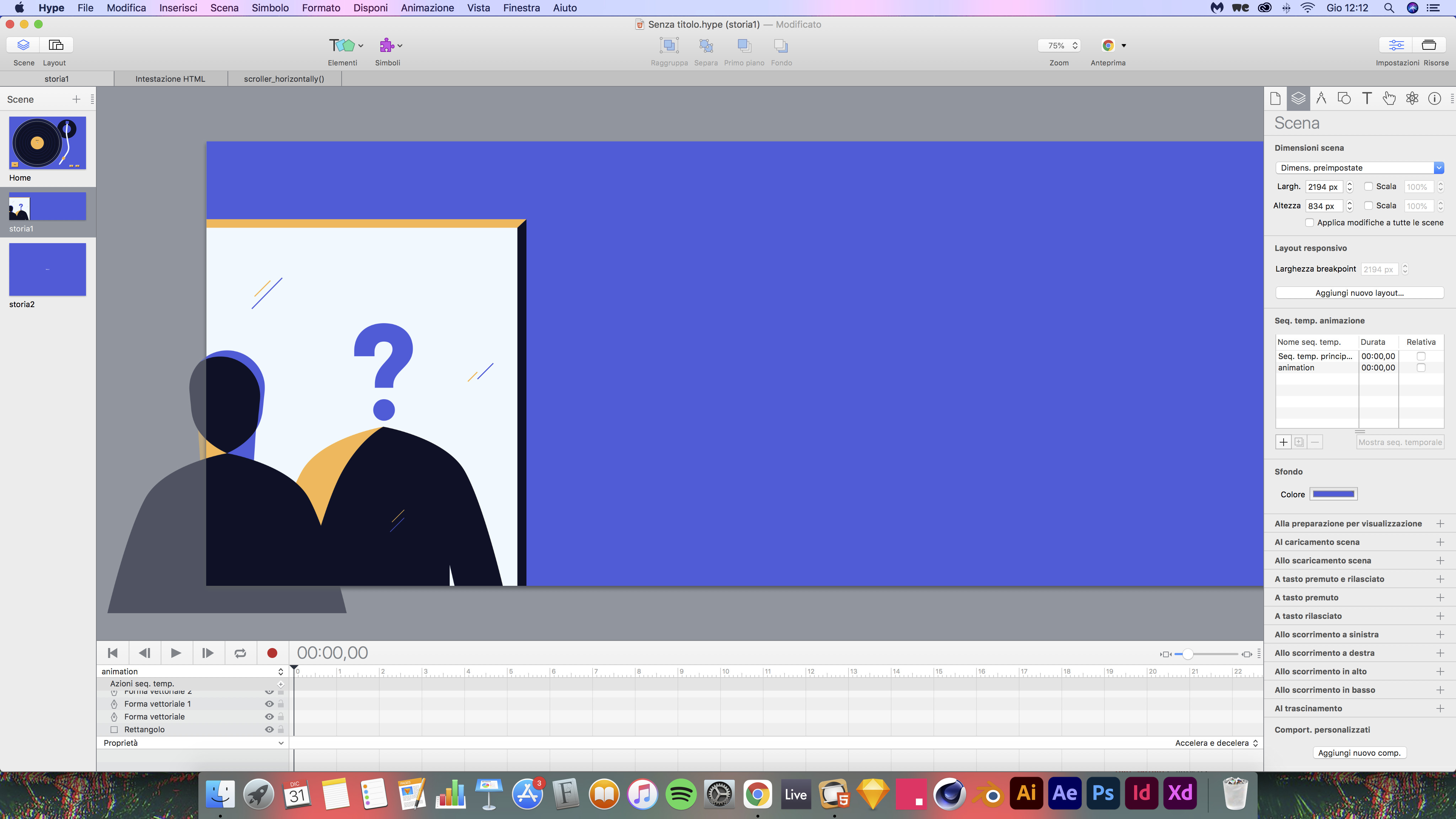
For this project I’d like to make it so that you could scroll horizontally, so when I try to increase the width on Hype, Chrome resizes everything to contain it in the fixed size of my viewport, so i can't scroll (drag) horizontally...
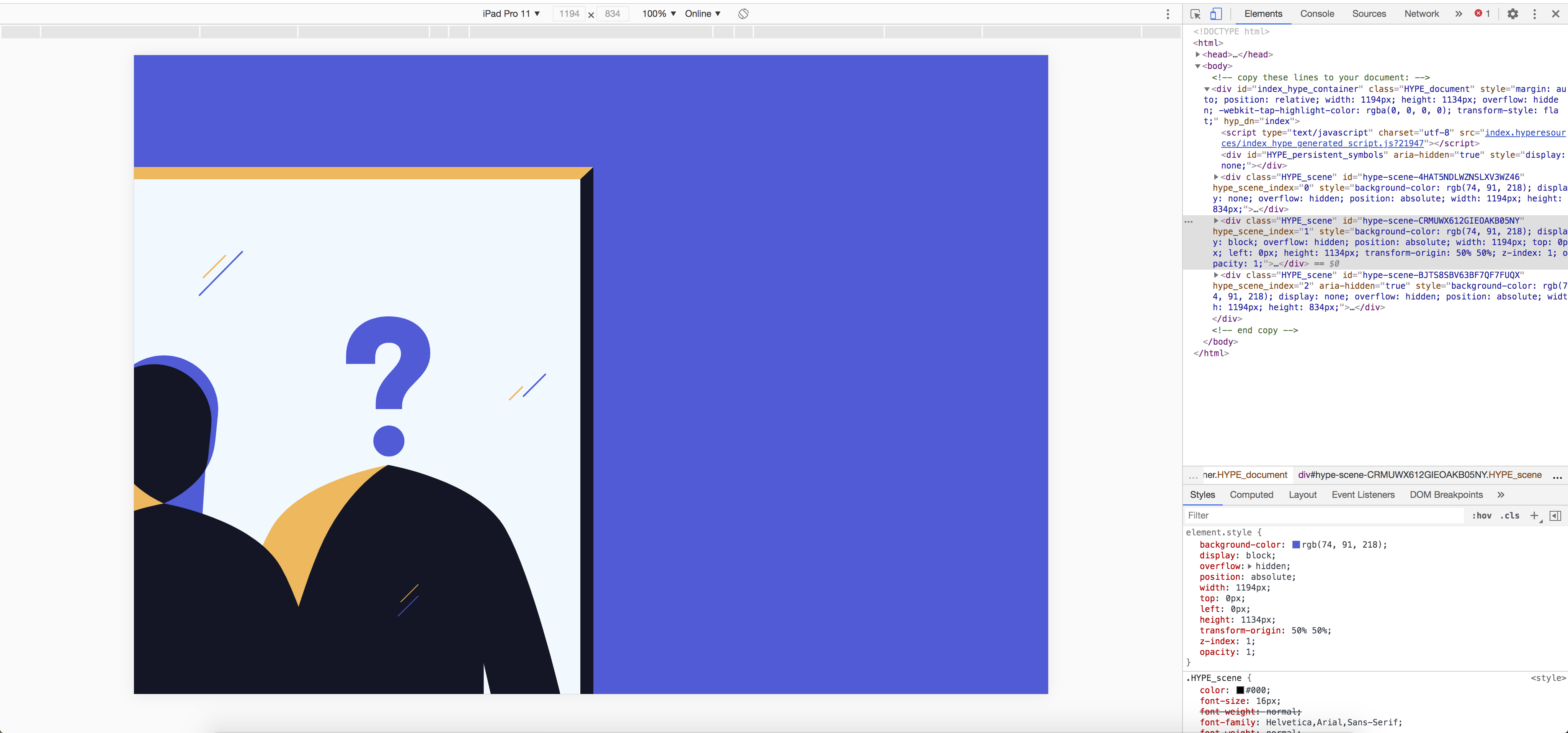
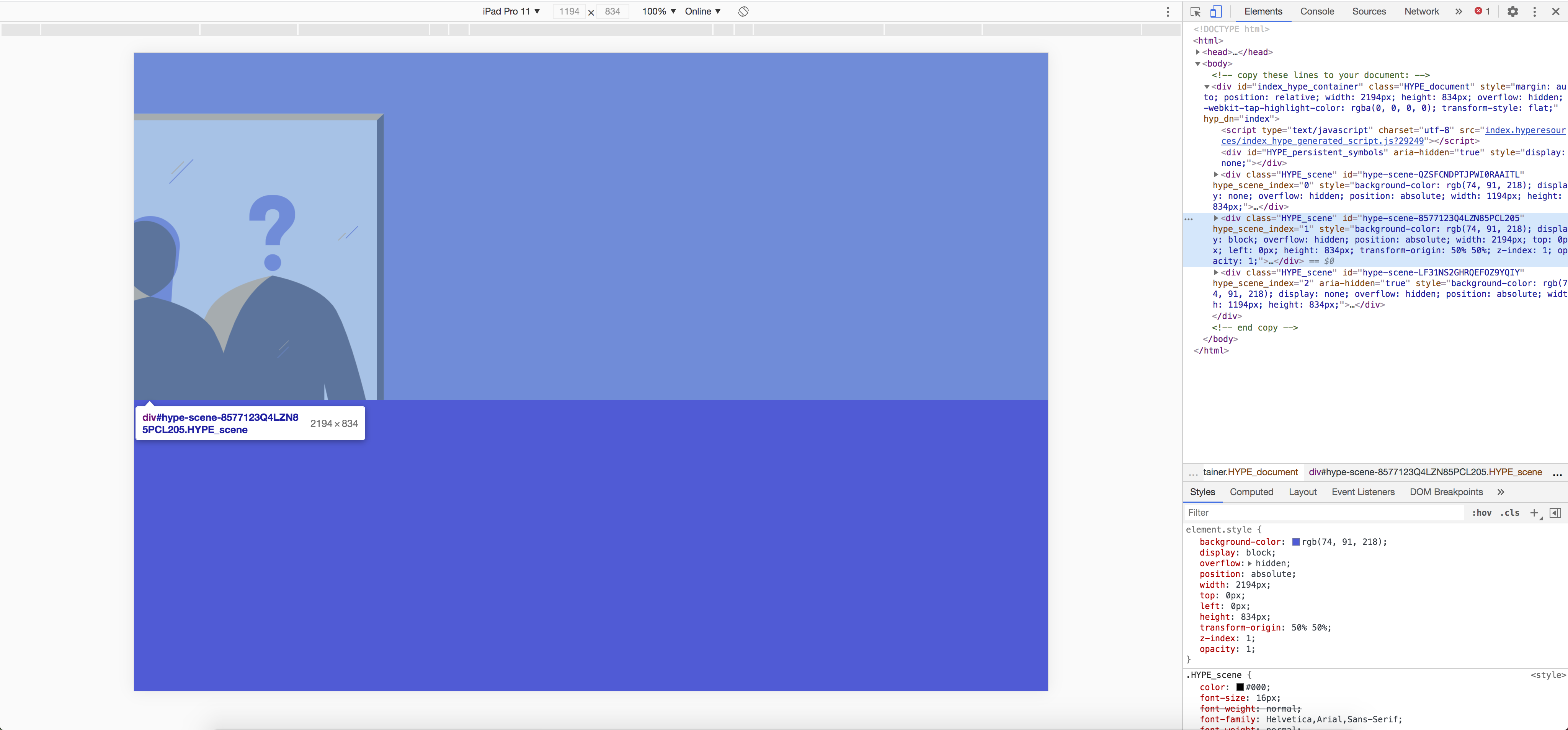
As you can see from the pictures I have attached, 1 it’s like I wish it were, 2 is what it actually looks like.
As an alternative, and probably more accurate, you could use the simulator in Xcode. It's not as good as a real iPad, but I'm thinking it's closer than Chrome.
I'm not sure what's going on here. I was up late, still groggy, but it seems like maybe this template might help...
the "Jump" template is similar to my situation, but what i would like is that the scene can be scrolled, not a singular element.
A vertical scroll works automatically when I increase the height of my scene.. but horizontally it doesn't work
It sounds like you are changing the scene size width?
Most likely what is happening is: Chrome's responsive design mode is following the Viewport Width mobile option. If it is set to "Document Width," the default, then this will effectively scale your document to fit. The viewport width in mobile terms is basically your window size.
You should probably change this to "Device width" so that this matches physical pixels. You could also choose "Not set" which lets a device decide something reasonable.
You'll probably also want to check "Initial scale 1.0" as Chrome seems to also scale your document down independently of the viewport size to fit.