Hi,
I’m just experimenting with alternative layouts for a document that I want to appear on various devices. When I view on my iPhone 6, iPad Pro (12") old iPad Mini (1024x768 and browser they all behave as I expect them to when viewing in Hype Reflect) except when viewing in the browser (Chrome). In the browser the image does not scale as expected and the animated box is visible off the stage! I’m probably missing something basic here but would be grateful if another pair of eyes could look it over.
lHype_layout_Test.zip (63.0 KB)
It would be good if you could define what you mean as expected; I find that it looks the same in Chrome and Safari on the browser. In both cases, the orange box does extend beyond the scene - this is because you are using Flexible Layout (width/height of the scene set to scale at 100%). You do not appear to be using the flexible layout settings on any elements, so this may not be necessary. Otherwise, you could also put elements within a group and set the Overflow (in the Metrics Inspector) to Hidden.
My guess would be that your magnification settings could be different on Chrome, so you are seeing more of the page, including the orange box.
Thank you for the reply Jonathan.
The main map scales but the location button is way out of position and moves around when the browser is resized. I’m getting hopelessly tangled with all this flexibility stuff so maybe I just need to build to fixed layouts for individual tablet screen sizes?
Flexibility definitely adds a bit of complexity. I generally recommend doing it as a last step since there tends to be lots of changes during design that would require unnecessary churn in flexible layout options. It is hard for me to recommend one way or another since I don’t know your requirements and timeframes, so my best general advice is to make sure you’re working on the most impactful part of the project! Of course, I do believe that modern sites/apps should be responsive to different devices and browser sizes, hence why we have the feature.
Thank you. It’s all problems here this week - I too have had the same issues as others when trying to export to Animated png. As per your advice I have attached the System Report.iMac.zip (348.6 KB)
Thanks for this report! The issue is machine-specific; if you have another computer you may want to try exporting as APNG on there. (otherwise Hype uses the apngasm command line tool, which can be installed via homebrew and then run against a PNG Sequence export).
Hi Jonathan,
Something trivial to ask.
If I am using a background image, corresponding to the iPad landscape layout size (1024 width by 768 height in pixels), I should expect to view the whole image (full screen no sidebar), within any browser, on a given iPad device, right! No responsive design options selected, I should also mention.
I exported this hype document and uploaded the content to the following server: [http://conceptpir.com/Alma_hype.html].
The height content, either in Safari or Chrome, is always shown with a sidebar.
From prior work in Hype, at this layout size, a native iPad app will show the whole content at full screen. Is it possible to get the same result from a browser standpoint?
Many thanks in advance.
PYPlourde
I’m unclear what you mean by sidebar, unless you mean the top navigation bar? On iOS 7 and later Apple removed the ability to dismiss it entirely (there used to be a technique of scrolling the page up until it was no longer in view, but now there’s always a little bit in view).
The best general workaround to not seeing a status bar is that users can set it as a Home Screen web app, and in Hype’s document inspector you can enable this as an option which will then not show the navigation bar. There’s also the requestFullScreen() javascript API that could be used though my memory is fuzzy if there’s any iOS-specific issues with that.
(On a side note, Hype used to have scene size settings for with and without the navigation bars, but as these are now more fluid we removed them)
Hello Jonathan,
I was referring to a vertical scrolling bar on the right side of my document (maybe 748 pixels shown instead of the full height image).
Thanks for your reply. I will examine the proposed solutions.
Have a good day.
PYPlourde
Envoyé de mon iPad
Maybe you could send an annotated screenshot? The width appears correctly to me, and I don’t follow the interplay you are describing between a sidebar and height.
The only thing I note is that the height is larger than the default page, because you are using 768px high and the navigation bar on iPad takes some of the vertical pixels.
Good afternoon,
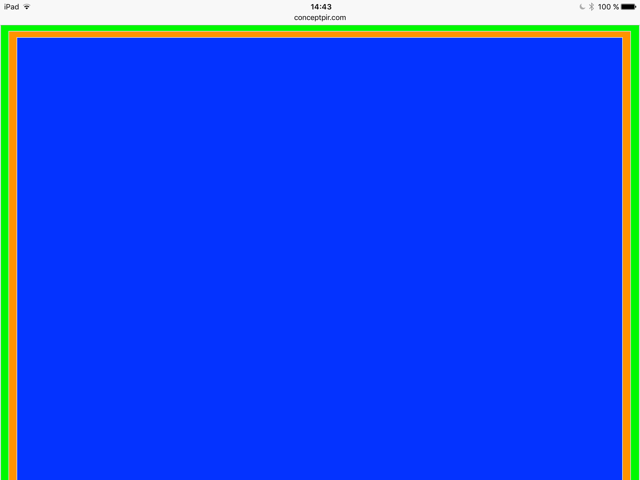
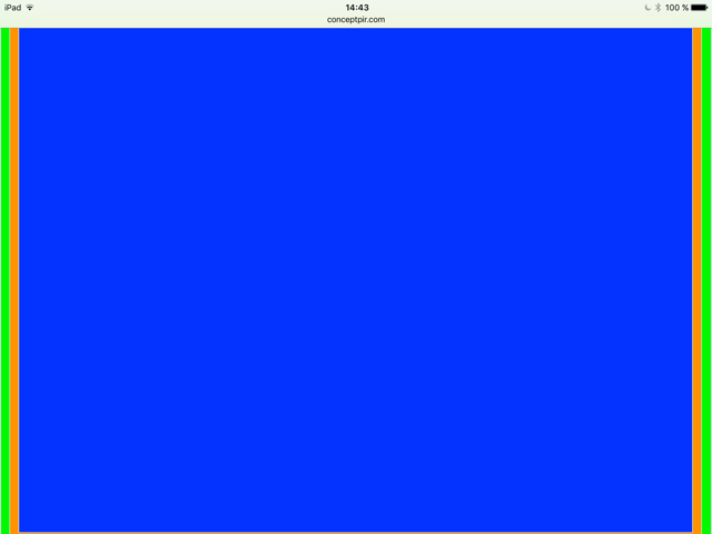
Here iPad Pro 9.7 screenshots taken from test_size.hype file attached. I settled the option to load as a web app with window width = document width.
Green rectangle (1024W x 768H); Orange rectangle (997W x 748H); Blue rectangle (971Wx 728H).
As you may notice in the iPadview1.png file, the bottom part of these rectangles is not visible.
You have to scroll down about 20 pixels to see the content of both rectangles, green and orange.
The blue layout is the only one completely revealed.
If my reasoning is good, in order to see the whole content of my document on any iPad (landscape orientation), I should create a custom layout equal to the blue rectangle size.
Do you think it might be better to start with a bigger layout, let’s say desktop (1200 px), and then for the different device sizes, settle the corresponding breakpoint to a given full view?
Your advice will be appreciated.
PY
test_size.hype.zip (14.7 KB)
I think the choice of what size to use is up to you and the content that you have. If the content will primarily be shown full screen on an iPad, you can stick with a 1024x768 size, and just know the top nav bar will hide some bottom content. You could do a few techniques to mitigate this, such as putting contents in a flexible layout group, and using shrink to fit, which would letterbox it on smaller sizes like this. You could also just make sure the bottom part of the content isn’t ever important!
It also looks like you’re trying to keep the aspect ratio - depending on your content you could have 1024 wide but have the document only be 728px tall. Do keep in mind though that the navigation bar can change size when shown; the above screenshot looks like it is in the minimal state. Even if users make a home screen web app, you still will not get all the 768px tall because the status bar is still shown.
Thanks a lot for the precious details.
PYPlourde