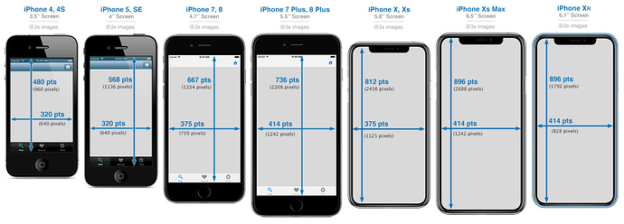
Today I learned something new: If you are trying to create a responsive layout in Hype that looks good on both an Apple Watch and an iPhone SE, you’re looking at a 320px width for both devices. This can make text look pretty small on an Apple watch. To have the Apple watch switch over to its actual/native viewport size of about 156px, you need a single line in the head of your Tumult Hype .html page:
<meta name="disable-adaptations" content="watch">
Of course, this is a couple years old and likely not new to some of you, but this is the first I’ve heard of someone designing a website specifically for the Apple Watch.
More info:
More info on this in this WWDC video from 2018. And additional info here:
Other resolutions:
If you want to target specific watch models using @media queries, see this post and styles below:
Apple Watch Series 4 (44mm) Media Queries
@media only screen and (min-width: 224px) and (max-width: 319px) { /* Your Styles... */ }
Apple Watch Series 4 (44mm) Min-Width Media Queries
@media only screen and (min-width: 224px) { /* Your Styles... */ }
Apple Watch Series 4 (44mm) Min-Height Media Queries
@media only screen and (min-height: 184px) { /* Your Styles... */ }
Apple Watch Series 4 (44mm) Min-Width Media Queries
@media only screen and (max-width: 224px) { /* Your Styles... */ }
General Media Queries for Smart Watches
@media only screen and (max-width: 319px) { /* Your Styles... */ }
Retina 2x Media Query for Smart Watches
@media
  only screen and (-webkit-min-device-pixel-ratio: 2),
  only screen and (   min--moz-device-pixel-ratio: 2),
  only screen and (     -o-min-device-pixel-ratio: 2/1),
  only screen and (        min-device-pixel-ratio: 2),
  only screen and (                min-resolution: 192dpi),
  only screen and (                min-resolution: 2dppx) {
    /* Retina styles here */
}
