My text displays correctly on a Mac or Pc, whether in a text box or button. However the same text boxes/buttons display with a larger line height on and iPad or iPhone (even though it is set as the same). This has only happened on one scene and only with a handful of text boxes.
I have quit and restarted the Mac.
I have repaired disk permissions.
I have recreated from scratch each text example.
An annoying problem can anyone suggest a solution.
Thanks
Jeff
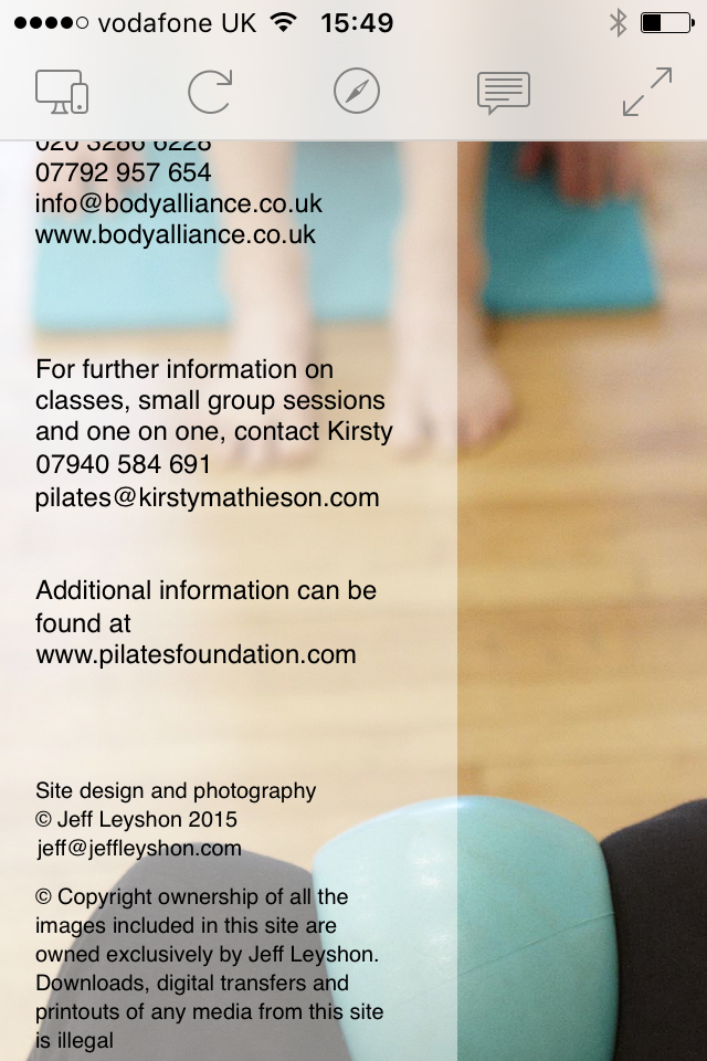
If you navigate to Contacts. Look at the text on the left hand side/column. In the first piece of text above the tel. no. the line spacing has increased. The same in the next block of text below just above the pilates email. Then again with my copyright below.
It all displays fine on a desktop browser but the problem revealed itself on an iDevice.
I am testing on an iPad Air 2 and an iPhone 6. It appears fine in Responsive Design Mode in Safari
Off the top of my head it looks like something to do with the wrapping of the text.
The lines that seem to be effected look as if there are wrapped lines but I might be wrong.
I haven’t looked at your document yet. I don’t know what’s happening exactly and why it’s doing it on IOS devices but it’s a start
*Edit It seems you have button elements next to text elements that is throwing off the positioning somehow in Safari Mobile. Again not 100% sure why.
As a workaround for the moment may I suggest including the linkable text alongside the other text as a link tag <a href="...... ></a> and adding some styling for your colours. I know it’s not Ideal. Maybe someone else has a little more info on this or solutions.
I agree that the button elements are throwing off the text elements, but I have button and text elements in near proximity in many other places with no problems. The question is why, I’ve tried everything I can think of. I have even changed the text elements to buttons to see if that makes a difference.
Check the line-height’s in the inspector for the text / buttons in question you’ll find a few things there that might shed some light If you make them more consistent than they are. Maybe all the same size and line height then things should work better. At least in theory.
Just to clarify … I suggest anything that is 12px font-size then make the line-height 14px and move the element into position. Same with 10px font-size, make this 12px line-height and move the elements.
No, that didn’t work. I changed all the line heights to match those fonts of the same size. Had my hopes, but nope.
Thanks for the suggestion though. I tried changing the button to text again as well but no joy.
I forgot to mention that even if I seperate the boxes i.e. put some considerable space between them, the line height still displays wrong on iPad and iPhone
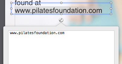
Here is a screenshot in Hype reflect (Safari iOS 9) after I did the changes I mentioned above (with a little bit of movement of the elements to compensate)
I would suggest putting everything in a single text box for now. If you look in the innerHTML of the “buttons” you will see the code it puts in there and you can copy and paste this if you’re not sure how to code links.
I’ve just created a few more scenes. They all consist of layouts that have two columns of text. No Buttons just play old text boxes. Obviously the text is lined up perfectly in each column with the other. This displays correct on a desktop browser, but is all over the place on iDevices.
Is there some bug that anyone has noticed.
I’m still having problems with type displaying differently. iPads, iPhones and now IE!!?
So I have taken your advice and started to use simple text boxes and provide links using the innerHTML.
This has worked well. The links work. The layout is better but still not perfect on the iPad, iPhone now.
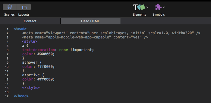
However I have also added code to Head HTML and where it has styled the text in normal state, it doesn’t work for me in hover and active however.

 If you make them more consistent than they are. Maybe all the same size and line height then things should work better. At least in theory.