Text gets cut in mobile devices (on browser it's ok)

Hey, I have a big text scene 375x27500 and when I preview it on the iPhone 6 it doesn’t show my whole text.

I have to trick it making the document much bigger, leaving a blank space in the end, to see the whole of it on the device.

I’ve got this dropbox link with an example of what’s happening here. Hope someone can have a look. It’s driving me mad :slight_smile:

Thanks.

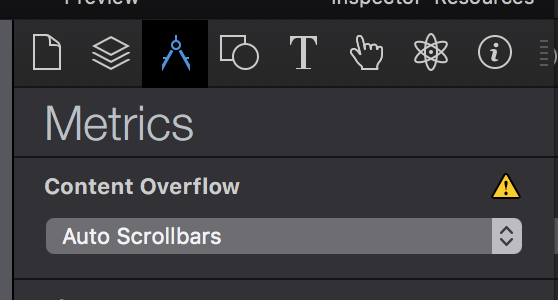
One way to fix this is to use ‘Auto scrollbars’ for that text element. If text extends beyond the height of the text box, the element will allow the user to scroll:

The issue here is that text has varying line-height across different browsers. When you see the height of a text element in Hype, that’s a near-perfect approximation of what the height will be in Safari, but may not be right for mobile devices.

Thanks, Daniel.

Are there any other solutions? Auto scrollbars don’t function well on mobile - they stuck when you scroll - and you end up with a bad effect.

1 Like