My guess would be some sort of interaction between flexible layout setup and your animations that make the positioning unexpected when not entirely on screen.
PS It is quite slick – and I didn’t read close enough the first time to know it was a re-creation and thought both links were the same at first!
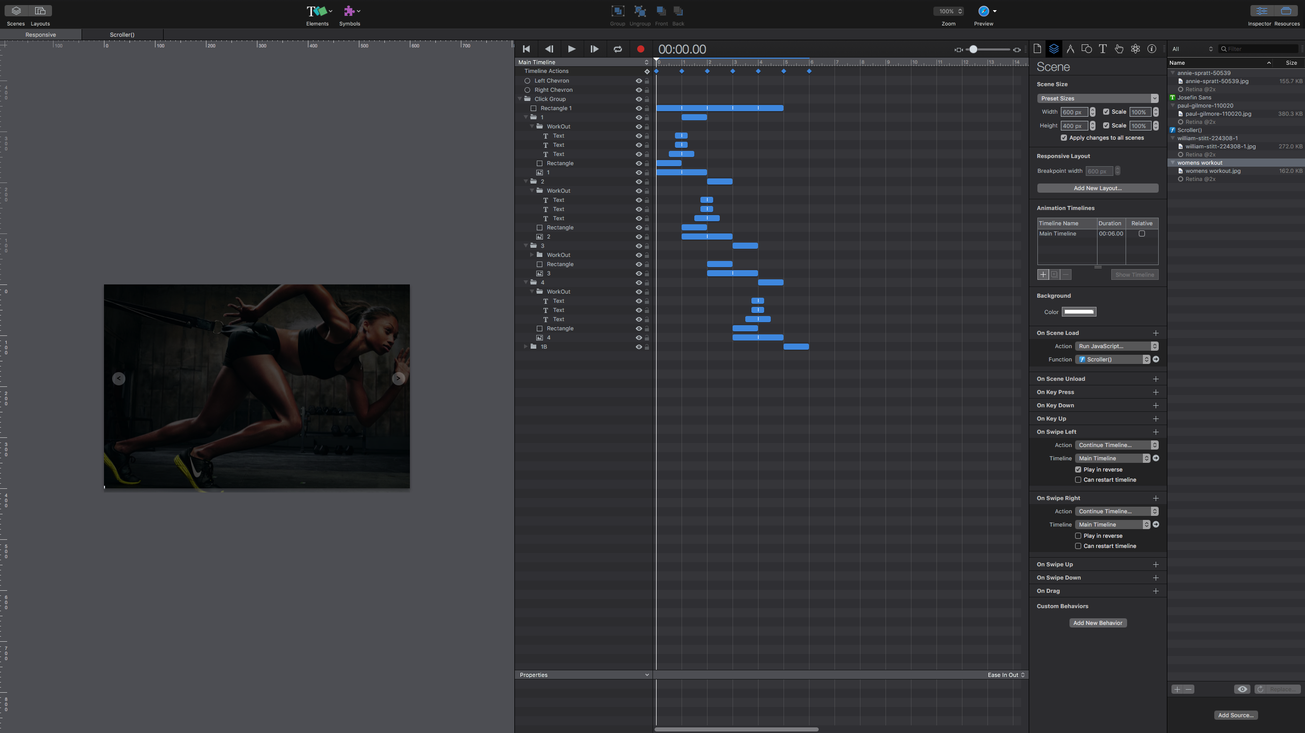
Sure, thank you! Luca’s version doesn’t have mouse scrolling, click on image to go to next slide and endless transition from last to first slide in a seamless progression. The progress bar moves and starts over simulating relative timelines all in one main timeline.
@jonathan, you can find the hype file attached. To replicate the image zoom problem, please preview the file and slide to the last or 4th slide, make the browser window narrower and advance to the first slide thats where the image zoom happens. I think the reason why it does this is because and I maybe wrong - hype triggers and registers the position of the page at the very begining of the document. In the case of the last slide, when its about to go to the 1st slide from the 4th I have a endless transition effect which I dropped an action to go to 1.15 seconds at which point hype can’t figure out where the starting point of the document to readjust the window width.
Hi @petester Following on from our conversation on the Blocs forum, I think the issue you’re facing is partially due to the pinning arrangement you have on the images. Whilst I understand that the pinning is designed to keep the images responsive across devices, unfortunately the ratio of the images don’t lend themselves to the other device formats (i.e. smartphone and tablet portrait). I still think the best option is to create the different layouts and then replace the images on the tablet and smartphone layouts.
Attached is a zip of your images rescaled to fit these two additional device sizes - keeping them as a full screen slider on all devices. Obviously, you may have to rearrange the text and icons for each layout but, It will be interesting to see if you can get this working well - its a nice implementation of a full screen slider and offers greater flexibility than the option produced by Lucas - if you have Hype, of course. Archive.zip (2.9 MB)
Good Idea! Just so you know, this zoom doesn’t happen all the time, just when the window size is very narrow so it seems. Also, I feel like if there was a script to allow the browsers to almost reset width and force it to always keep it at 100% it would fix this issue? Or perhaps, If I can define the group ID and have CSS to override rules to always have the width of that Id at 100% width? Speaking of layouts, I don’t know why the animation replays every single time a different breakpoint is triggered? Why not just scale it to that breakpoint perhaps @jonathan had a good reasoning for this interaction.
I’ve had a look at the project on an iPad and a smartphone and I don’t seem to be able to recreate the issue. It seems like an issue that kicks-in if the viewport is changed mid-viewing. Fortunately, most people viewing the slider will do so in a fixed viewport (no opportunity to resize the viewport manually - especially on mobile devices). When I’m viewing on tablet and smartphone I don’t see any problem. It only seems to happen if users resize a browser window on a desktop. Under those circumstances, I think users would expect something odd to happen. So, I guess the question is how many people will actually change the browser width during a site viewing??
I agree, not too many people. I was just frustrated to a point where I said to myself, I think Im doing something wrong or not according to how it suppose to be done. Which is why I latched onto the Idea of fixing it even though the impact is not that worthwhile After all, I could've taken the relative timelines route but the more I thought about it the more it seemed liked there were no reason for that. I'd just create one instance of the group to try to best match Lucas transition effect and duplicate the groups and make it so that its endless and to make matters work, I reuse a scroller script I did for this ad and call it a day...
Thanks, I was able to take a look. The root cause of what you're seeing is a combination of the fact that flexible re-layouts happen when the window/viewport size changes and that changing the width of an group element isn't a "flexible" resize. Here's the breakdown:
Your group (and image) has flexible layout on it
The animation then makes the group width to -5000 pixels
When resizing the window, the image will now look at this new group size in context of flexible layout and grow to match based on its size and rules
When restoring the width, there's nothing that triggers the re-layout so it stays this large size
I need to think further if this is a fixable issue from Hype's end or if it is just a limitation of the current system. I'm pretty sure there was a reason we didn't have a group's resize trigger a re-layout of its components at one point, but with more flexible layout options we've added there might be new reasons that this could change.
It isn't a great solution, but you could add onto the timeline actions a call to hypeDocument.relayoutIfNecessary() and that will at least fix it up when the animation is done.
Layouts are conceptually different scenes. If you need behavior to preserve animation state, you can put elements in a Persistent Symbol.
That did it! I can't replicate this anomaly thanks to you. I think its best you enable this for those folks that work in flexible layouts and rely on groups.
In any event, I have the above script on scene load, in the beginning of the timeline running javascript and its gone for good
 After all, I could've taken the relative timelines route but the more I thought about it the more it seemed liked there were no reason for that. I'd just create one instance of the group to try to best match Lucas transition effect and duplicate the groups and make it so that its endless and to make matters work, I reuse a scroller script I did for this