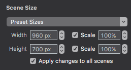
One of the things I’ve noticed with many responsive websites is the content adjustment that happens not just when the width of the browser is adjusted, but also browser height. For instance, if you go to borngroup.com, you can adjust the browsers height (don’t adjust width), and the heading of the page will expand vertically. All the textual content becomes centered, and the movie of the gorilla fills the screen. I can replicate this feature in Hype if I have “Scale” checked off under “Scene Size”:
…But the big problem is, I can’t create any content below that (without it looking extraordinarily condensed) if I have the the Height Scale option checked off. This is one of my attempts to create this effect, but again, I’d like to have more content that you can scroll down to: http://2.ideahubdesign.com/
Does anyone have an idea for a JS hack? If I group this section and give it a Unique Element ID of “Header” or something to that effect, I could target it, but I wouldn’t know where to start. Again, the goal is that I would be able to uncheck the height scale, yet still be able to target a specific group that would adjust to full browser height, pushing the content below it down.
-Jon