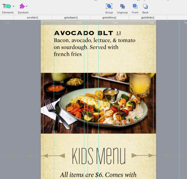
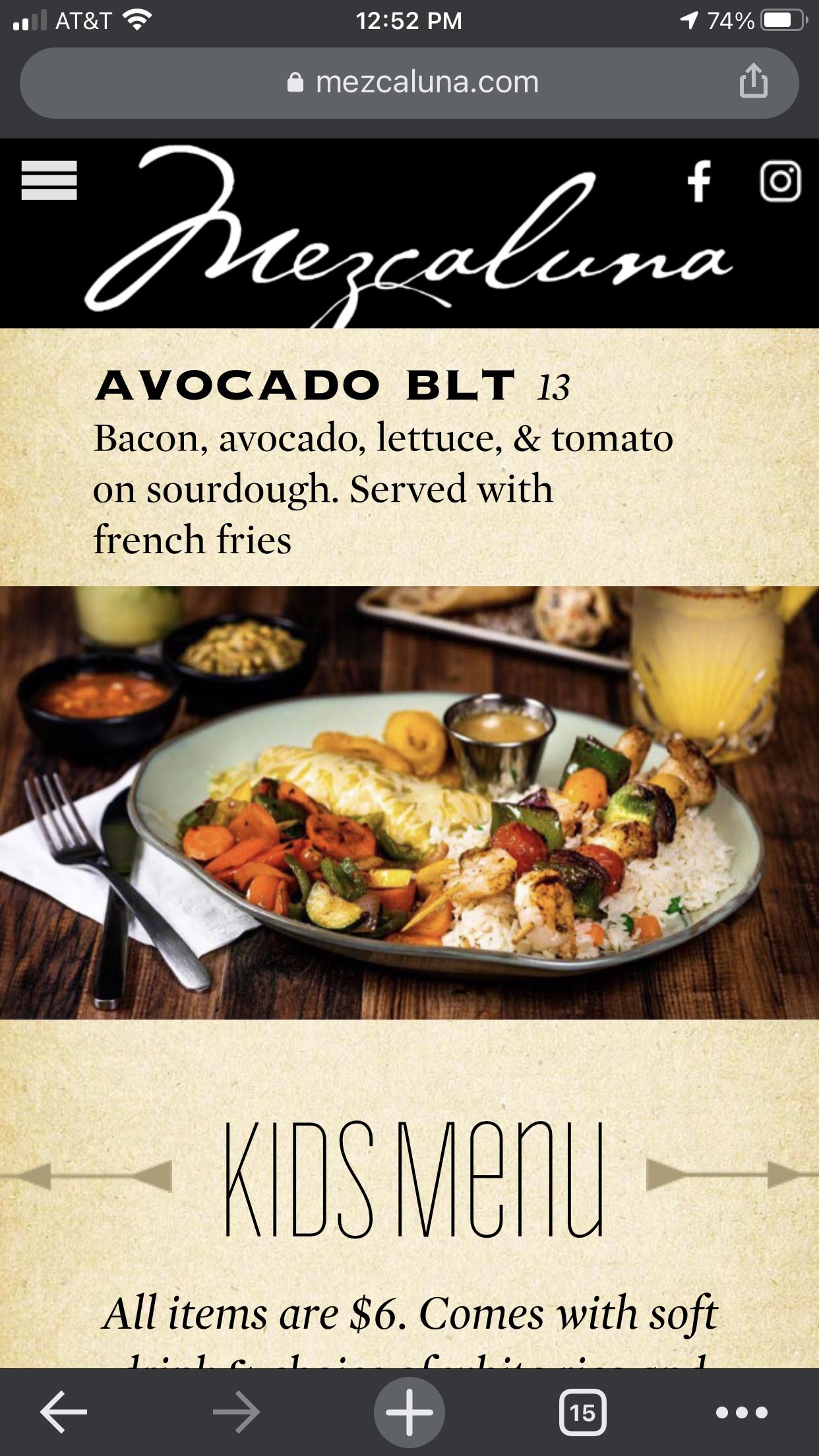
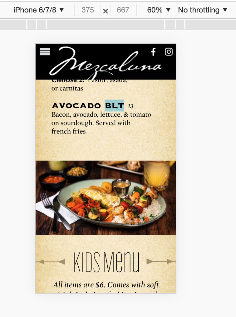
I'm having a spacing problem in one particular spot on mobile only. The spacing is working on the Chrome mobile preview, but on an actual iPhone, one image is behaving strangely.
I have had to add extra space between the image of the shrimp skewers and the Avocado BLT description to keep the text from overlapping the image. I've tried grouping things differently, saving the problematic image with a different name and replacing it in the Hype layout.
The page is live here: https://www.mezcaluna.com/menu.html
This issue is near the bottom of the page, just above the Kids Menu section.