I’ve tried everything inside the Hype and I can not get the same result. My layout does not behave with the referencing website.
I’ve attached my file. responsive.hype.zip (1.0 MB)
Hello Gustavo,
i just have checked the responsive layouts above and your website www.rfill.co !
Looks great!
Is it completely build with Hype?
The responsive fullscreen slider at the starting page works perfect!
I try to build such a fullscreen responsive slider in Hype but i can't manage the animation with a responsive scaling behavior. Either the animation is responsive and the images are distorted or the images are responsive and the animation is not scaling responsive.
I have tried to build this with scene transition. It works, but the animation its pretty much limited to the options of the scene transition presets.
I think i need a more flexible and universal solution in just one scene.
The slider from Gustavos website www.rfill.co must be made in one scene just with responsive group settings. Please check the right part of the layout with the text. This area is semi-transparent and moves over the man with the zebra head and are everything is scaling perfectly responsive.
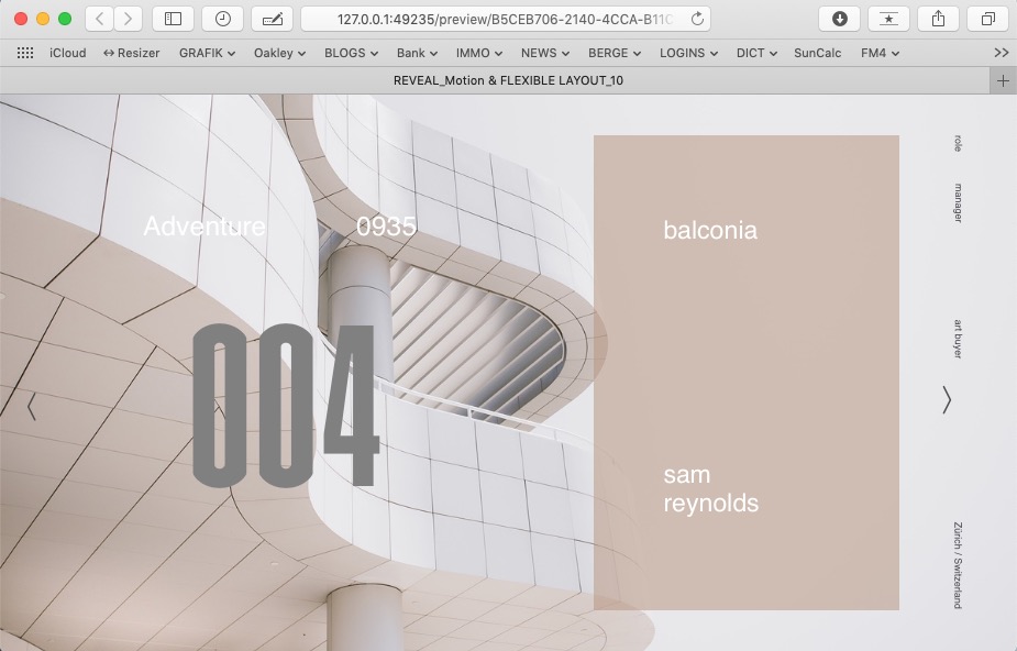
My project is a reveal motion animation that should be fully responsive, but i can't find the right responsive group settings. In my hype file are two scenes. A and B.
In Version A all Elements are responsive - but Animation is not. If you scale the browser window wider than page dimension of 1200 px the animation is too small and you see the part 1 underneath the element of part 2,3... If you make the window quite narrow the animation runs out of the window and don't end at the edge.
In Scene B. The animation is perfect responsive but all elements are getting stretched if you change browser window..
around some responsive settings every animation of Hype is based on absolut properties.
you're trying to achieve an animation based on relative (100% windowwidth) settings. It won't work.
This'll only be possible wrting some custom js, but according to your needs this approach will limit you too.
Sorry for the delay in responding. My website rfill.co is no longer made on Hype. I did it on Webflow. For website the webflow is much better. I use Hype only for animations now.
Hallo Hans,
many thanks for your feedback. Yes. Its build with Webflow. I was hoping that there is way to build it within Hype.
I know you are one of the most experienced Hype Users here in the Forum, and if you tell me its not possible - its not possible. I have to let go this effort.
I really like Hype and it is a bit disillusioning that its not possible, and Webflow can do this.
Whats the reason for that?
Maybe in the next Version 5.0?
( Is it a dreamy unrealistic wish to have a tool that can handle all this without coding skills? )
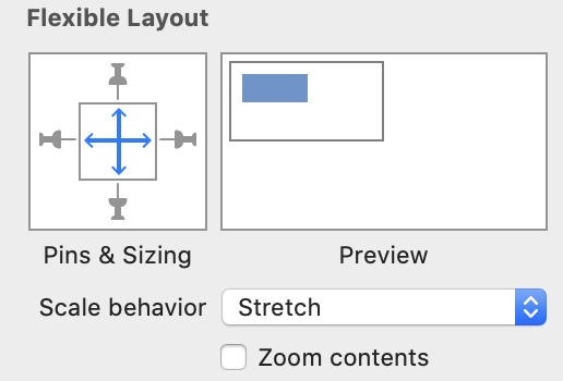
In the first scene, the groups that change their size have all pins turned on. Having pins on means that the flexible layout system will try to preserve margins, and so the amount of the above group remaining after the animation is basically the attempt at the flexible layout system to preserve your margin on the right.
The fix is to turn off the left/right/top/bottom pins for the group. This will keep the positions and scale all a relative percentage to the parent view (using multiplication), so a 0 width element stays at 0 width.
On the second scene, you have checked "zoom contents" which performs bitmap scaling on the group and all its children. Without a scale behavior to preserve proportionality it will get stretched.