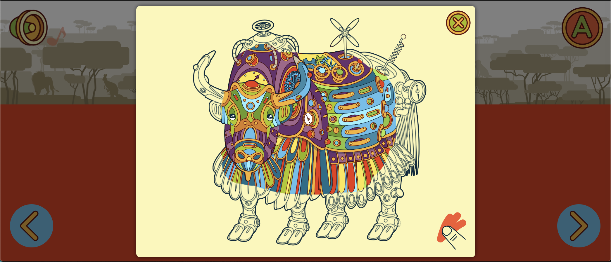
I have a scratch script that reveals an image as you “scratch” over it. The project I’m working on is 100% scalable, and it works up to a point. When the screen gets to small then I can only scratch a portion of the image.
The colored portion is as far as it can go. If the screen is slightly larger, then I can color the full image. So the script works responsively, just not on small screens, like phones.
This is the code:
var piece1 = hypeDocument.getElementById('outline_animal_Y');
var piece1lastPart = piece1.style.backgroundImage.split("/").pop();
var piece1lastPart = piece1lastPart.substring(0,piece1lastPart.length - 1);
var piece2 = hypeDocument.getElementById('top_animal_Y');
var piece2lastPart = piece2.style.backgroundImage.split("/").pop();
var piece2lastPart = piece2lastPart.substring(0,piece2lastPart.length - 1);
var TheContainer= hypeDocument.getElementById("Container_Y");
TheContainer.style.width=piece1.style.width;
TheContainer.style.height=piece1.style.height;

piece1lastPart = piece1lastPart.replace('"','');
piece2lastPart = piece2lastPart.replace('"','');
//MOVE ALONG//
			createScratchCard({
  'container':hypeDocument.getElementById("Container_Y"),
  'background':"${resourcesFolderName}/"+ piece2lastPart,
  'foreground':"${resourcesFolderName}/"+piece1lastPart,
   //STOP//
  //amount to be rubbed out before it gets fully revealed
  'percent':80,
  //finger thickness
  'thickness':55,
	"counter":"percent",
	"callback":"callback"

});
piece1.style.display = "none";
piece2.style.display = "none";
Any ideas on how to solve this? I could change the percentage before it’s fully revealed, have 50% instead of 80%, but I’d rather avoid that.
THANK YOU!