I have a responsive wordpress blog. I’m looking to embed a Hype animation in a blog post at 1170x500pixels.
Since my blog is responsive I would like the Hype animation to scale proportionatley with everything else on the blog.
I’ve tried using an iframe but at a fixed width this breaks the layout.
I’ve also tried using percentages for the width but I still get the same issue.
Please let me know what I need to do to achive the desired result.
Three difference layouts satisfy three screen breakpoints:
320 to 400px
400 to 1200px
and finally, 1200 and up.
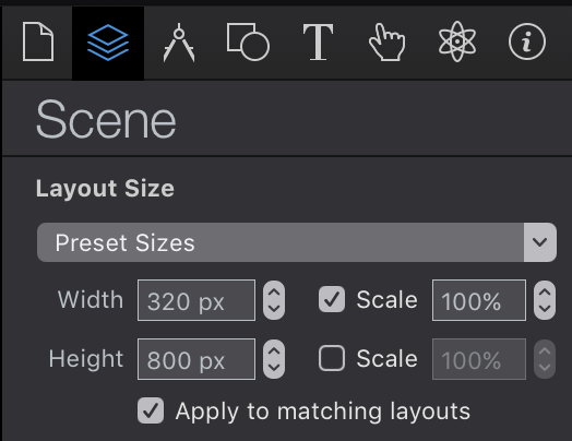
I also set Flexible Layout properties on the scene by checking the width / scale box in the document inspector:
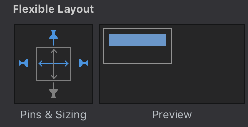
And on some elements I set width scaling so they reach the edges of the document:
There many ways to do this, but the one thing that will likely not work well without some additional work is scaling on the height dimension.
If your document scales up and down for mobile devices and desktop screens with the same layout, your text will likely not look right in the size you don’t design for --it will either be far too large or far too small.
It would be great to know what you’re building and what type of content you are working with if this solution doesn’t work well for you. I’m currently working on a video tutorial for this and I would like to find a way to create a tutorial that helps most people working on most types of documents if I can.
I have a funny feeling you are working on a comic book
Let’s say you have a 4 x 4 grid of a comic and each of the sections are images. In your mobile layout you would have a 2 x 2 grid which would allow the images to appear the correct size on smaller devices. Instead of seeing all of the content once, they would scroll to see the entire 16 frame panel. To answer your question, you could have the image scale up or down, but the real case you want to prepare for is mobile --> desktop. ‘Scaling’ is a nice thing to do between layouts, but not a solution for every screen size.
The responsive layout works when you shrink the browser window. Can you let me know how to hide the image of the woman when it moves outside of the width and height of the document?