Here are two versions of an interactive product demo of a hardwood shutter. The “Rotating Shutters Animation” has a high frame rate for greater precision. With this one, you can open and close the louvers automatically by clicking in the center or manually by dragging the edge-mounted tilt rods.
Rotating Shutters Animation.zip (2.9 MB)
https://www.hightail.com/download/cUJYYUlpeFVWRDljR05Vag
The second file, “RotatingShutterPanelTEST” was a low frame rate test. Rather than rotating the louvers, this rotates the panel with the louvers in five preset angles. Drag the ring to rotate (the circular arrow is not intuitive - if this were to be redone, this would be better labeled). It is huge - around 4.5 MB, so I would not use it unless it were below the fold and with something distracting above the fold to allow for loading time.
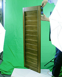
The higher frame rate version was done with green screen, using a bubble level app on the iPhone to keep it on axis. (See photo.) The one I am posting only opens and closes the louvers. I did shoot the whole package, though, including full Y rotation.
For the rotation, it was important to make sure that the rotation was consistent between frames (5º rotations in this case), so I created a protractor in Illustrator, tiled and printed it, then spray-glued it to some corrugate with a hole at the center. The panel has a hole at the top and bottom edge, which is used in manufacturing for suspending the panel when a finish is being applied. I placed a dowel in the bottom hole of the panel and plugged it into the hole in the protractor. (If I’d had access to the spray booth I would have set it up in the booth using the painting brackets, which would have been better than having to level every still.)
I would not recommend having so many photos in a Hype animation as it slows down the loading, but I’m not up enough to create JS controls for a video. I did minimize the size by using TinyPNG (free conversion online or as a paid PS plug-in). Also, once the masking was done, I determined the minimum width for the widest panel angle and trimmed all the frames to the same size. I could have saved more by trimming to a minimum space on every frame, but because of the way that perspective works, this would have caused shifts in the center points and I didn’t want to mess with horizontal alignment.
One thing I would love to do would be to create a grid of hot spots that would allow the user to drag up and down and in any direction so that they could open and close the louvers at the same time they are rotating the panel, but the load time would be impractical (12 louver X angles times 30 panel Y angles = 360 photos).