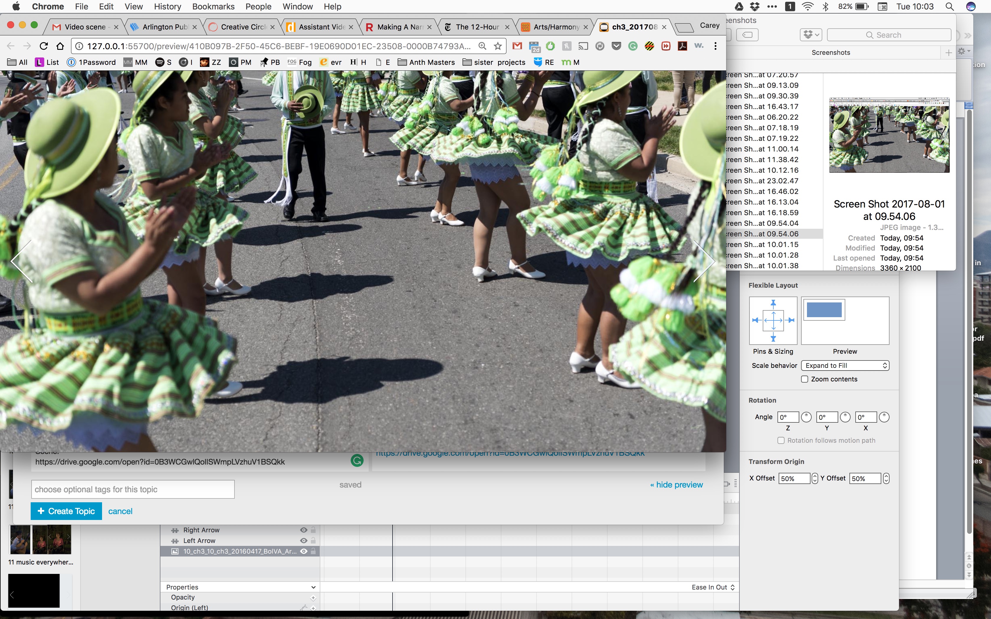
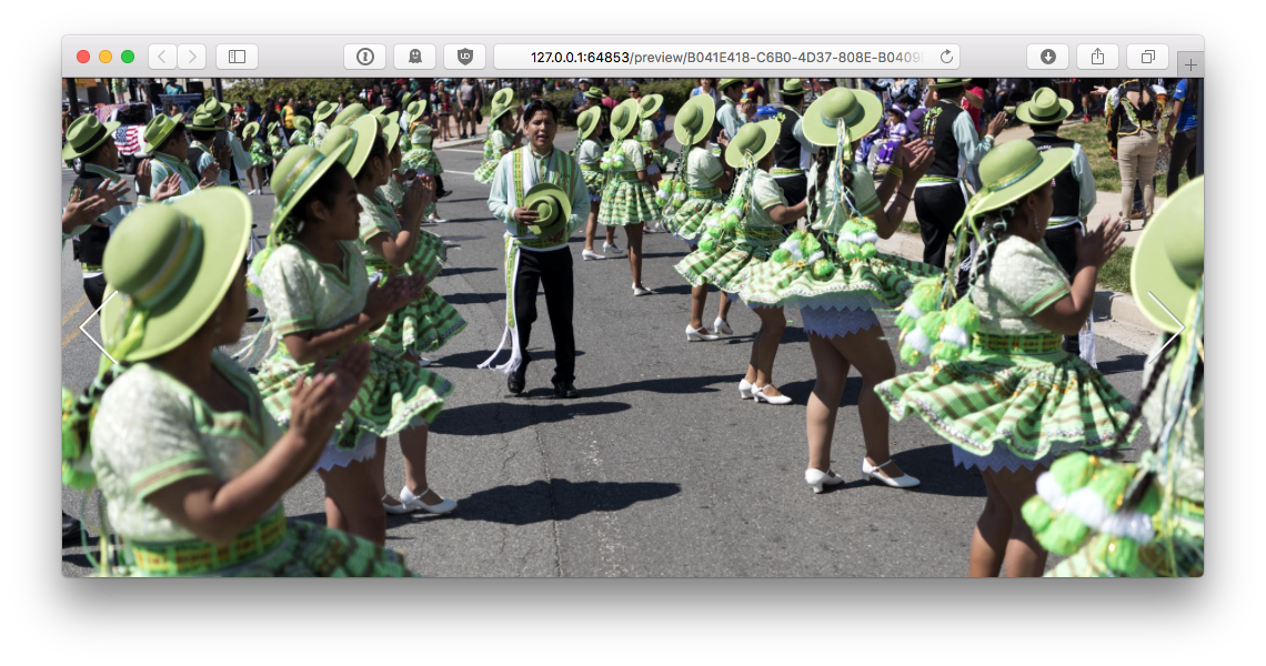
Hello! I don’t understand why I can’t adjust this photo so that it doesn’t cut off the center subject’s head. Can someone please help me?
Scene:
https://drive.google.com/open?id=0B3WCGwlQolISWmpLVzhuV1BSQkk

At different browser sizes:
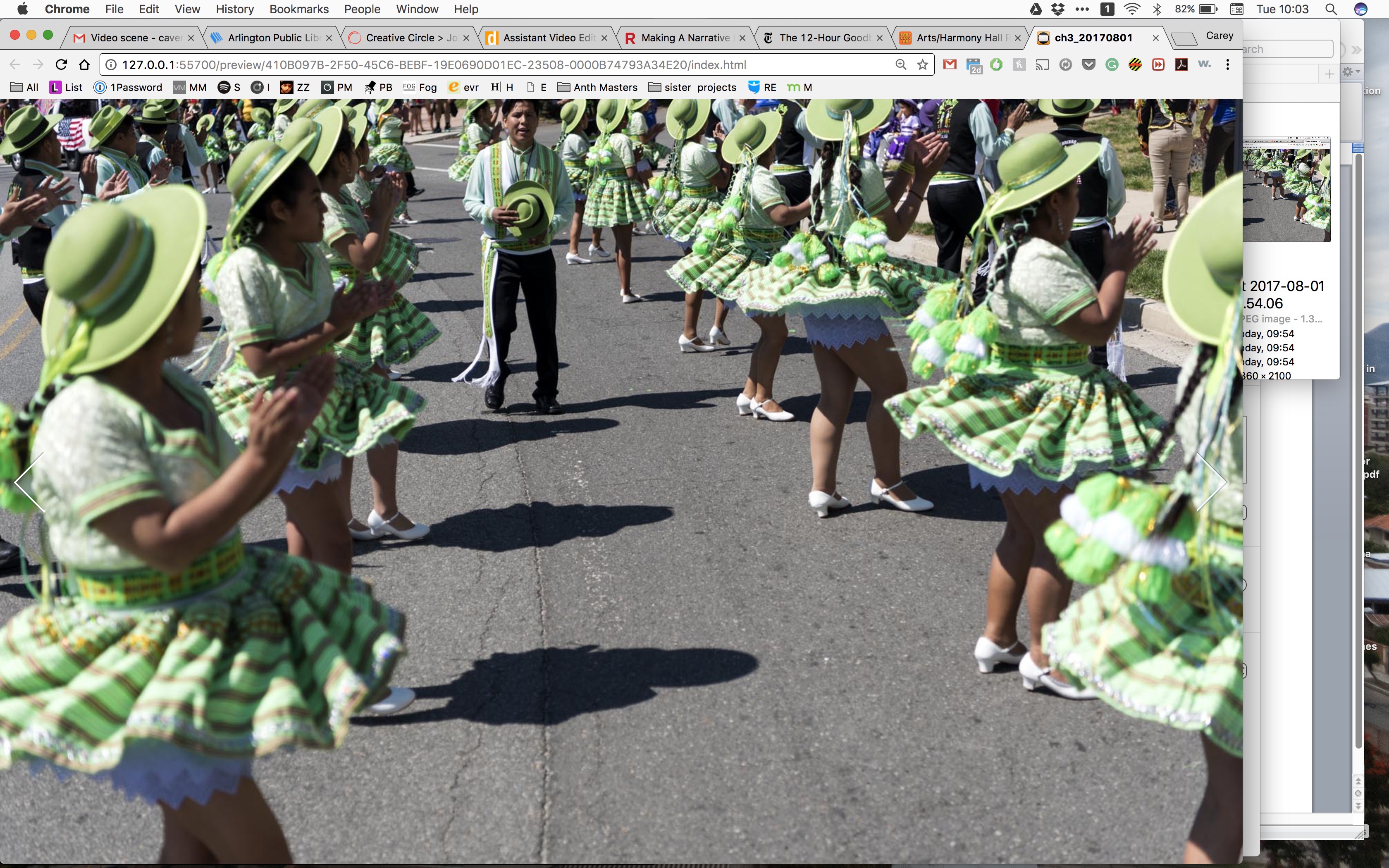
Hello! I don’t understand why I can’t adjust this photo so that it doesn’t cut off the center subject’s head. Can someone please help me?
Scene:
https://drive.google.com/open?id=0B3WCGwlQolISWmpLVzhuV1BSQkk
At different browser sizes:
These two options should work:
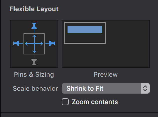
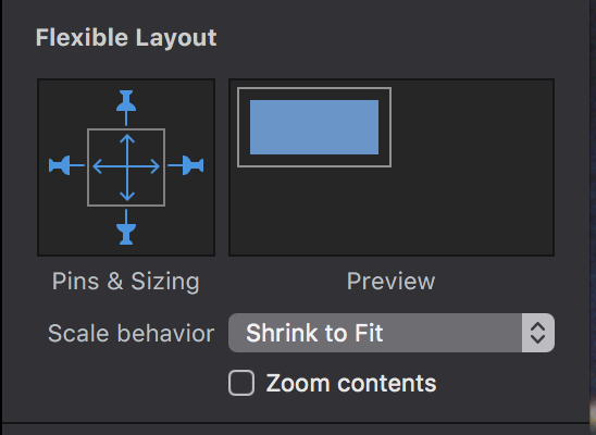
#1 would ensure that the top of the image is always the same distance from the top of the browser, and #2 would ‘shrink’ the image so that none of it is ever hidden.
Thanks Daniel! I have tried both of those and they don’t work. That’s why I’m so confused!
Here is the scene if you might be able to give it a look? https://drive.google.com/open?id=0B3WCGwlQolISWmpLVzhuV1BSQkk
Thanks!
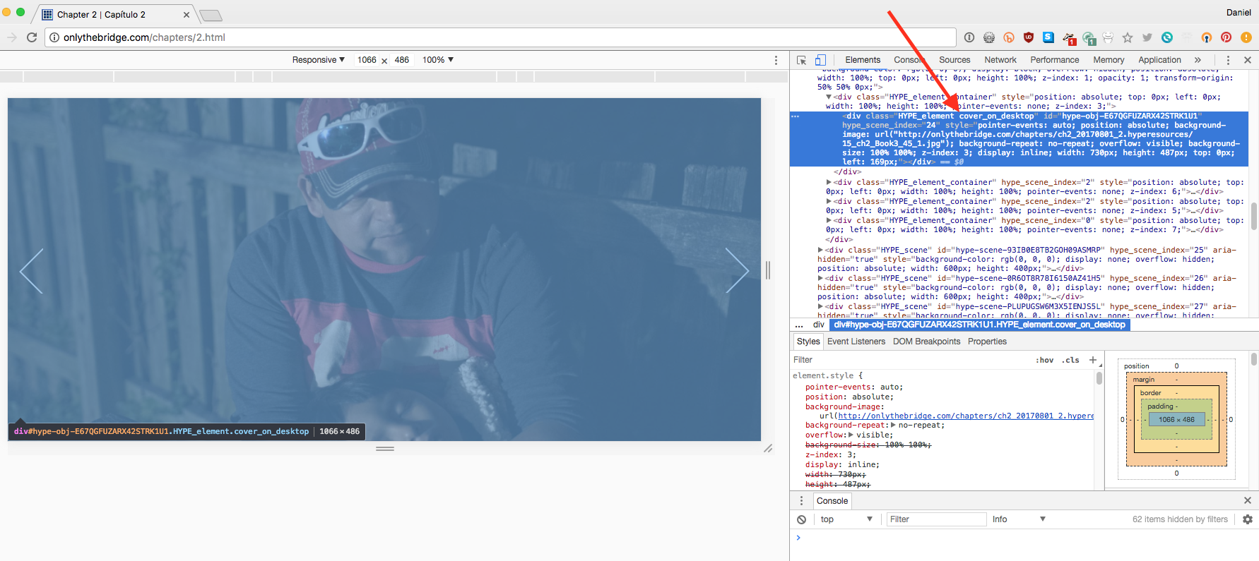
Did you see my link: https://cl.ly/0R3n0S1y3j1f ? In that example nothing is ever cut off, but there’s something odd going on when resizing the document since you have media queries set on the class cover_on_desktop which is applied to that image.
That css is cutting off your image:
.cover_on_desktop {
background-repeat: no-repeat;
background-position: center center;
-webkit-background-size: cover !important;
-moz-background-size: cover !important;
-o-background-size: cover !important;
background-size: cover !important;
height:100% !important;
width: 100% !important;
left: 0 !important;
top: 0 !important;
margin: 0 !important;
padding: 0 !important;
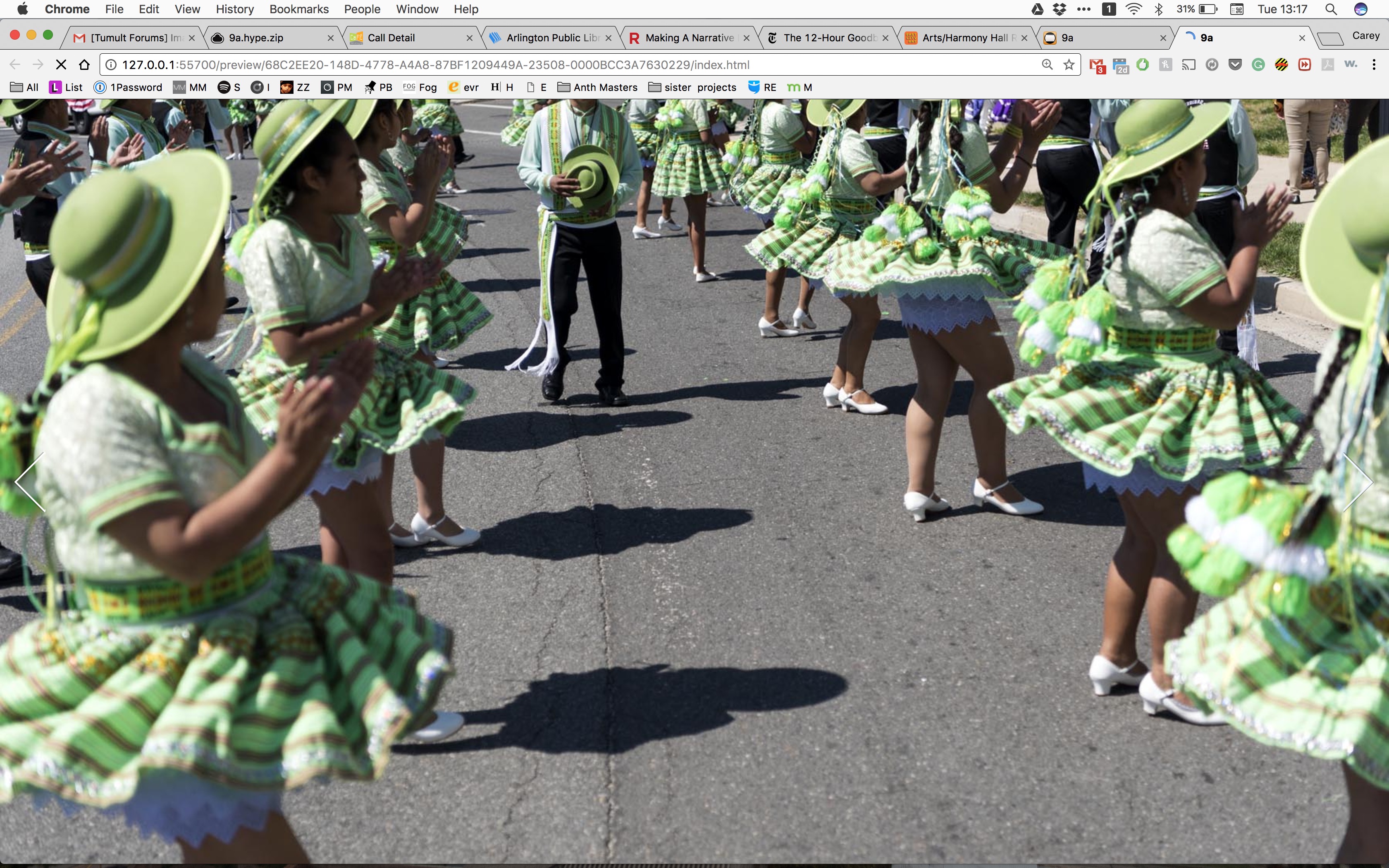
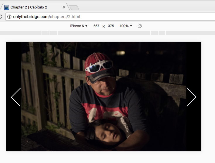
}Hi! I did see the doc and when my browser is full screen, it looks like the photo below.
Huh, I don’t know about that… should I remove “cover_on_desktop”? How would that affect all of the other scenes?
Thank you so much!
That CSS class in the Head of your document is overriding anything you do in the Flexible Layout inspector, so I recommend removing that .cover_on_desktop class from your image (it is set in the identity inspector) it unless you understand what it is doing.
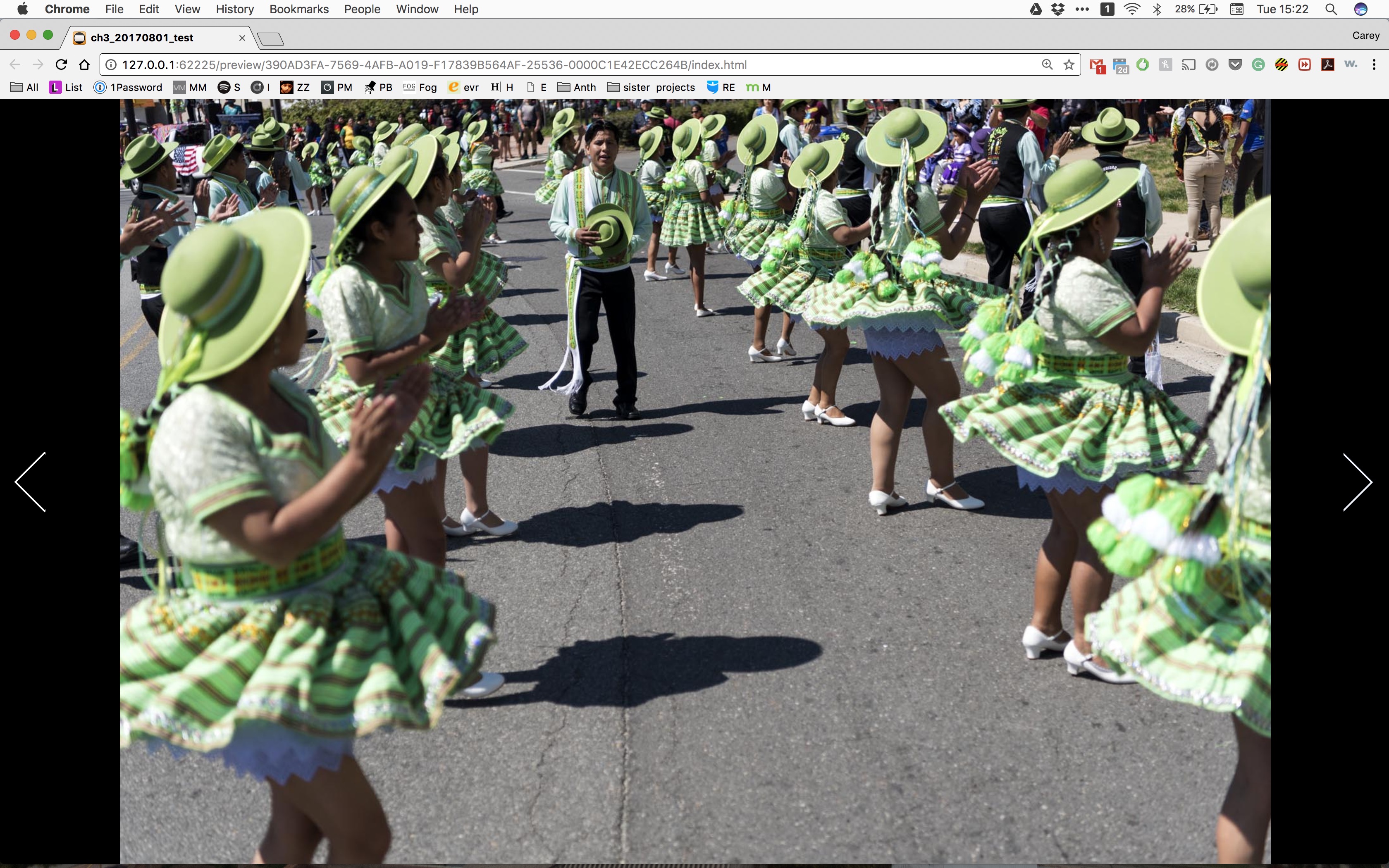
that css class appears to make it so that the photos take up the full browser. When I remove it - it looks like the below. So my question is how do I keep this scene (and 2 others) full browser and decide where it is getting cut off.
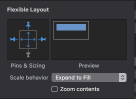
If you want something like this where only the bottom of the image can be cutoff:
Then you would use these settings, where the top pinning distance is unchangeable, but the bottom pin is unset:
(But do make sure you’ve removed the class from your image in the identity inspector first)
9b.zip (1.2 MB)
I understand now! Thank you so much!
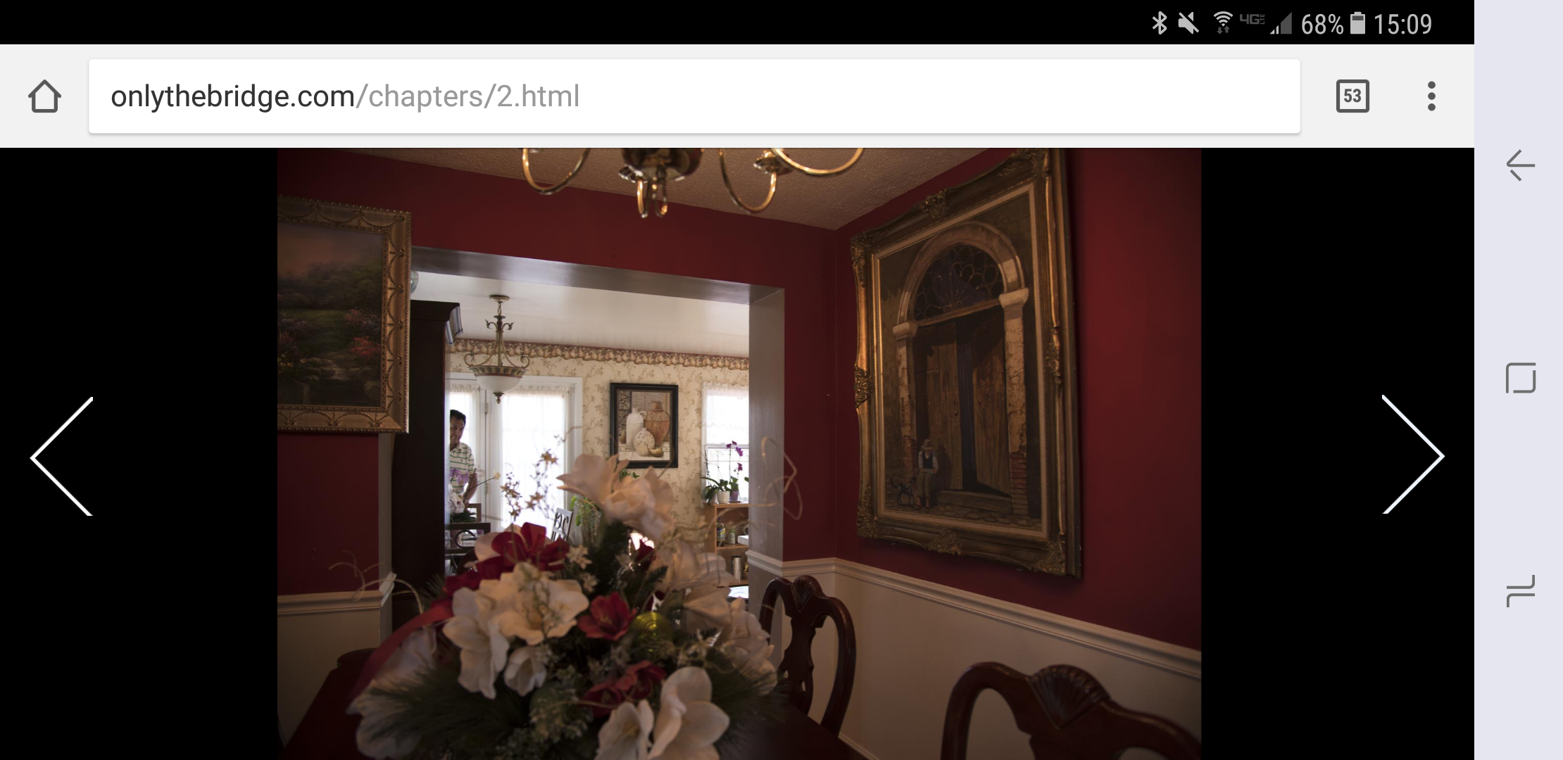
Hey Daniel ! I just realized something that is a major problem with this. By removing “`cover_on_desktop” and doing the above (which worked perfectly for computer browsers), it has overriden or undone something essential for cell phones:
if you go to www.onlythebridge.com and make your way to ch.2 from experience the documentary or start ch.1/ at the top of chapter 1 once you enter is a bar with the chapters, go to ch2 on the cell phone
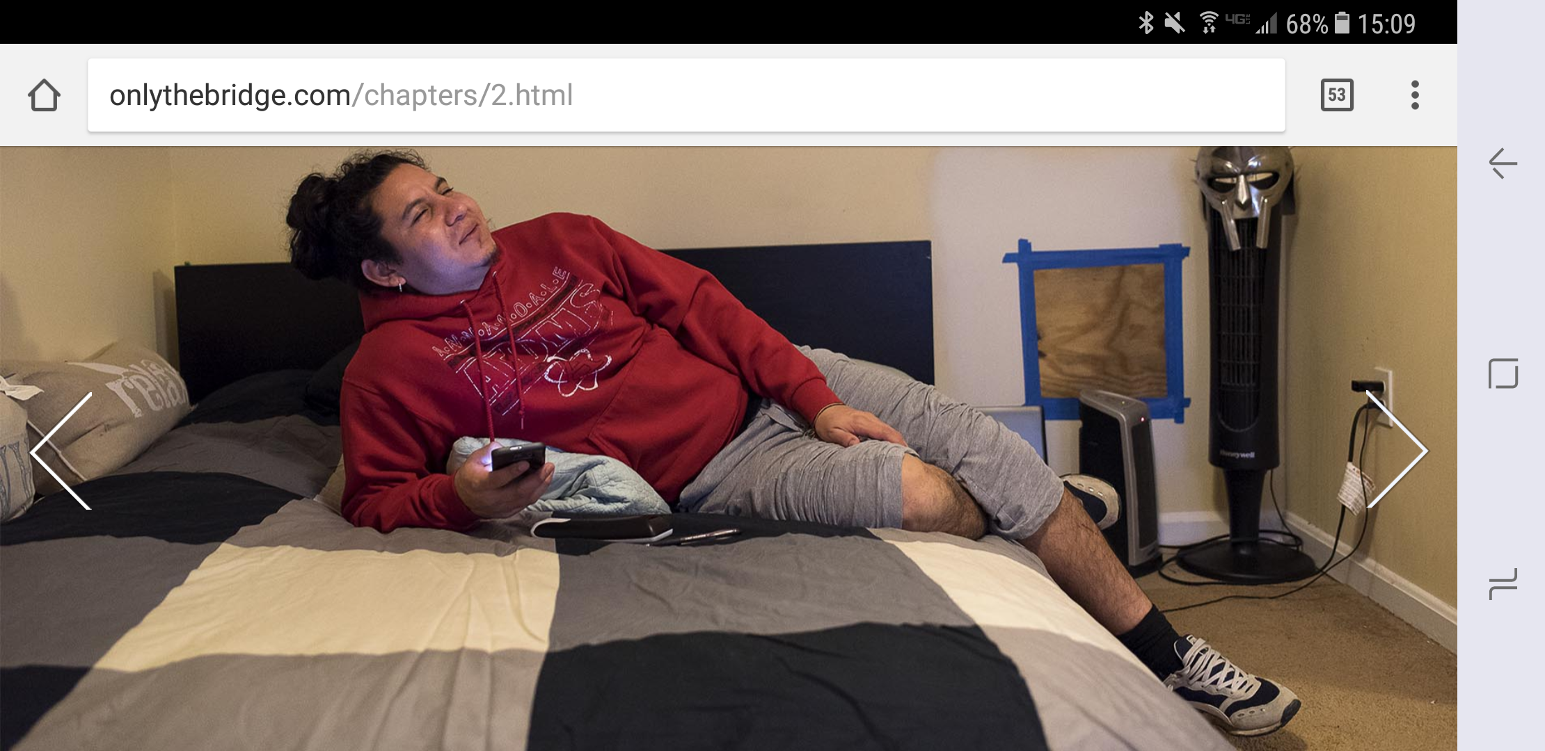
You’ll see in ch2 that the photos are meant to retain their dimensions with that black border. Any photo that is full screen is a photo that I adjusted with the above in this thread. So I need to be able to do what we did for desktops but retain this look with black sides and keeping the photo dimension on cell phones. How can I do that? is there something I can add to ignore this (what we did) on cell phones?
Thanks!
If you have an image in Hype which also has the class cover_on_desktop assigned to it, it will only apply to that image on layouts larger than 1024 pixels.
@media only screen and (min-width: 1024px) {
.cover_on_desktop {
	background-repeat: no-repeat;
	background-position: center center;
    -webkit-background-size: cover !important;
	-moz-background-size: cover !important;
	-o-background-size: cover !important;
	background-size: cover !important;
	height:100% !important;
	width: 100% !important;
	left: 0 !important;
	top: 0 !important;
	margin: 0 !important;
	padding: 0 !important;
	 }
.cover_on_desktop_video {
	height:100% !important;
	width: 100% !important;
	left: 0 !important;
	top: 0 !important;
	}
 }
On Phones, I'm seeing that images are not being cutoff.
Then when viewing that same page on a device with a width higher than 1024, the cover_on_desktop CSS is applying to the image:
I'm confused what YOU want to happen here, and when you want it to happen (on what viewport width).
If you like how the black sides look on the iPhone, where no part of the image is cutoff, you should remove the CSS.
What's happening is that your CSS is firing at 1024 on those images. This is overriding the flexible layout property you set on images in Hype. If you want to just manage images in Hype, remove that CSS. If you want to have that CSS occur only in certain device widths, adjust the number 1024. Having the desktop behavior where images expand to fit the available space (the top and bottom of the image always hit their edge but the right and left sides get cut off) is incompatible with the letterboxing you are seeing on smaller devices.
Ok, let me start from where you said I’m being confusing - what I want to happen here.
As I followed your instructions, the way it looks on layouts larger than 1024 pixels is how i want it to look on layouts larger than 1024 pixels.
On smaller than 1024 pixels (including cell phones), it needs to have the black borders on the sides. So, all of the photos that I removed the “cover_on_desktop” and adjusted as expand to fill + selected pin --> these images fill the whole screen on less than 1024 and don’t maintain the black borders and dimensions.
screenshots from my cellphone:
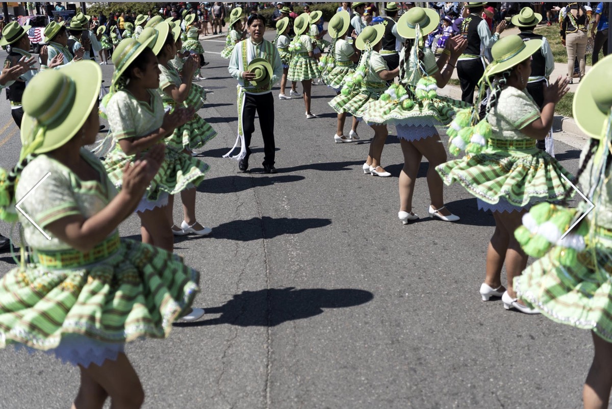
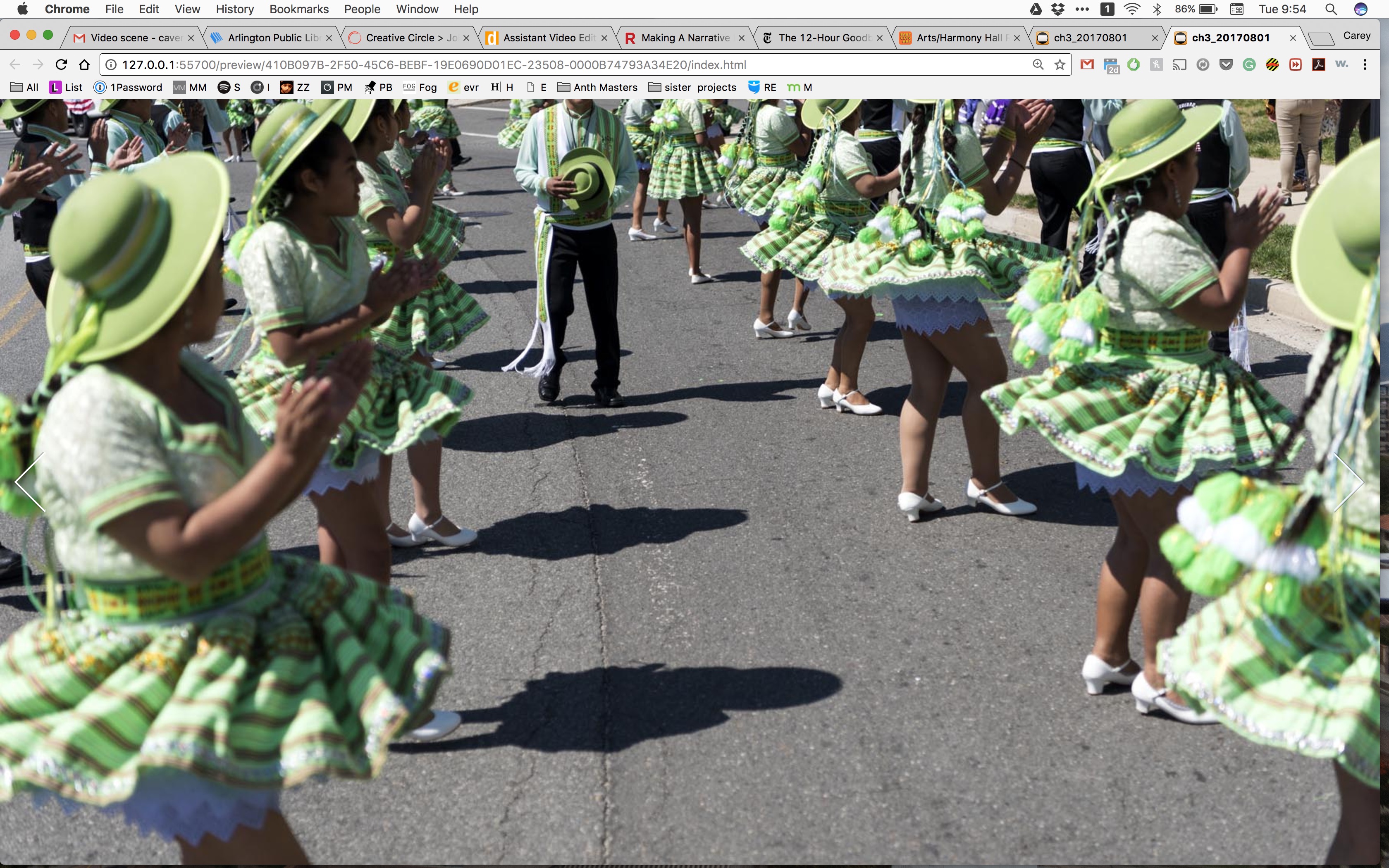
Image with cover on desktop (how all photos need to be)
image removing cover on desktop + pin I chose + expand to fill (to get it to look correct on larger than 1024)
Does that help? 
Thank you!
Both of these images have the same behavior: Their top and bottom are flush with the available space. Since they are different image ratios, they will appear different. If you were to crop the image of the man on the bed to be the same dimensions as the top image it will appear the same. So even thought you have the same settings on these two images, they will behave differently unless you crop them to be the same image ratio.
Hi Daniel
I previously in this project had coding for all of the images that was called {cover on desktop} which made all of the images behave as the first image and cover the full screen on screen sizes large enough to be laptops and computers. I have removed that on a few images, like the guy on the bed, to be able to control if the bottom or top is cut off in the crop on the full screen. What I need now is to maintain that behavior on the screens small enough to be cell phones etc and control this behavior on laptop/desktop screens. Does that make more sense?
Thank you!
Currently your media query turns on at widths over 1024 pixels:
So you would need to adjust that to match the minimum width you'd like to see the 'cover on desktop' css applied.
Or, you could use Hype's responsive layout and setup different layouts for your images and not use the CSS technique, but instead use Flexible Layouts.
You would also use .cover_on_desktop on all images by removing it from within the @media query. You would just remove the first and last line of this code snippet to have the class work for all dimensions:
@media only screen and (min-width: 1024px) {
.cover_on_desktop {
	background-repeat: no-repeat;
	background-position: center center;
    -webkit-background-size: cover !important;
	-moz-background-size: cover !important;
	-o-background-size: cover !important;
	background-size: cover !important;
	height:100% !important;
	width: 100% !important;
	left: 0 !important;
	top: 0 !important;
	margin: 0 !important;
	padding: 0 !important;
	 }
.cover_on_desktop_video {
	height:100% !important;
	width: 100% !important;
	left: 0 !important;
	top: 0 !important;
	}
 }