you may provide some file or link, but one thing i can say: my script was not made with an oam-file in mind. it should resize hypes div, but not an iFrame. so you may try some other solution …
There are 2 of the same hype animations. One with a div that sets the height, one with a div that sets the min-height.
.html5{ height:400px; }
.html5b{ min-height:400px; }
The min-height style does not appear at all.
I’ve attached 2 screenshots, one of the Hype page, so you can see how I’ve applied a style and one of the actual page, so you can see how they appear on the back-end.
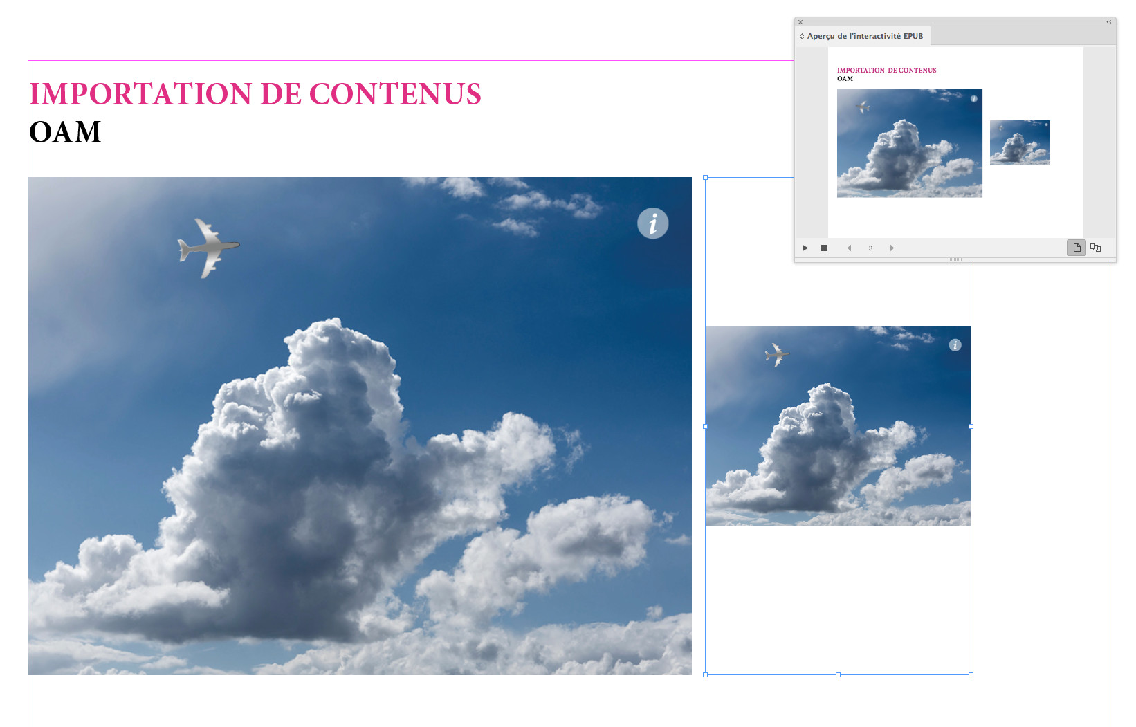
I have a multipage and responsive Hype animation and I export it as an OAM.
When I import the OAM in InDesign, it handles only the fist layout (iPad) but not the Phone layout despite the fact that I draw a portrait-oriented frame. Usually, InDesign handles well these different orientations with "straight-HTML” content but not with OAMs.
Can you share your source Hype file so I can test this out?
Was this something that previously worked as you expect in prior versions of Hype? Or have you worked with other OAM content that is more responsive than Hype exports?