Hi,
I’m working on a slide show in Hype, and the “next” and “previous” elements are positioned off the stage in Hype. The whole thing is responsive, so things get bigger or are anchored to various parts of the window. This problem really covers browsers and possibly larger tablets - phones have their own, special, scene.
In Hype, the layout looks like this.
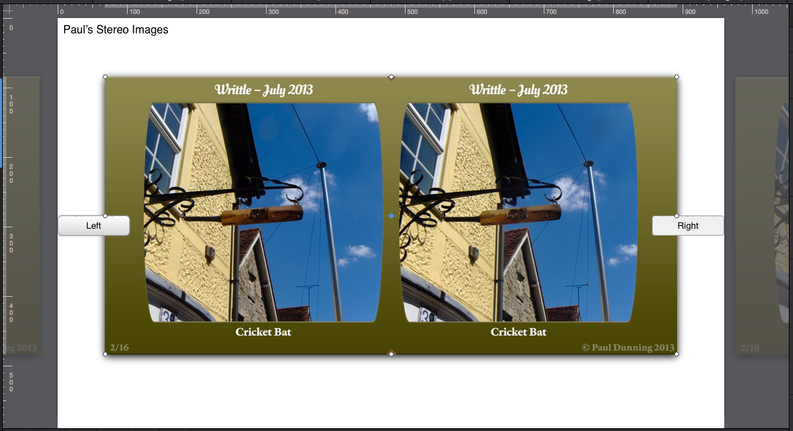
You’ll see that the “next” and “previous” images are either side of the main image (in the grey area), and are off the document.
However, in the browser, it looks like this:
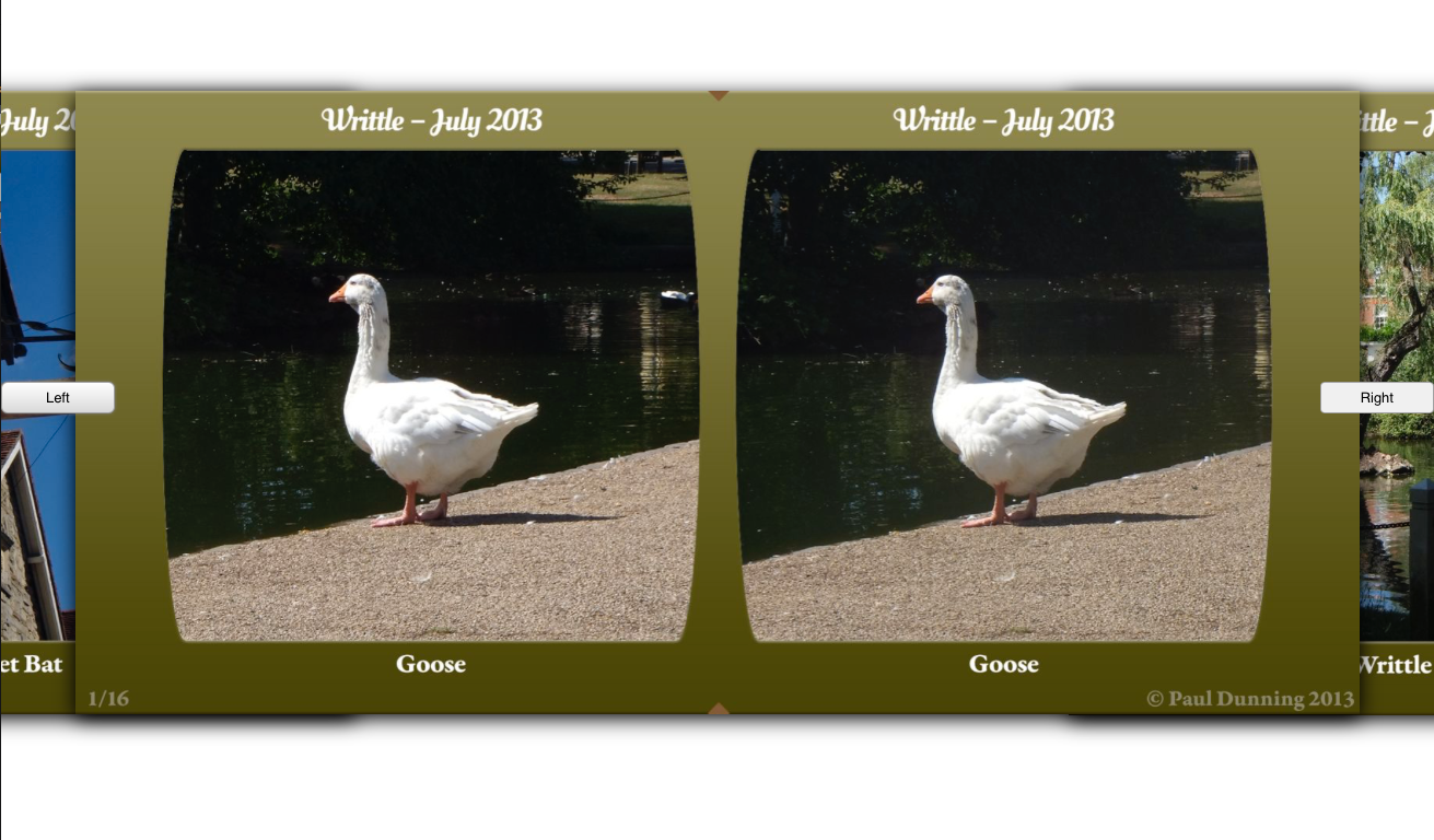
(That’s a parallel stereo image, if anyone is interested)
The “next” and “previous” images are visible in the window. If I reduce the window’s width, I get to the point where I get to see what I want.
As this is done with responsive design in mind, I was hoping that I could position these images using % instead of px, or position them using other edges (eg right instead of left) and get the same effect regardless of window size.
Any ideas how I can over come this?