Hype isn't exactly a page builder. You can build whole websites with it, but then you have to do the extra work. I made some templates that might help you...
https://photics.com/free-template-tuesday-35-tumult-hype-webpage/
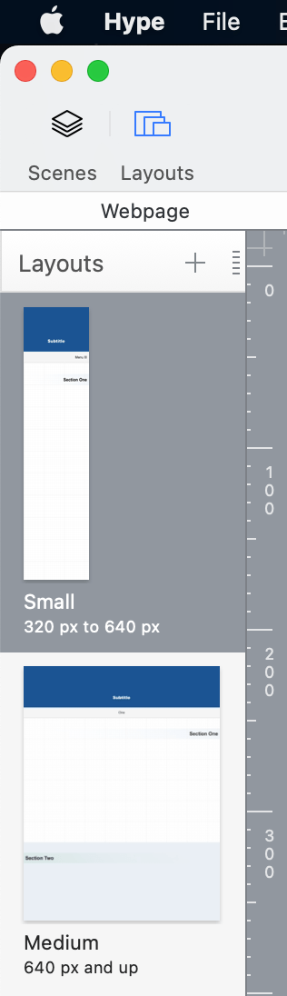
That template is an example of how to use "Layouts" to better manage different screen sizes.
Should Hype have this by default? That could be nice. I've been suggesting that there should be a Hype Marketplace, a place where beginners (or people without a lot of time) could get a pre-made template to jumpstart their project. That's because the design of a website can vary.
As an example of the challenge, what should be the values for the breakpoints? What's the standard? It depends. I like to use multiples of 320... 320, 640, 920, 1280 ...which covers a wide range of screens and devices.
- 320 — Small Mobile
- 640 — Medium Mobile
- 920 — Small Desktop
- 1280 — Medium Desktop
However, what if the viewer is using a screen that's in a "portrait" orientation?
That leads to another template...
https://photics.com/free-template-tuesday-36-tumult-hype-orientation/
The "Orientation" template changes the current Hype scene, based on portrait or landscape orientation. That uses JavaScript, which is where a lot of the fancy features can be created. (Although, if someone disables JavaScript on their browser, then this doesn't work.)
Basically, I treat Hype like a replacement for Flash. You're using WordPress, so you don't have to use Hype to build the whole webpage. It sounds like you only want to drop in Hype elements at specific locations on the page, such as a banner. There's a plugin for that...
A simple iFrame works too. That's what I do. The Hype project is set to expand to fit different screen sizes. Here's an example...
https://photics.com/games/circles-with-grandma/
...the game is basically a square, but the background expands to fill the available space. You can use the "Flexible Layout" option to achieve a similar effect.
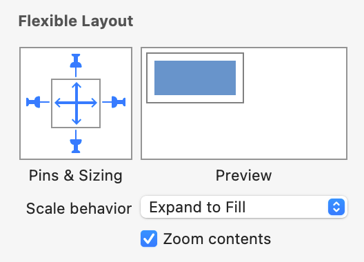
The background element can change size. That's why it's tricky to have a readymade Hype project — it depends on your content.
It's a lot of information for a beginner. But basically, Hype was designed to support mobile and desktop, it just takes a bit of work.