I'm a beginner here, still in the trial period. Is there any kind of default responsive behavior for simple pages developed in the Standard package or are they useable on the desktop only?
I'm using a Wordpress tool for my site, Thrive Themes Architect, which does have the ability to control the display of objects, including iframes, for the differerent screen sizes. Havn't had a chance to test it yet.
Thanks
Derm
Buteyko Plus™
Hype isn't exactly a page builder. You can build whole websites with it, but then you have to do the extra work. I made some templates that might help you...
https://photics.com/free-template-tuesday-35-tumult-hype-webpage/
That template is an example of how to use "Layouts" to better manage different screen sizes.
Should Hype have this by default? That could be nice. I've been suggesting that there should be a Hype Marketplace, a place where beginners (or people without a lot of time) could get a pre-made template to jumpstart their project. That's because the design of a website can vary.
As an example of the challenge, what should be the values for the breakpoints? What's the standard? It depends. I like to use multiples of 320... 320, 640, 920, 1280 ...which covers a wide range of screens and devices.
- 320 — Small Mobile
- 640 — Medium Mobile
- 920 — Small Desktop
- 1280 — Medium Desktop
However, what if the viewer is using a screen that's in a "portrait" orientation?
That leads to another template...
https://photics.com/free-template-tuesday-36-tumult-hype-orientation/
The "Orientation" template changes the current Hype scene, based on portrait or landscape orientation. That uses JavaScript, which is where a lot of the fancy features can be created. (Although, if someone disables JavaScript on their browser, then this doesn't work.)
Basically, I treat Hype like a replacement for Flash. You're using WordPress, so you don't have to use Hype to build the whole webpage. It sounds like you only want to drop in Hype elements at specific locations on the page, such as a banner. There's a plugin for that...
A simple iFrame works too. That's what I do. The Hype project is set to expand to fit different screen sizes. Here's an example...
https://photics.com/games/circles-with-grandma/
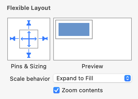
...the game is basically a square, but the background expands to fill the available space. You can use the "Flexible Layout" option to achieve a similar effect.

The background element can change size. That's why it's tricky to have a readymade Hype project — it depends on your content.
It's a lot of information for a beginner. But basically, Hype was designed to support mobile and desktop, it just takes a bit of work.
To specifically answer about Hype Standard -- it includes a Flexible Layout system, which allows elements to reposition based on the size of the page.
Hype Professional contains Responsive Layouts, allowing for entirely different layouts based on a "breakpoint" width where the changeover will occur.
Ah, I missed the capital "S". I thought the question was asking if there was a starting point template.
Regular Hype actually uses the word "Standard"... Tumult Hype — Compare Standard vs. Professional Editions
Duh, I even wrote about it in my book...
Another bonus to the Tumult Hype trial is the ability to test the different editions. The initial launch screen has an option to choose between the "Standard" and "Professional" editions.
The "Orientation" template is even more useful in that scenario. The article even says it...
If you didn’t splurge the extra $50 for Hype Pro, then this technique is even more useful.
I suppose the general idea of template could be expanded to add breakpoints too... but I prefer Hype Pro! That's because I like Physics and Symbols. Most of my Hype projects don't use Layouts/Breakpoints. I tend to make a 16:9 ratio scene, toss all the elements in a group, and then just scale the whole thing.
It's funny, I just figured that almost everyone went with Hype Pro. I suppose not everyone is as crazy about Physics as I am. ![]()
Thank you so much! This is very helpful.
Regards
Dermod
