Resize based on browser stretch

Hello. I was (am) an Adobe Muse user. Just found out about Hype. I’m trying out Hype Pro v3.6.7. The first impressions are great. However, I’m having a little trouble figuring out the responsive layouting for my content. The problem isn’t resizing my content to smaller screens. The problem is resizing it to bigger screens.

Adobe Muse had an excellent feature: Stretch to browser width. Basically, I used to design a web content at 1200px and Muse would resize the content proportionally to any higher resolution (like 1920px). Of course, for smaller resolutions like tablets and phones, I had to manually adjust the content, but, the stretch to browser width feature really caught a hold of me, thus, not allowing me to switch to any other app even though Adobe has decided to kill it.

Now, my problem with Hype is that, I was able to resize a SVG to any width. So, I got more excited seeing this feature. However, the excitement all got lost when I tried to add text below it.

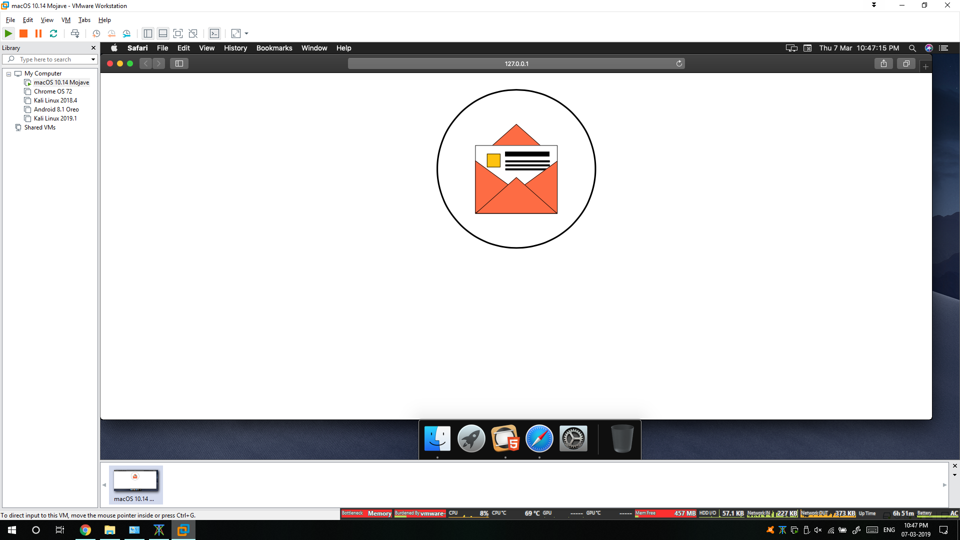
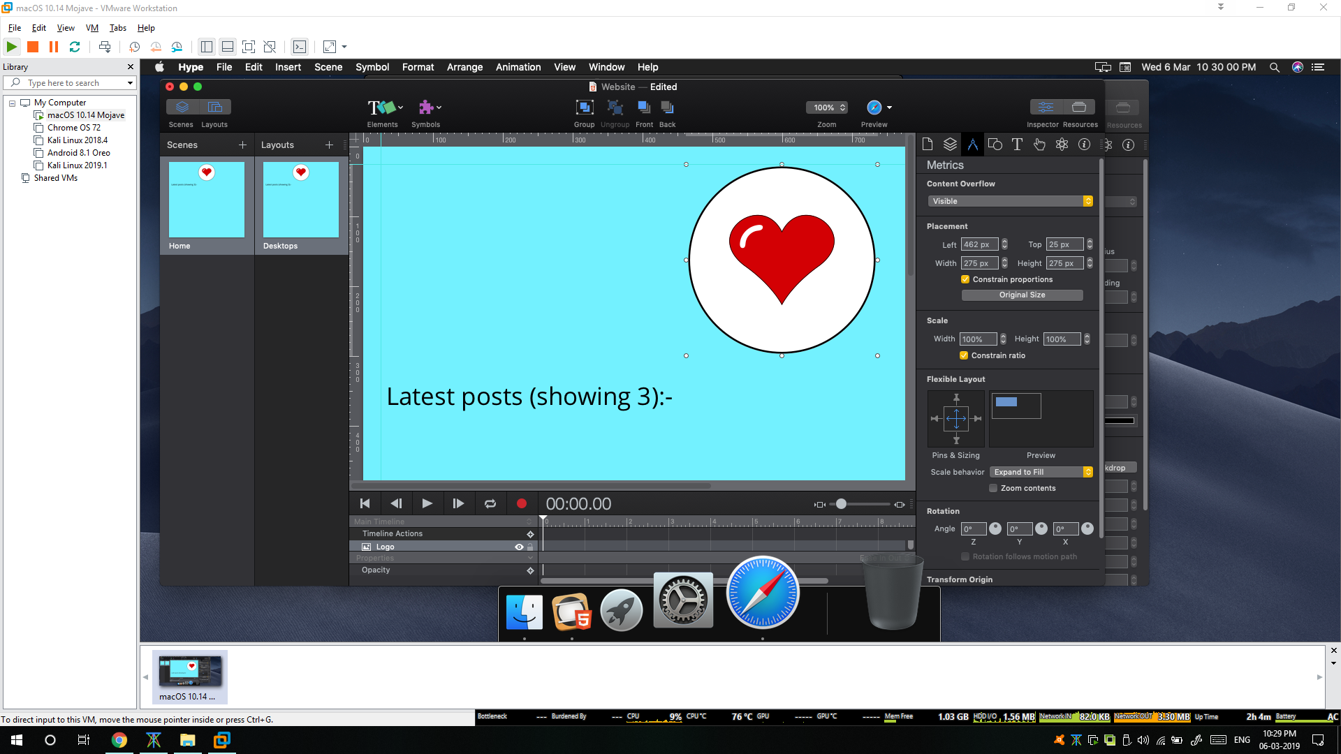
As of now, this is my design:

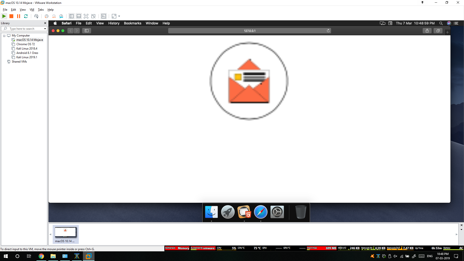
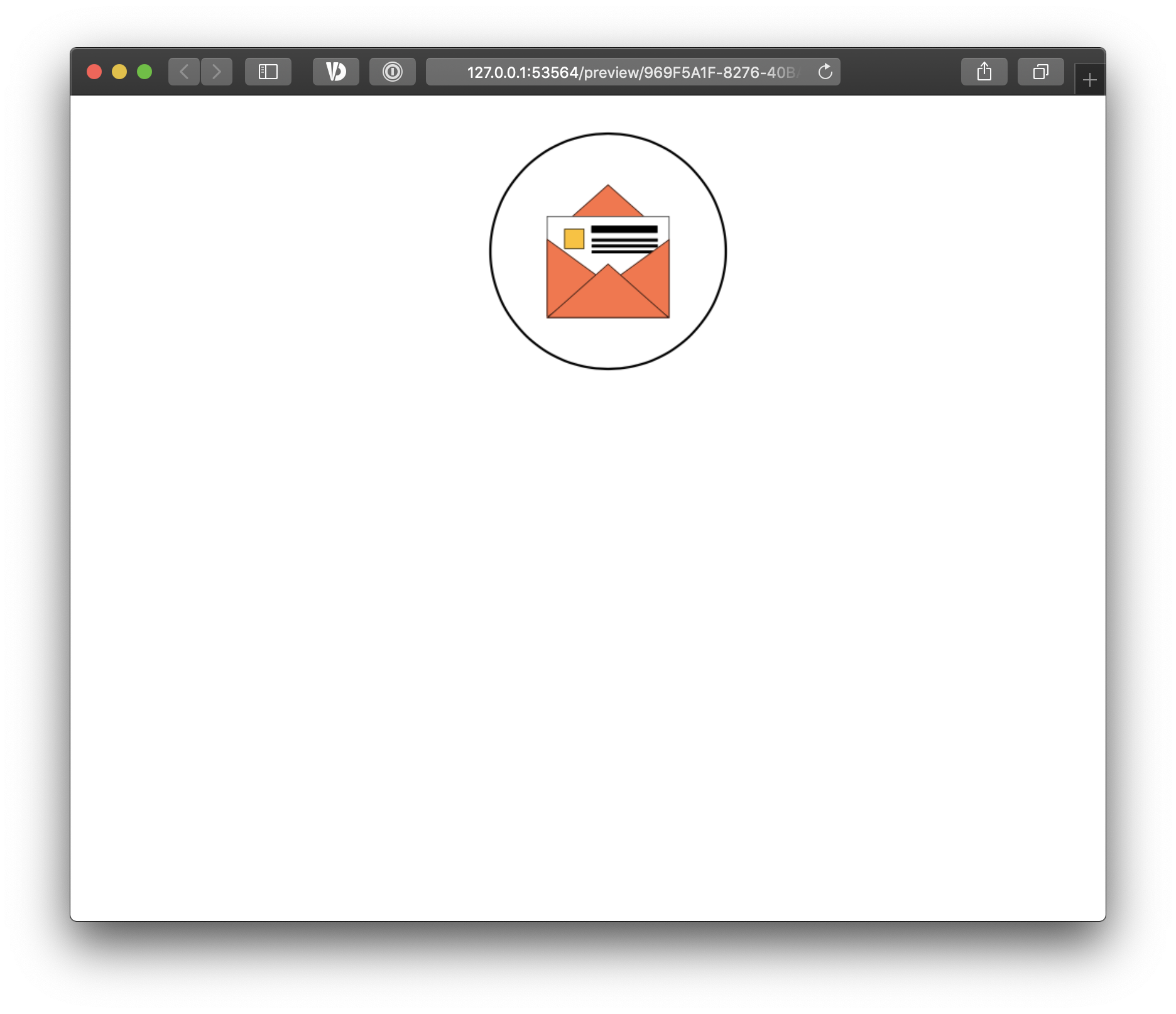
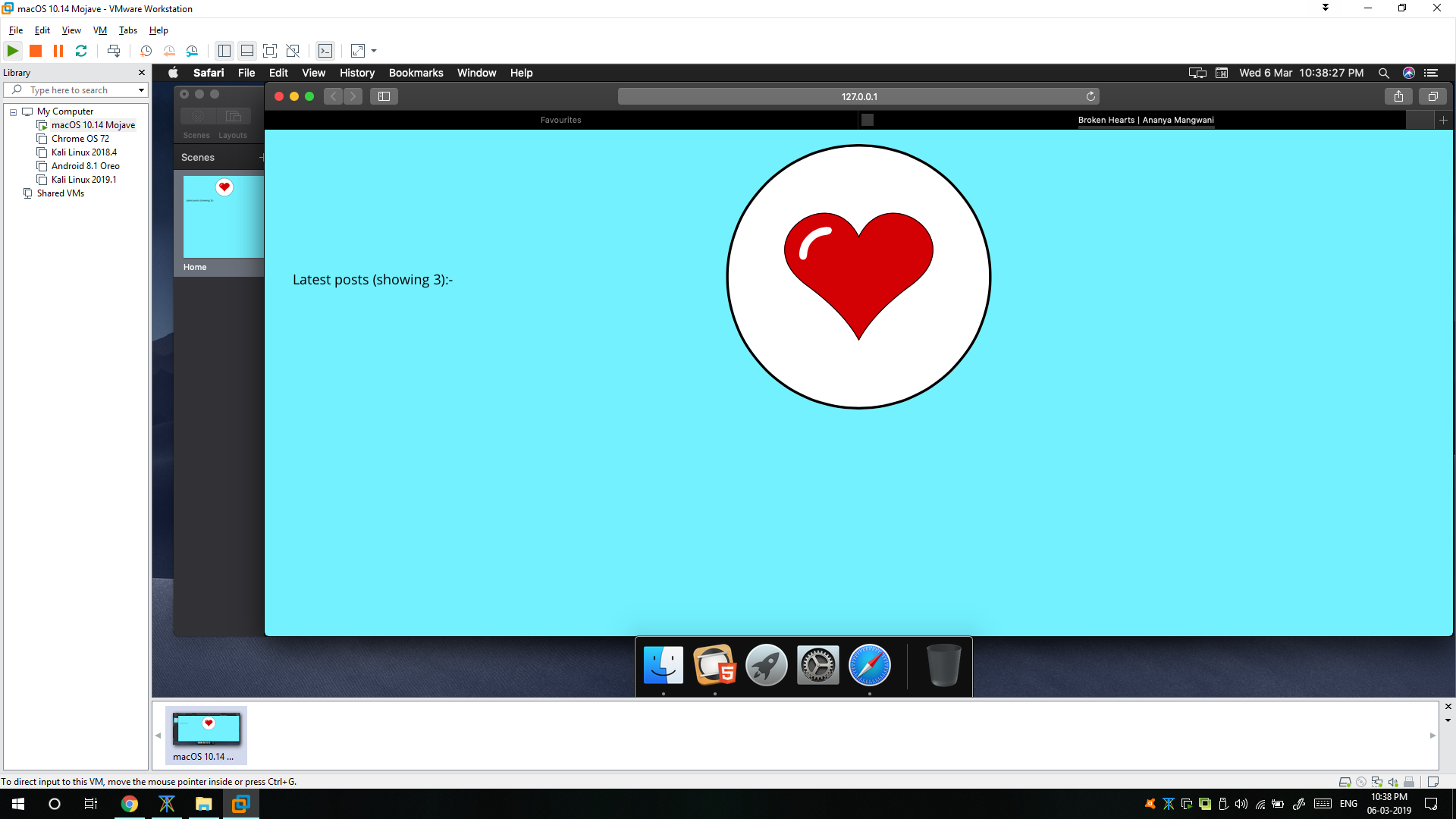
And the output in Safari preview is quite disturbing:

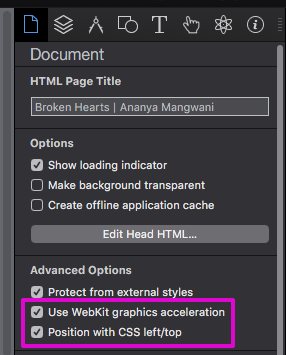
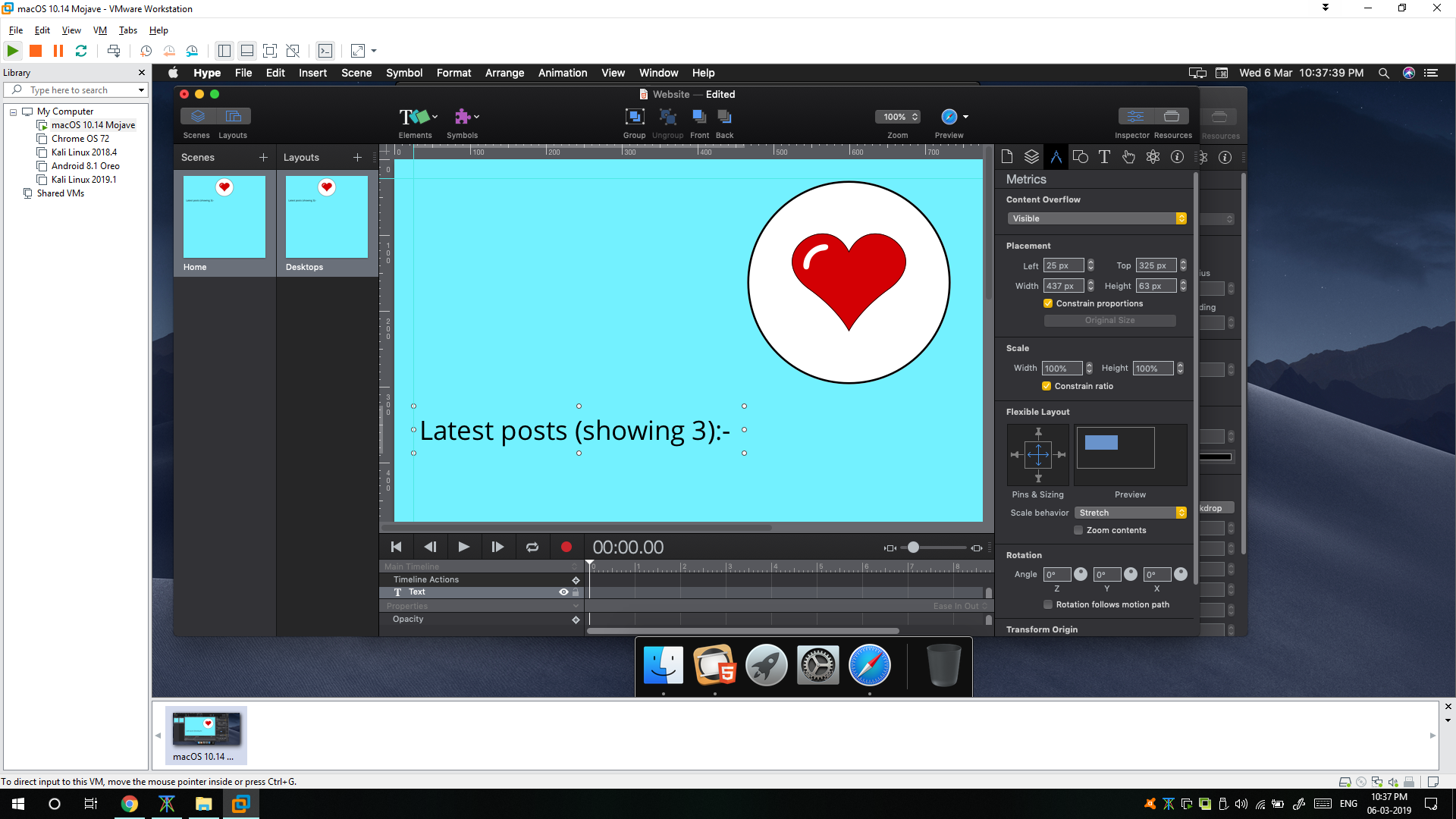
The stretch properties of text are here:

As you can see, the SVG resized just perfect. The text is what’s giving me problems. In Muse, the text’s size also used to grow according to browser’s width. This doesn’t seem the case in Hype (maybe, I can’t figure it out). Instead, it’s looking smaller and the because of the image growing larger, the position is changing. Like, the text is getting within image’s area.

I don’t really mind designing a breakpoint at 1920px, but, I was just thinking about even bigger resolution screens. I can’t keep designing for so many breakpoints. Thus, the stretch according to browser feature in Muse was great. It used to manage positions, aspect ratio, size, everything. So, the websites made in Muse were really responsive. I was wondering if I can get the same thing done in Hype.

1 Like

Welcome to Hype!

The way to set this up with multiple elements behaving the same way is to add them to a group, and set the properties to that group. Setting properties on objects individually can lead to odd behavior (which is sometimes what you want). But for your case, you’ll want to add these items to a group.

Setting ‘Zoom Contents’ + ‘Expand To Fill’ on the group will ensure both elements scale up and down based on the constraints and available space for that group. The Group’s boundaries set the edges of this relationship, so make sure they are either extending to the edges of the scene area, or you get the behavior that you want based on their size.

2 Likes

That’s for the quick reply. I tried what you said and it worked till some part.

However, this is a snap from Safari preview:

Basically, my content is getting blur and kinda pixelated.

This is what I’ve done:

Am I still doing something wrong?

1 Like

Can you share your .hype document as a zip file?

Archive.zip (23.5 KB)

In the “Document Inspector” I unchecked “Position with CSS left/top” and it took care of the blur~pixelation at increase sizes on your demo file. Unchecking “Use Webkit graphics acceleration” also worked. You do not need to uncheck both.

Pixelation%20issue

2 Likes

Thanks a lot, sir. That worked!!

2 Likes

Hello. Sorry for re-opening this. But, today, I tried adding a simple flip animation to the SVG image (y-axis rotate) and the image again got pixlated. Can this be fixed too?

If you can isolate the image in a hype document and share it (and also let us know what browser you’re testing in) that would be great.

I just tried creating a completely new document.

That’s how it looks without any animation:

That’s how it looks with animation:

I’m testing on Safari.

Here’s the document: Archive.zip (20.1 KB)

It is slightly fuzzy for me, but nowhere near as bad as yours:

This seems like a limitation in Safari, where an SVG in a parent element doesn’t stay sharp when the parent (in this case, the group) is scaled up. You can set the element to be on its own (not in a group) to workaround this:

Blur.hype.zip (67.9 KB)

There’s a few things I’d like to chime in about to help clarify:

  • Using 3D rotation changes the rendering mode such that when scaling up, it an element will scale as a bitmap
  • Using “zoom contents” will do a scale up, so it will look blurry as it has been scaled like a bitmap
  • So instead, you can not use zoom contents, and have the SVG scale relative to the group. I’ve attached this version:

Blur-fixed.hype.zip (21.8 KB)

  • The way “WebKit graphics acceleration” works is by doing a 3D rotation of 0 degrees. Hype tries to be smart about when to turn this off to avoid the blur effect, but sometimes we don’t do this. Hence manually unchecking can lead to sharper images that get re-rendered when scaling.
3 Likes

Thanks a lot for the information.

1 Like