Reducing the image area in bitmaps

One element of reducing the file size of a bitmapped item is to eliminate unused space surrounding the art. This tip is mentioned briefly elsewhere on the forum, but I thought I’d toss it in here, and with a bit more info. This is an old Photoshop trick.

JPGs contain data for every pixel, but not all pixels are treated the same. With a solid color, it encodes the color for the first pixel in that continuous color area, then specifies the repeats of that data. The more colors and the more complex, the larger the file.

PNGs are different, as every pixel (including transparent pixels) has equal data size. Removing the surrounding background in a PNG has greater impact than doing the same with a JPG. (See note below.)

To isolate the art from the background, do this:

Create your art on a transparent background. If you are going to output it as a JPG, create a layer beneath this for the background color. When your art is ready, get rid of unwanted layers, create a layers folder and drag in all the layers except for the background (if any). Duplicate the folder (giving yourself an easy way to back out if you mess up). Turn off the dupe, select the twin folder and hit cmd-e (or select merge down in the popup menu). This will merge the folder and its contents into a single layer.

Hit cmd-a to select all, then hold down the cmd key and hit the left arrow key. This will force Photoshop to isolate the actual pixel data from the rest of the canvas. Release the cmd key and, with the content still selected, hit the right arrow key to return the pixels to their original locations. Note that the “marching ants” selection perimeter will not provide an accurate read when faint shadows are involved.

With this still selected, go to the Image menu and select Crop. You have just gotten rid of the extra space. If you are happy with the result, delete the flattened layer and turn the backup folder back on. Save the file as Photoshop document (in case you ever need to edit it), then use File > Save For Web, and output it as desired – JPG or PNG 24 (for high-quality transparency).

If you seem to have too much empty space surrounding the art (as indicated by the distance from the “marching ants” selection area to the edges of the canvas), this is usually because of an extremely faint feathering of a shadow. To tighten it up further, toss the flattened layer, turn on the layers folder and go to the layer(s) with shadow(s), adjust the shadow (opacity, spread and blur) to tighten it up, then dupe the folder and isolate and crop as described above.

There are other ways to select and isolate the background (such as having a background with a fill, setting the magic wand to contiguous, zero tolerance, no antialiasing, and inverting the selection before cropping), but this is fastest.

This approach can be very important when you are splitting layers for a stacked bitmap animation. There are two directions you can go with this. To make things easy to align in Hype, isolate everything all together before cropping, then crop and output the separate layers. Smaller objects will be floating in a much larger area, but all layers will have the same XY coordinated and sizes. To conserve file size, split them into separate documents first, then isolate and crop the images. You would have to nudge them into alignment once they are in Hype, but the combined savings in file size would be worth it.

Note that shadows in Photoshop use transparency, whereas shadows in Hype use value. A burned-in shadow in an image will multiply against the background when placed in Hype, which looks better. If, however, the art is a rectangle and has no transparency, it is often better to save file size by outputting it as a JPG and using Hype to create the shadow.

–––––––––––

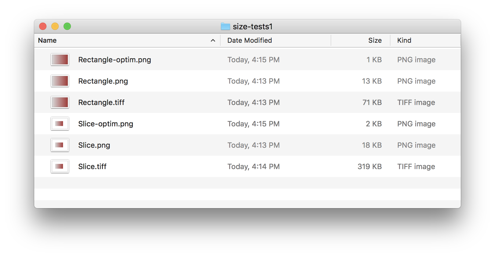
Note: Jonathan has noted that PNGs that have been processed through image optimization are different. Here’s an example – I took an 300 x 95 image, about half the area being transparent. Here are the differences in file sizes on output:

Photoshop - save as TIF, no compression: 115K
Photoshop - save as TIF, LZW compression: 57K
Photoshop - save as PNG, no compression: 115K
Photoshop - save as PNG, with compression: 37K
Photoshop – save for web, PMG 24: 33K
Photoshop - export via TinyPNG: 9K

I tried the same file, but doubled the canvas size. The optimized version via TinyPNG also comes out at 9K, because one of its processes is to automatically trims the pixels outside of the rectangle defined by the boundary of active pixels. Other image optimization apps will do the same.

The moral is twofold: that optimization is a very big deal

1 Like

This is great advice! Along with file size, the pure dimensions of an image can have a big impact on rendering performance and memory usage. Cropping unnecessary pixels away can even prevent crashes on iOS.

I don't want to derail from the main idea of the post, but here's a side note about PNGs:

PNG can use both scanline filtering and run-length encoding compression, so if you are using reasonable png creation software or optimization tools this isn't the case. Solid color/transparent areas of a PNG don't count much against the file size.

I made two images, one with a gradient (Rectangle at 169 × 105) and one with that same gradient and a big white border (Slice at 338 × 236). I made a raw TIFF version which is the bitmap data, a PNG export from Sketch, and then a PNG using ImageOptim. The rendered image is the same for all formats.

Due to the amount of pixels, the TIFF grew 4.5x but the basic PNG has some optimizations and only grew 1.4x.

The PNG is lossless and with a combination of ImageOptim techniques it is 0.7% the size of the raw TIFF bitmap data! The point being that depending on the content, sometime a PNG can be reduced in size very well and does not grow purely based on pixel dimensions.

2 Likes

I was talking about standard tools such as Photoshop’s “save for web”. When I run images through the optimizer plug-in, TinyPNG/TinyJPG (also available for processing in the cloud), it reduces the difference. (See the note appended to my original post.)

The practice I’ve always followed - which comes from a background in digital publishing, including a position at a high-end Chicago service bureau – and of the earlier days of the web when upgrading to a 14.4 modem was an impressive leap – is pretty simple. limit the physical dimensions and bit depth to no more than what you need.

It is common sense and something that all of us do, and that beginners learn early on.

If that need includes the requirement to easily align things on the XY by adding some empty pixels, no problem.

There are also exceptions in which one might add a few pixels of space to provide a more workable number. If, for example, an image is 300 x 94, enlarging the canvas by an extra 6 extra pixels to the canvas to bring it to 300 x 100. There have been times when I have done something stupid (like not checking the proportional scaling box in Hype) in which the width-to-height ratio was off by a hair - too little to notice visually – that a glance at the dimensions in the inspector would let me know I’d screwed up.

Designing for the Unexpected

Another codicil is that you never know what might come up in the future. There might be an instance when you need an image for print, when all you have is one that was designed for web. If you have a good sized PNG (which is lossless) and a plug-in such as Red Giant’s Photoshop plug-in Instant HD, that PNG might save the day.

Even so, I tend to work with images that are larger than I need, then output smaller sizes to cover the bases. I will do a fair amount of this using Illustrator – anything that might require vectors, such as logos. This included placing high resolution RGB images within clipping paths. The reason for this is that resizing is very easy, and it provides the option or either resizing strokes or maintaining their existing widths (this can be very helpful when you need small images that can be clearly read - the proportionately heavier stroke can make the difference.

I will will a page with various sizes and when it is time to produce the bitmapped version, I won’t export it as such from Illustrator, but will select the desired item and copy it, launch Photoshop and have it create a new file. It will detect the file size from the content clipboard and offer to create a document of that size. At that point you can alter the file to be created at whatever size you want. When you paste the vector into Photoshop, you can either place it as pixels and scale it as you wish before placement, or as a reference to the original file, retaining the vector data, so that if you alter the original in Illustrator, it will be reflected in Photoshop.

One example was the creation of a fancy 75th anniversary logo for a company - realistic metallics created in Photoshop, along with a sky and clouds with gradient, etc, plus all the vector content. I originally designed it for a log on a website. The next thing I knew, we needed versions for everything from a 10 foot banner to embroidery on a range of shirts, messenger bags and whatnot. (a range of sizes from 80 px tall to 8100 px (54 inches at 150).

As I had created it in AI with Photoshop content, and as I had started with a 12" tall file just-in-case it was very easy to modify. For the larger sizes, I still had all the bitmaps in PS and could use the Red Giant plug-in for scaling. By enlarging the logo in Illustrator and swapping the links to the rezed-up bitmaps, outputting was easy. I do this with vehicle wraps, etc., while using the other AI versions (with different strokes) for literature, web graphics and Hype animations.

1 Like