Goodmorning everyone!
I’m new on this forum, but I wanted to congratulate you for the community that has been created and especially for this wonderful program that is Tumult Hype!
I write to you because I need help, I can not understand the functioning of the pins and then the responsive on the various devices.
I am attaching a photo to make you understand the structure of the project:
I tried to bring this layout back into a Hype document, but I can not get it to work properly because the elements are moved incorrectly when resizing. For incorrectly I mean that the screen does not remain exactly half-divided when it is resized, and at the same time the texts move differently than the background.
I am attaching the example Hype file where I tried to report the structure. reference.zip (1.5 MB)
Can someone explain how I can achieve my project?
Or make me understand the correct functioning of the use of the pins?
I hope I have explained well my problem. Thank you so much for the help
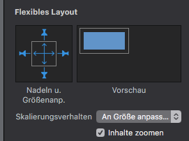
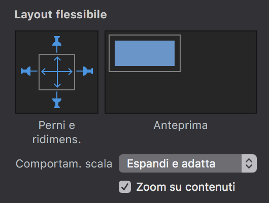
all you´ve to do is, put all together in one group-folder, pin to all sides, make the blue cross
and say: “Adjust size”, but activate - zoom content.
for me then it is working, deviding the screen in half on all screens.
Hello @samsara,
One technique to deal with complexe responsive layout is using grouping. When you group elements it actually create a div that contain the grouped elements.
The pin setting define how nested elements react against their parent groupe (for the top level groups their parent is the viewport).
So you need to create one group that contain your image and one groupe that contain your menu. You set the pin of the groups as described in the above reply then set the pin of your groups nested elements considering how they should react with respect to their group resizing
Hi @strmiska and @sa1 sa1 , thank for your awesome help.
I’m sorry for the late reply.
You have been really helpful as the project works perfectly.
Now I’m trying to make similar project but this time the layout is one page scroll.
I have grouped all the project elements in one group and added pins as the screenshot display (expand and fit- zoom on contents active)

It works well but there’s still one issue to solve:
If the document is opened with a larger screen than the project layout, it isn’t displayed until the end but it stucks at the height set in the project, cutting the last piece of layout.
Do you have a possible solution?
Thanks to all of you guys, it’s a really great community,
Greetings
Samsara
there´s a template for onSidePages. hope, this´ll help.
if you have specific problems, you should post your document
and describe your problem for further help. some people of the communtity are really geniuses
in hype, they´ll help you. OnePage_Scroll.zip (91,2 KB)