I'm trying to get rid of the bottom grey area that shows in mobile Safari, under certain conditions. See screenshot "web_app_fullscreen_NOT_OK".
Its a web app with a manifest, home screen bookmark icon, etc.
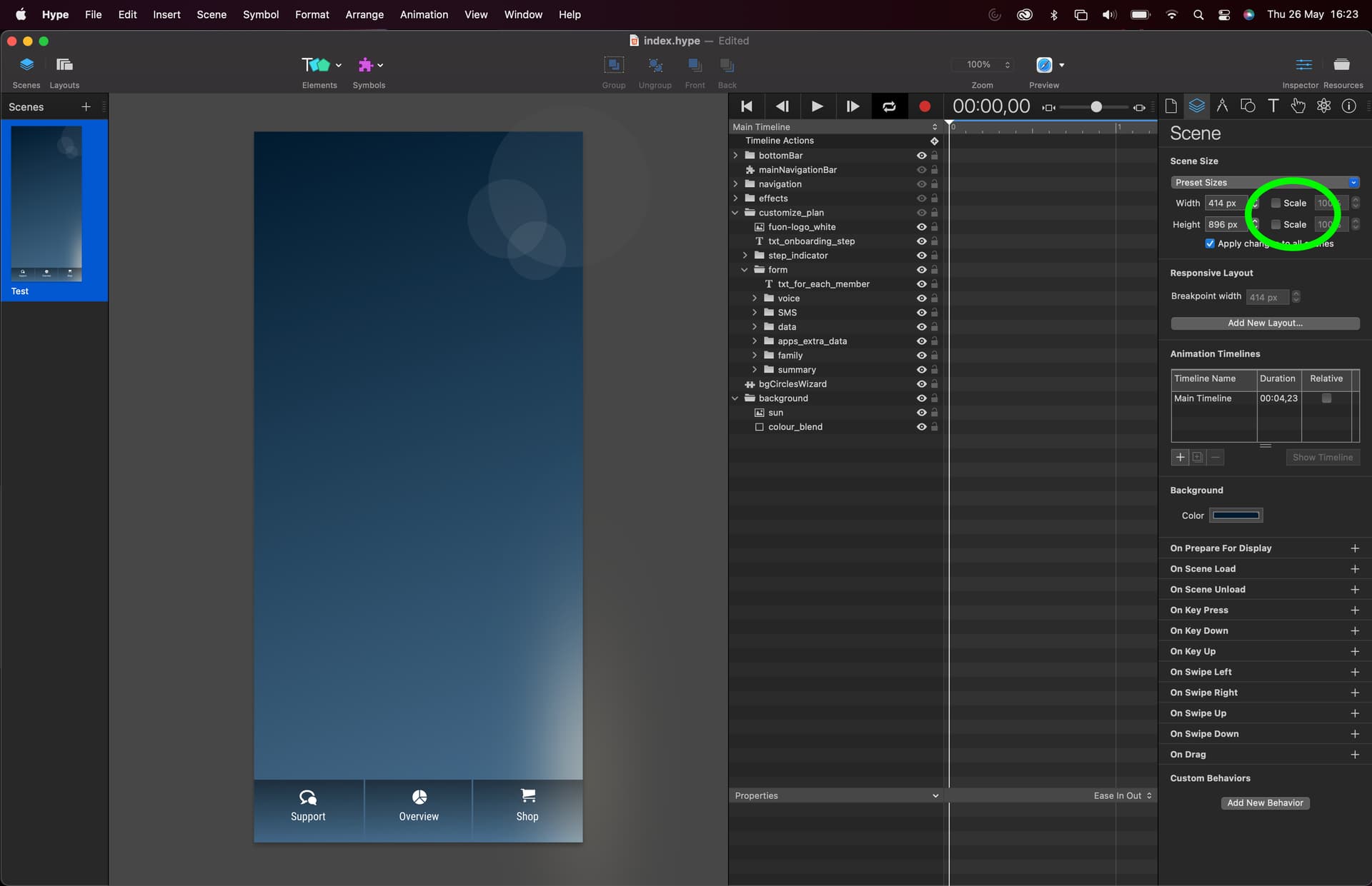
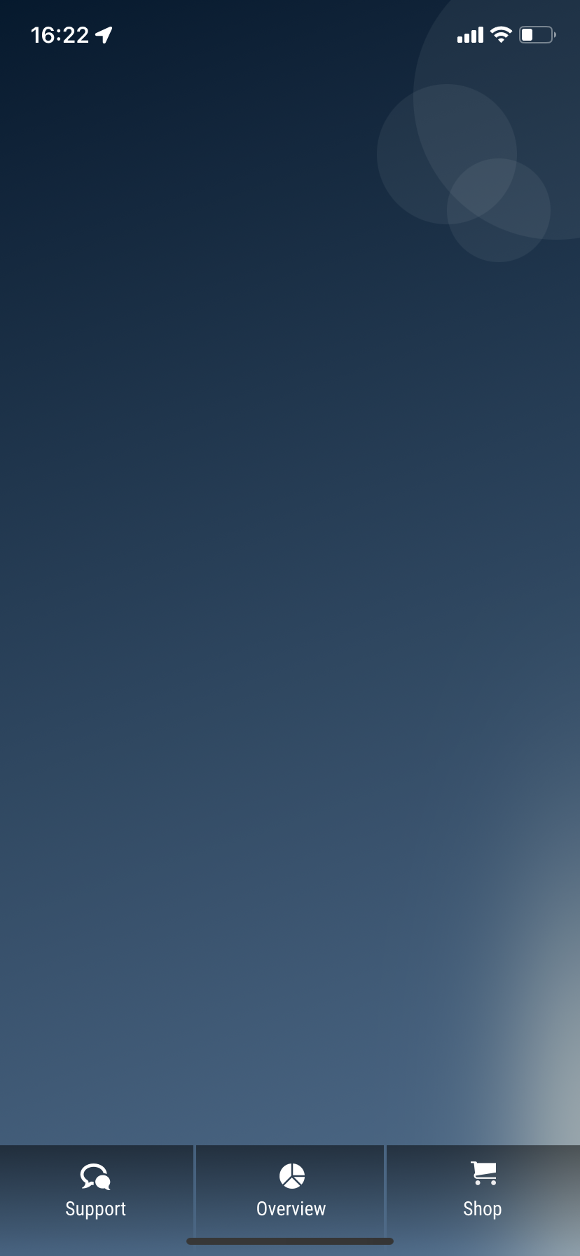
If the scene setting is without scale width, height – then it will be truly fullscreen on an iPhone 11 used for test, all fine. With the bottom bar line on top of the app. See screenshot "web_app_fullscreen_OK.png".
However, scale width, height must be on, in order to support different mobile screen size, using flexible layout settings etc. If I turn scaling ON, it will be like screenshot "web_app_fullscreen_NOT_OK".
Header tags
Have tried numerous combination of width=device-width, width=414, width not set, etc. The result has been the same with all combinations.
TestAppManifest.json
{
"short_name": "TestApp",
"name": "TestApp",
"lang": "en",
"description": "Test",
"icons": [
{
"src": "images/icon-192x192.png",
"type": "image/png",
"sizes": "192x192"
},
{
"src": "images/icon-512x512.png",
"type": "image/png",
"sizes": "512x512"
}
],
"background_color": "#242424",
"theme_color": "#242424",
"display": "fullscreen",
"orientation": "portrait"
}
Anyone with hints on how to solve this?

Scaling off, OK
Scale settings