Hi all,
Brand new here.
Making a website for a wedding company and they want a testimonials page. I essentially need a smooth slideshow where the testimonial flies in from the right, stays for about 10-14 secs, and flies off to the left, being replaced by the next one. Also, I will need small buttons so users can navigate to and from previous testimonials.
How can I achieve this in Hype?
So far I have one testimonial ‘card’, and I’ve created a simple 1.5 sec animation where it flies in from the right, from 30% opacity to 100%. looks good.
Just need help implementing multiple ‘cards’ and buttons.
Thanks,
Jack
This is essentially a horizontally scrolling slideshow. There are many examples out there. The easiest way is to create a Hype document of the desired size, create a scene with the first testimonial, create buttons for previous and next scenes and duplicate the scene once for each testimonial, then edit them as desired. Set the buttons to trigger a jump to the next or previous scene and use a right or left. push transition.
Note that if you want and endless two-directional loop you would have to add a couple of things. Ask if you need more info.
Thanks very much. Did exactly as you said and it looks great.
I’ve managed to get it working with Freeway Pro, in that it shows up when i view the site in my browser,
only problem now is the hype animation appears to be hugging the left hand side of the screen.
how can i align to the centre of the page?
thanks,
jack
Also, when I use responsive layout in Hype and set the width to relevant percentages, I encounter all sorts of problems when viewing the page.
Right now its set to a fixed 1000px in width, and obviously remains that width when resizing the window.
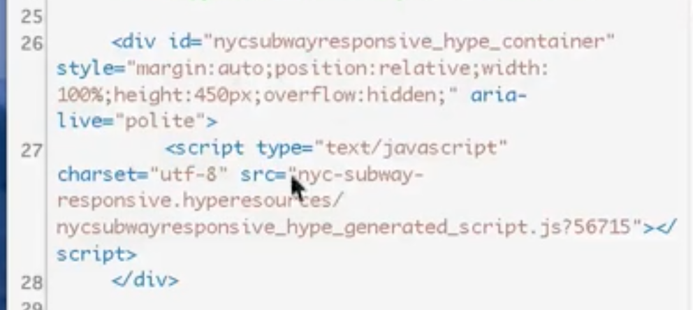
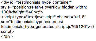
The workflow for creating a responsive document for a Wordpress theme is pretty similar: you’ll want to create a document with a responsive width, but not a responsive height:
In that example, with code for embedding the document has a responsive width, but fixed height shown at 6:48:
As long as the object in Freeway is set to respond to the browser width, this flow should work for you as well. If not, can you share your Hype document and Freeway project?
The code you posted seems right, but make sure this is the result of setting up Flexible Layout and Responsive Layout in Hype, not just editing the embed code.
BTW you can click this icon when code is selected to format it:
To set the automatic position and dimensions of a container, go to the Scenes inspector and click on the Scale checkbox next to the Width setting. Go to the Metrics inspector, select an item and you will see that the pins in the Flexible Layout section are now active. You can control the position of things by enabling pins and effect how items and groups fill the container by turning on and off the scale arrows. Things will also be affected by the Scale Behavior popup menu.
One thing I usually do is place everything inside a group that is scaled to match the page and set that to expand or contract to suit the browser window. There are various reasons why, but it is not a necessity.
There is also something I do for elements that move into and out of a container - I go to Photoshop and create a PNG with a solid-to-transparent gradient of around 100pxp wide by 10px tall, matching the color to the background. This can be places at the right and / or left edge of the container (rotated 180º if needed), then stretch it vertically to match the height. Set the In Metrics set the Content Overflow to hidden. This provides a smooth edge instead of things being cut off as they move past.
Thanks so much, this reply has been super helpful. I’ve cleared up all the mistakes in Hype and ensured all the width percentages are correct, and the pins are activated.
Again, once I export the HTML to the relevant Freeway Folder, the content hugs the left side of the screen.
In fact, I’ve fixed that issue now and it no longer hugs the left, but there are other issues. I’m going to upload the page to the website tomorrow so you can have a look.
If your files are under 3MB, you can drag a zip file into the window while you’re replying. If your zip file is larger, you can use a file sharing service like Dropbox.
I’ve opted just to upload the page.
Have a look: ever-after.co.uk
If you click the link ‘Happy Couples’ you’ll see the hype animation.
I believe I’ve fixed all problems, but if you notice anything that could be improved do let me know.
Thanks a lot for your help