Hi there, I've got a problem. I'm trying to fix my website. It suppose to be responsive.
The layout mobile is working in browser preview and hype reflect however after uploading on the server it zooms out. Probably my set up is wrong but I didn't find what is that. Please advice how to fix it.
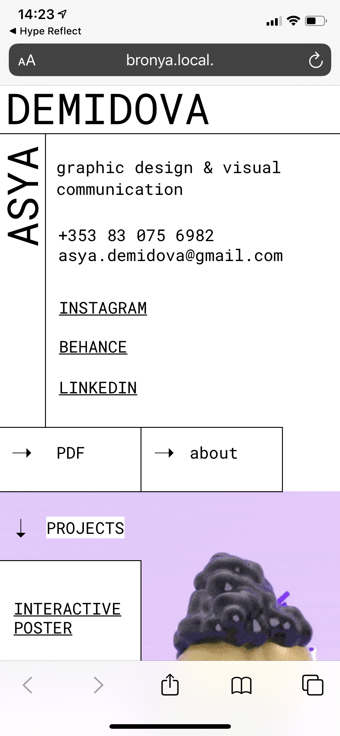
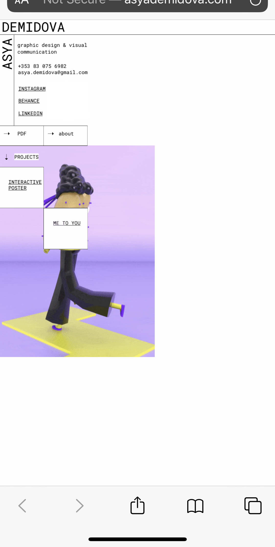
how it should look:
If you are scaling 'height', then this disables scrolling. It looks like you're embedding in a frame - I recommend just loading the Hype HTML document instead of a frame.
When setting a 'height' scale checkbox but disabling 'scale' in flexible layout, the size of the document won't scale, but instead be cropped.
Hi Daniel, thank you for replying.
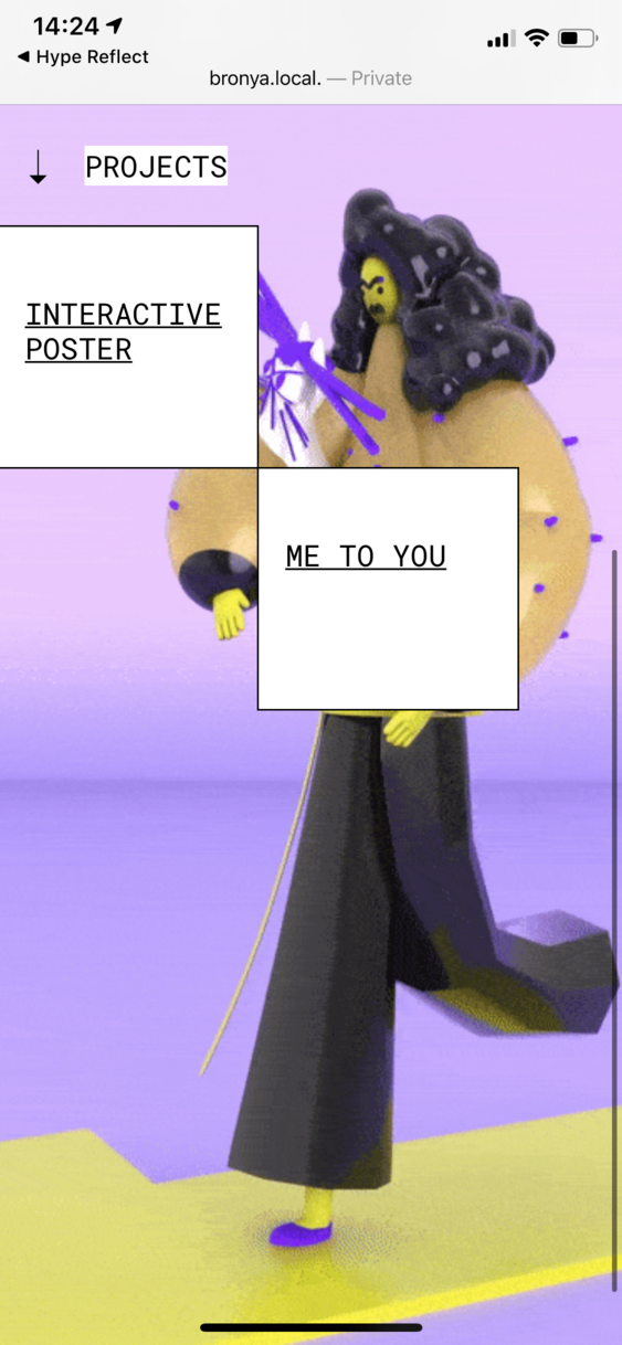
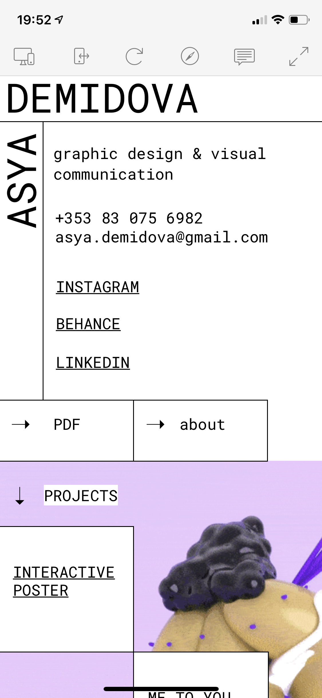
I tried deleting the frame and deactivating flexible layout height scaling. The mobile version still looked small on mobile.
On HypeMirror it is working properly. So nothing changed.
I cleaned and checked cache of browser. Same problem in all browsers...
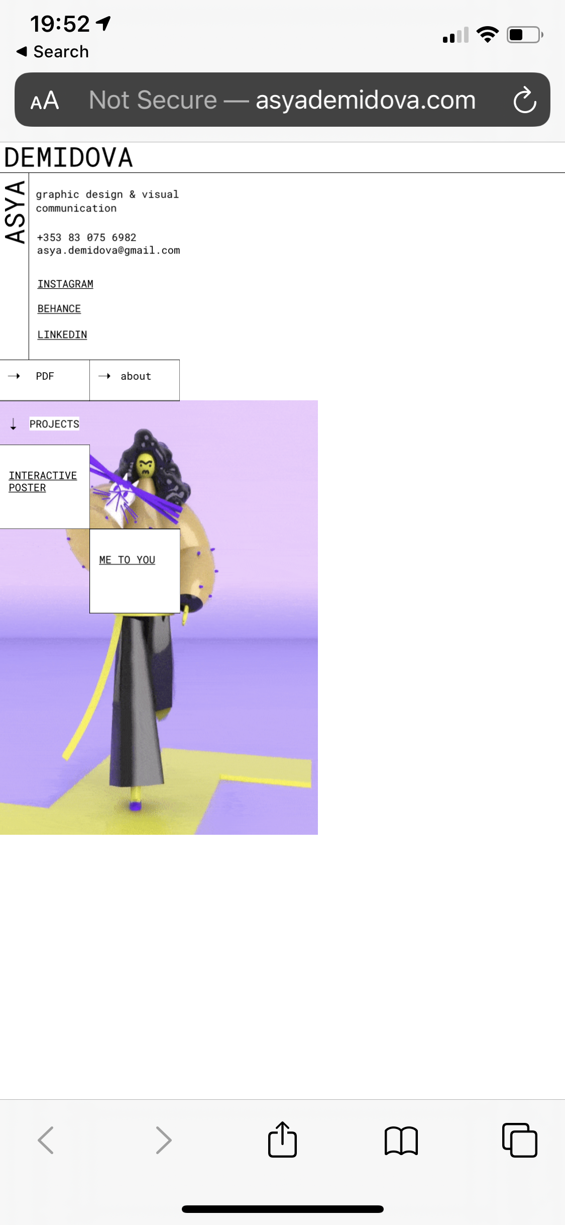
Thank you for checking my website)). I deleted frame from hype file like you told me. However I'm using redirection from godaddy to hide name and use my domain and I think they are adding "frame" automatically((. Is there any hack?)
On whatever hosting service you use for Kuroro.com, you'll want to create a new domain (asyademidova) but then point your Godaddy DNS to that ip address. This is an 'A' record that Godaddy needs to be aware of. So you shouldn't pay your hosting provider for a new domain since you already have one through Godaddy.