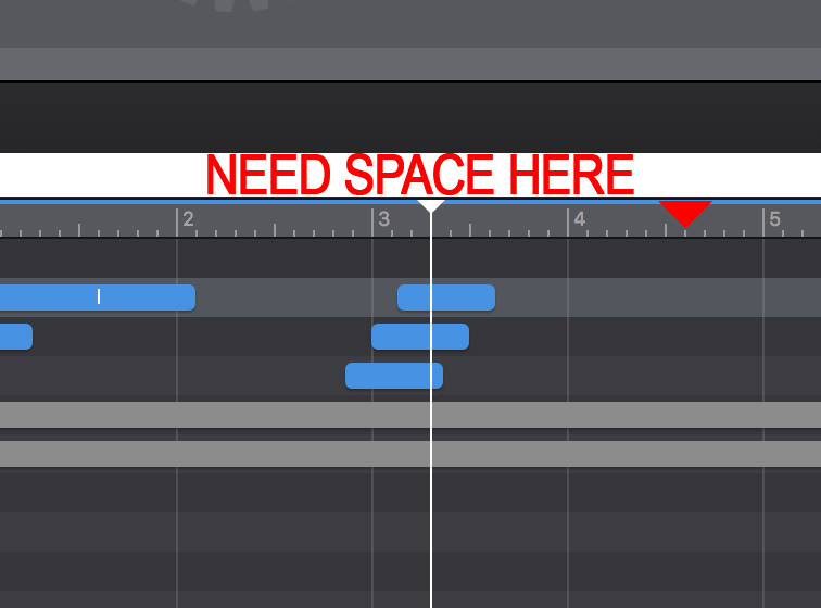
Love this program. But there is one thing I am always doing and it is annoying me to death. When I grab the scrub bar I am always grabbing the horizontal widows adjust slider. There needs to be more space between the active a slider area button and the scrub play head. See attached.
Also, I added a marker triangle. I would love to see markers but I realize that could change the way the program layout is currently. Another set of features would be animation presets. Like: slide right/left/up/down with the ability to select one that fades into and out of. Arrows up and down on rotation would be another helpful add.
Thanks for the feedback! Note that you don't need to grab the playhead triangle exactly, anywhere on the timescale view will move the playhead equally.
To clarify, do you mean to use arrows (like on width/height/etc.) instead of the spinner knobs?
Yes. The spinners, in my opinion, are too small. I am on a 27 inch Mac 5k Retina so maybe that’s why it seems small. When I need to rotate an element the rotate controls are too coarse for fine adjustments. Entering in numerical values is hit and miss cumbersome. I like the rotators just wish they were bigger or there were arrows in combination.
Again, I was an Adobe Edge Animate user and this program totally rocks! I absolutely will use it in every web project. Here’s one I am working on right now:
2 Likes
Gotchya - definitely valid feedback (we've heard it before!). There's a certain amount of precision and experimentation the arrows provide that the spinner doesn't. A more direct approach is if you hold down the command-key and drag from just outside the resize handle of the element on the scene you can rotate the element.
Fun crane!
1 Like
While we are at it, would it be possible to look at the tool bars, etc, to see if it is possible for them to take up a bit less screen real estate? Just some percentage points off here and there, I’m not saying to cram a bunch of stuff into too small a space like some of the older Windows apps do, but it would all help. Even on large monitors I spend a lot of time dragging windows.
Or tear off menus like has been mentioned before.
1 Like
We’re forcing the small size for toolbar icons right now. You can remove the text labels by control-clicking on the toolbar and choosing ‘Icon Only’ or you can remove the toolbar entirely via the ‘View > Hide Toolbar’ menu.
As for the other bars, there’s not too many pixels to remove; in fact we already do some stuff like shrink the inspector title name and spacing between inspector items if the window size is smaller.
Tear-offs for the different palettes is something we’d like to do!
2 Likes