DVNSH.com
(Devansh Trivedi)
1
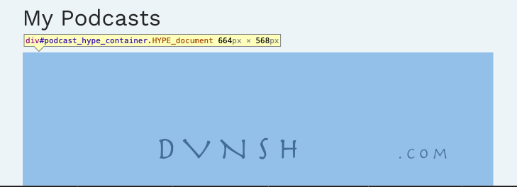
This is the preview from Hype:
And I have set up layouts and flexibility for scene scaling for 1080 and 320 px:
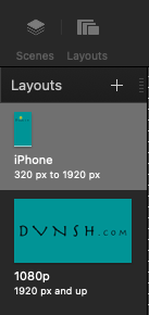
This is how it comes on the phone:
And the website:
How it loads on the website at https://dvnsh.com/podcast/ (on a 1440 x 900 screen):
Do I need more breakpoints? Is there a way to scale this without adding more layouts?
h_classen
(Hans-Gerd Claßen)
2
group everything, set responsive settings to the group, check zoom contents on the group
... and study the onlinedocumentation-section on responsive behavior 
h_classen
(Hans-Gerd Claßen)
3
Podcast.hype.zip (1,7 MB)
in case a proportional resizing is the aim ... this may help ...
1 Like
DVNSH.com
(Devansh Trivedi)
4
Thank you Hans. This is the result.
The circles are not concentric anymore.
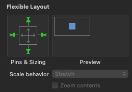
You were right. I had not turned on Flexible layout, zoom contents and Scale behaviour for the 320px layout.
Now it's working as expected at https://DVNSH.com/podcast
The only issue is, the fonts don't load when I see it from iPhone. But I should probably open a different topic for that.