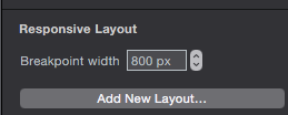
Hi, I´m building a site with 3 breaking points for desktop, tablet and smartphone. The problem is that when I´m on a mac and resize the window, my smartphone layout kicks in a 1024px. Could I change this?
For example:
My tablet layout is: 1024 to 1200px. I would need to change this to:
800 to 1200px. And the smartphone layout change it to: 320 to 800px.
Is there a way to do this?
Thanks
(I´m attaching a screenshot of the smartphone breaking point)