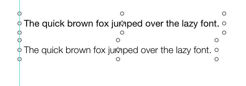
Perhaps it’s just my eye’s, but I can’t see a difference between Helvetica Neue and Helvetica Neue Light.
I’d expect HN Light to be much thinner…
Perhaps it’s just my eye’s, but I can’t see a difference between Helvetica Neue and Helvetica Neue Light.
I’d expect HN Light to be much thinner…
I’ve attached an example Hype document which should show what I’m seeing. The problem appears to be present in higher font sizes.
Font Test.hype.zip (19.6 KB)