I find switching between tabs a little confusing at times. What would be nice if there was a single properties panel that only shows properties for the selected element. I have created a few mockups of how I see this working…
What do you guys think?
I find switching between tabs a little confusing at times. What would be nice if there was a single properties panel that only shows properties for the selected element. I have created a few mockups of how I see this working…
What do you guys think?
Thanks,
These make more sense now I can see what you mean.
What do we do if we do not want to deselect but want to change something related to the scene.
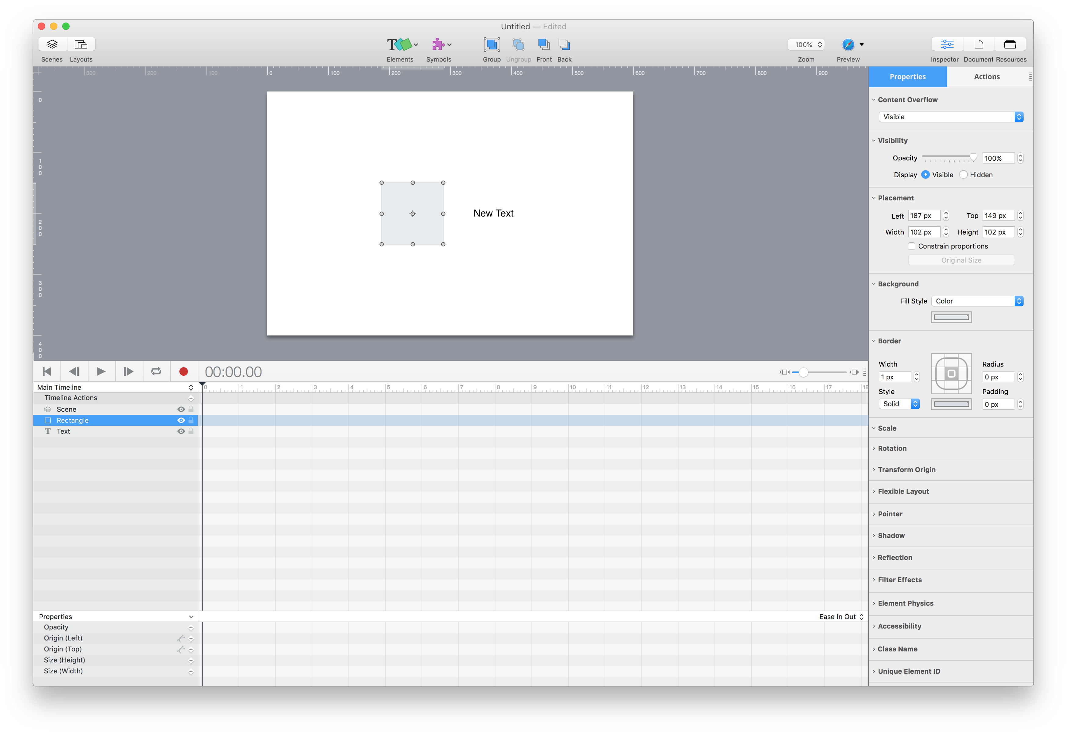
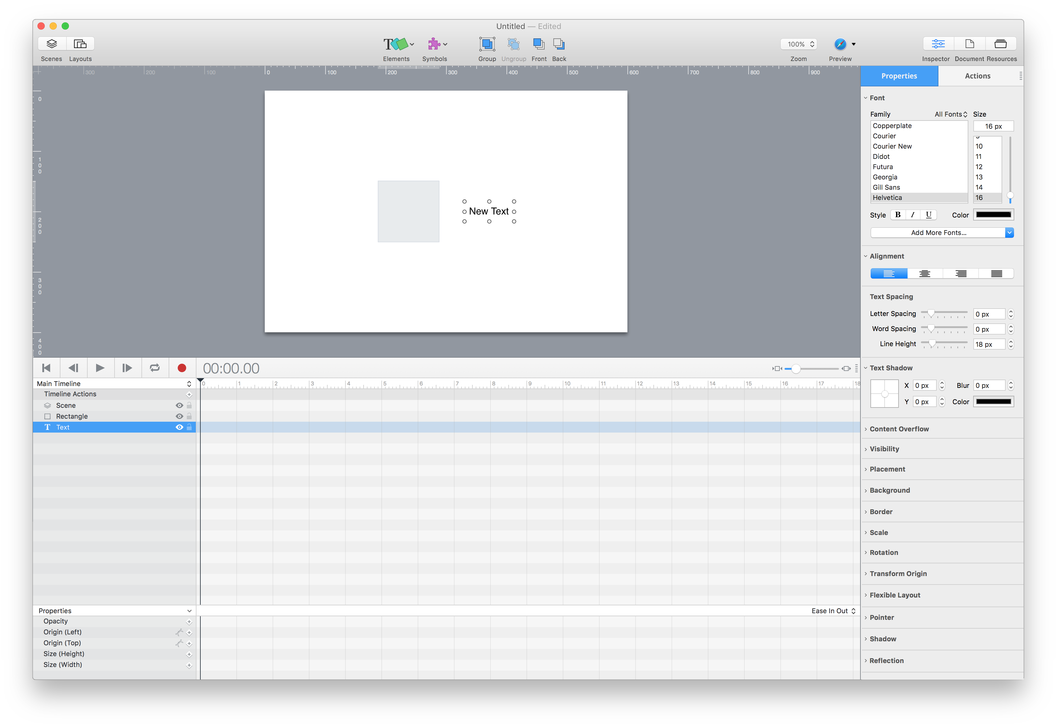
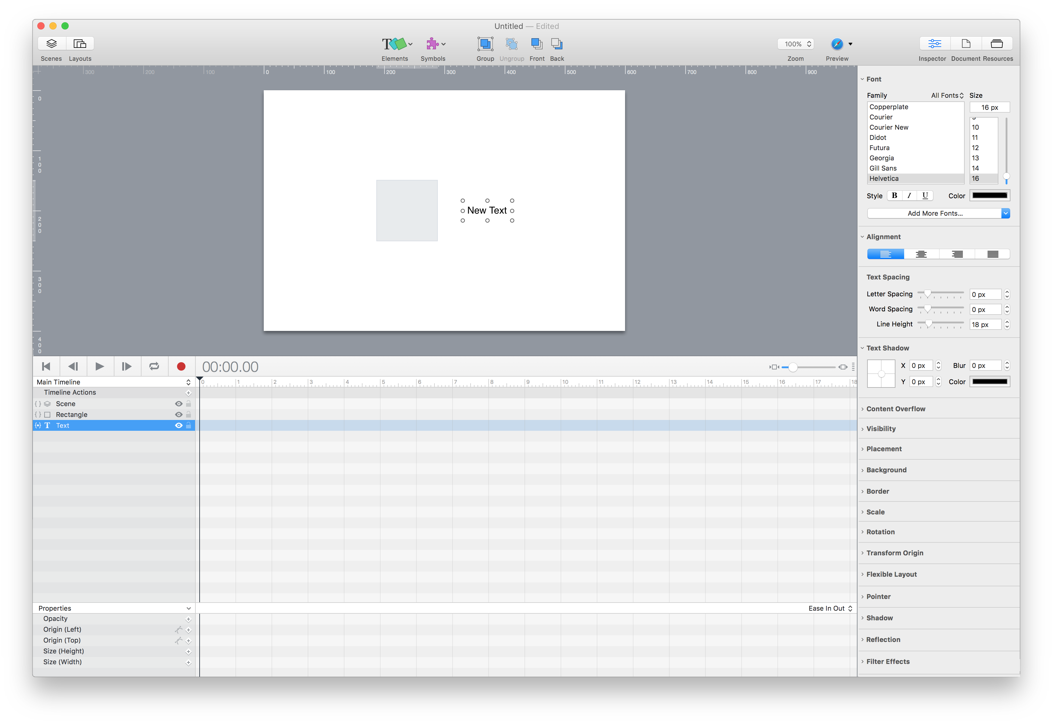
And if we have a shape selected how do we adjust it’s text. I assume you would want all he outlines to be available.
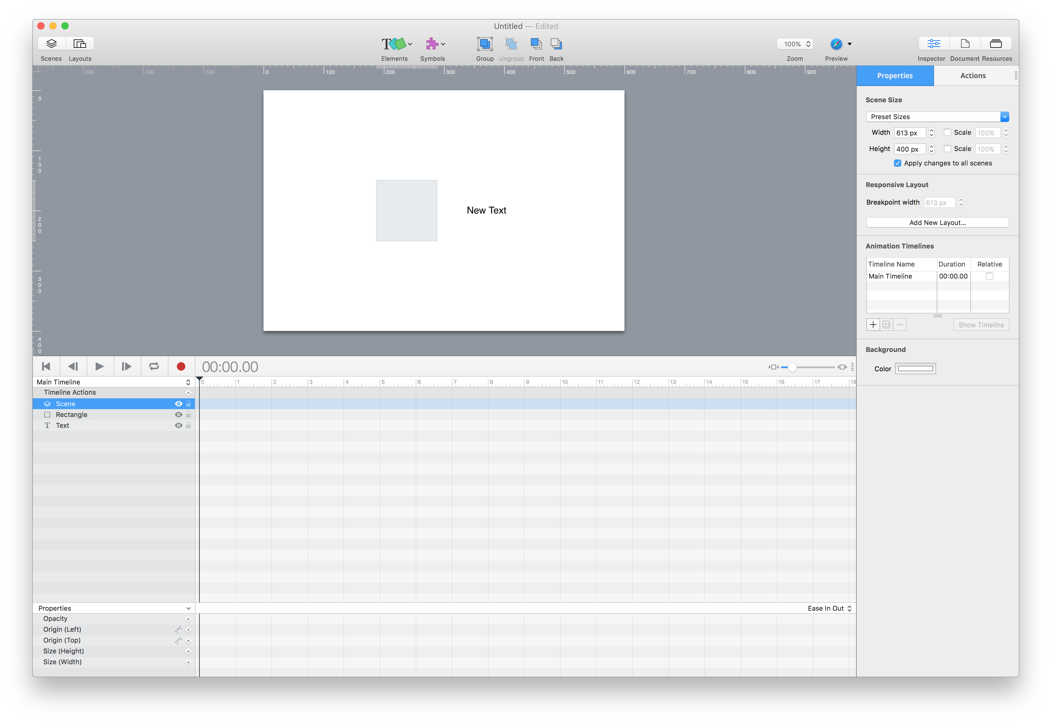
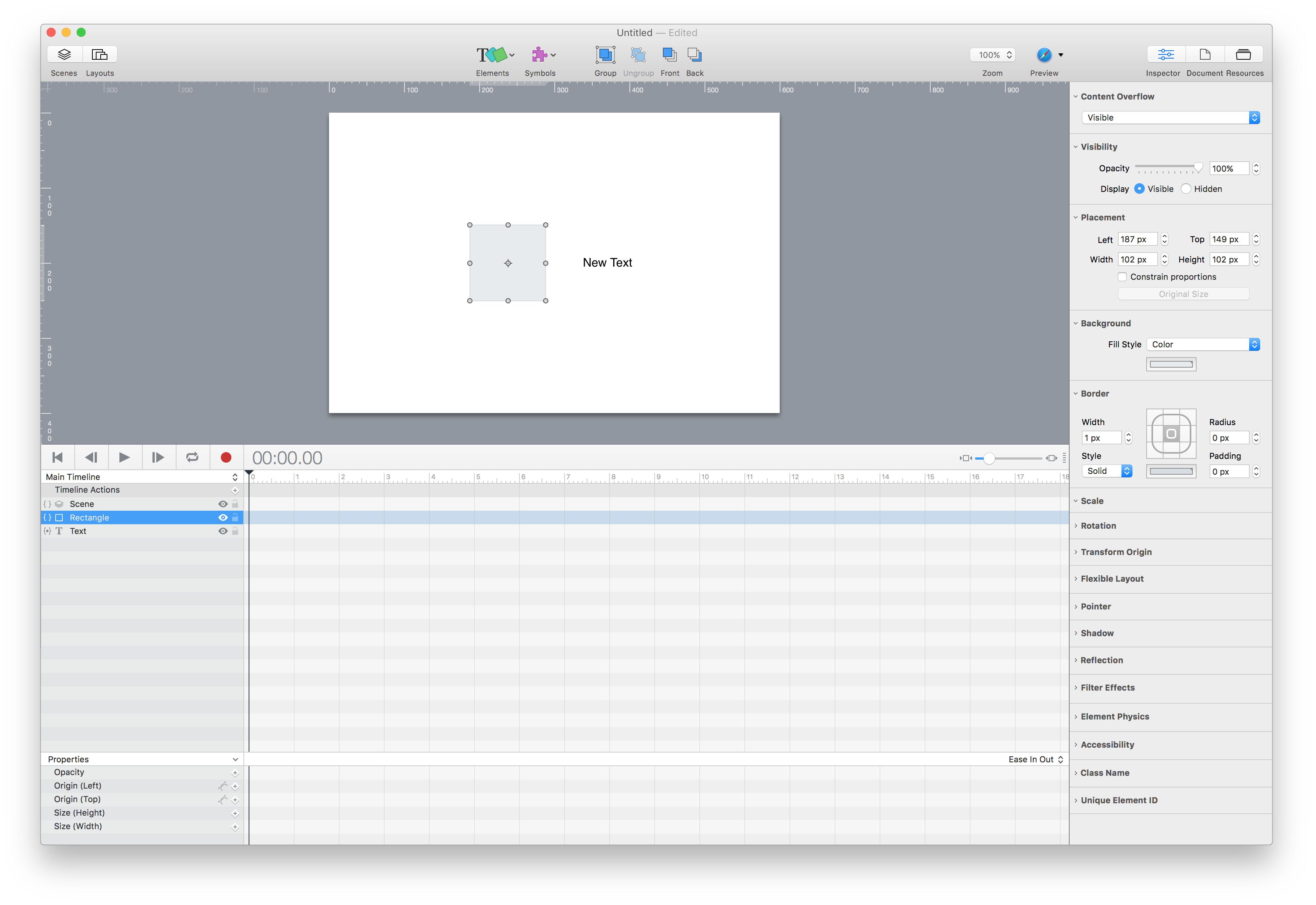
yeah thought of that, the scene is selectable via the timeline. See scene.png
Have done new versions with no Properties/Actions tabs. It is not clear if an element has an action unless you tap the Actions tab. A better method is to do away with these tabs. Actions can be viewed or added by tapping { } next to an element in the timeline… See screenshots below
Thanks for all the mockups!
I can tell you that the direction we went with the Inspector was highly debated and had pros and cons on whether to make it static or dynamic context-based on the selection. Ultimately we chose to make it more static for these reasons:
To mitigate this, we had two ideas that we thought could bridge the best of both worlds:
But we haven’t implemented these yet.
I will note that there are actually a couple cases where we’re context-based:
So even our current model isn’t perfect  .
.
I do highly recommend using the command-1-8 keyboard shortcuts when working with the inspector. Learning these makes it much faster.
It is great to see the screenshots of what our inspector could be in a context-based paradigm! Thanks!
Thanks so much for that lengthy and insightful reply.
No doubt you guys have put much more thought into it than me and all the reasons you mentioned.
If I may, just a few comments:
As your mockups show, some items might have very long lists (nearly all items from inspectors 3-8 are for all elements). This means there'd be a lot more manual management of the list as far as scrolling and collapsing/expanding items. This gets annoying fast!
You could always group similar features reducing the list. For example, Scale, Rotation and Transform Origin could be combined into a singe "Transform" group. Shadow, Reflection and Filter Effects could be grouped into "Effects". Background and Border into "Appearance", Class Name, Unique Element ID into "Identity"... you get the picture. I think a user will mostly likely always have there most used groups collapsed for easy access and then occasion when needed they can expand the lesser used. So, in my opinion it is less annoying. My whole issue with the current implementation is that its not clear what properties can be applied to a particular element without having to switch between every tab. Also, adding document and scene into the mix further complicates it.
It avoids confusion with understanding your selection and what you might be seeing (especially with the document/scene items)
This issue was addressed in my mockups. You will notice scene is selectable via the timeline. It kind of makes sense to treat Scene as the of element. I mean you can see it on the stage, you can modify its properties such as width height, background color, add actions to it just like all other elements. The odd one out was document which is why I suggested it as its own tab in the top toolbar (Inspector, Document, Resources)
Not all items are a high priority; like the Display Name is rarely changed, but being with a "D" would show up near the top of an alphabetical list. So then you need a different (and perhaps arbitrary) ordering.
Yes this is true which is why these could remain closed and at the bottom. Perhaps even a method to custom order lists to your liking. So if you use Display Name a lot you could drag it to the top of the list.
We took a lot of inspiration from iWork apps, which at the time had a stable interface.
The interface is killer. All the customizations are amazing.
Now the iWork inspector is more contextual, but to do it this (and your mockups) have to add another chooser at the top anyways.
Not sure I understand?
End of the day, I am becoming slightly more familiar with the UI and admittedly its becoming slightly easier to navigate. A more contextual UI would be most welcome. Anyways, thanks for the awesome tools. Hype is by far the best tool available for now and heres hoping you guys can remain one step ahead of the competition.