I’m having trouble maintaining consistent color between my design app (Affinity Designer) and Hype. What I have done is I create a system palette (Apple OS) that is used in Affinity, which I then access in Hype. In theory these should be the same, but there is a difference.
I’m attaching a couple images showing screenshots of my palette in AD and Hype. In Hype, I imported the color wheel from AD, but then I drew individual circles over the colors…and in these I chose the SAME COLORS in the system palette, but you can see in Hype there is a difference. Doing the same in AD there is no difference.
Exactly. That’s not just in the screenshot. It’s what I’m getting too.
I have messed around this a bit more and ended up creating a test. Through the test I am still getting inconsistent colors. This is what I did:
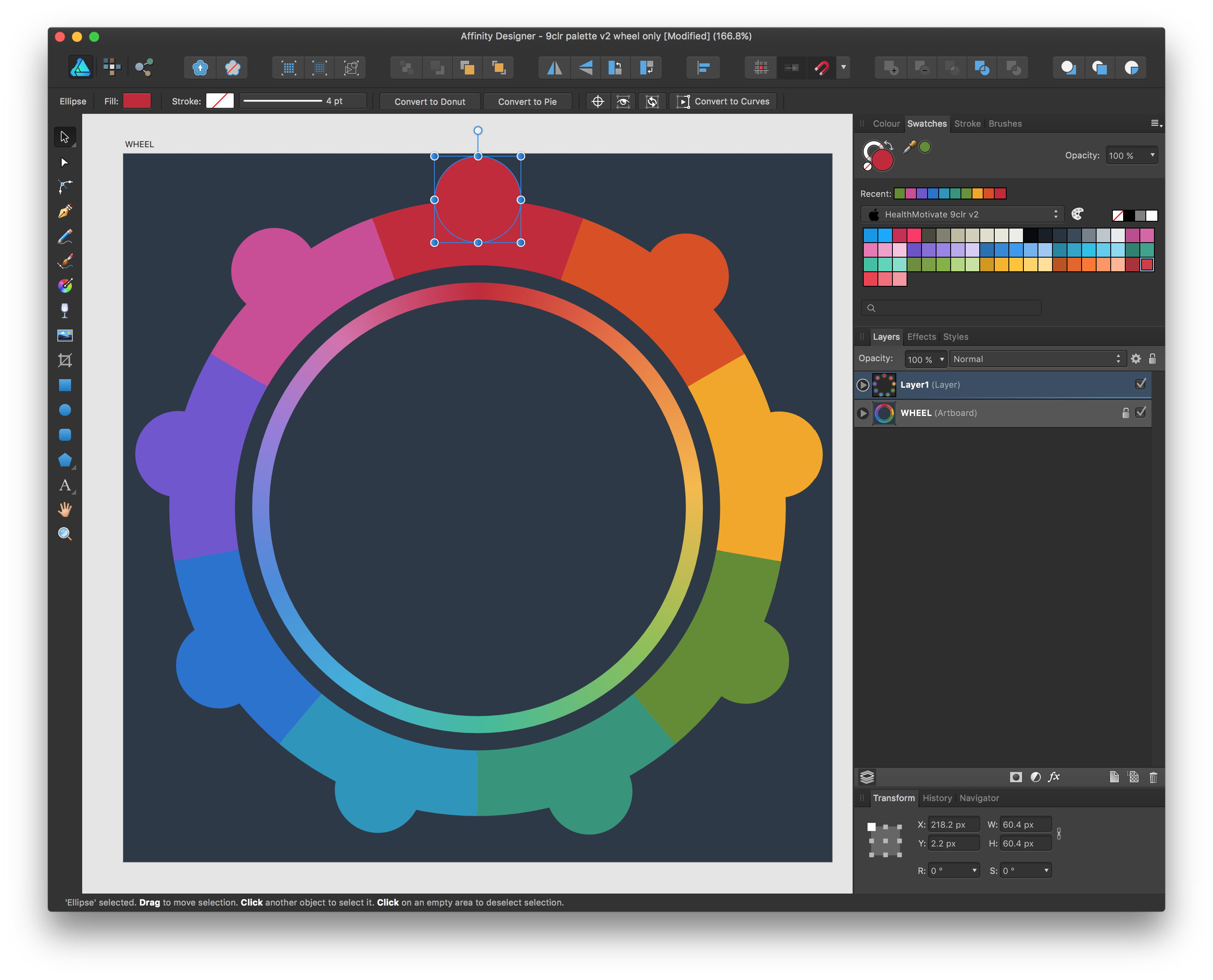
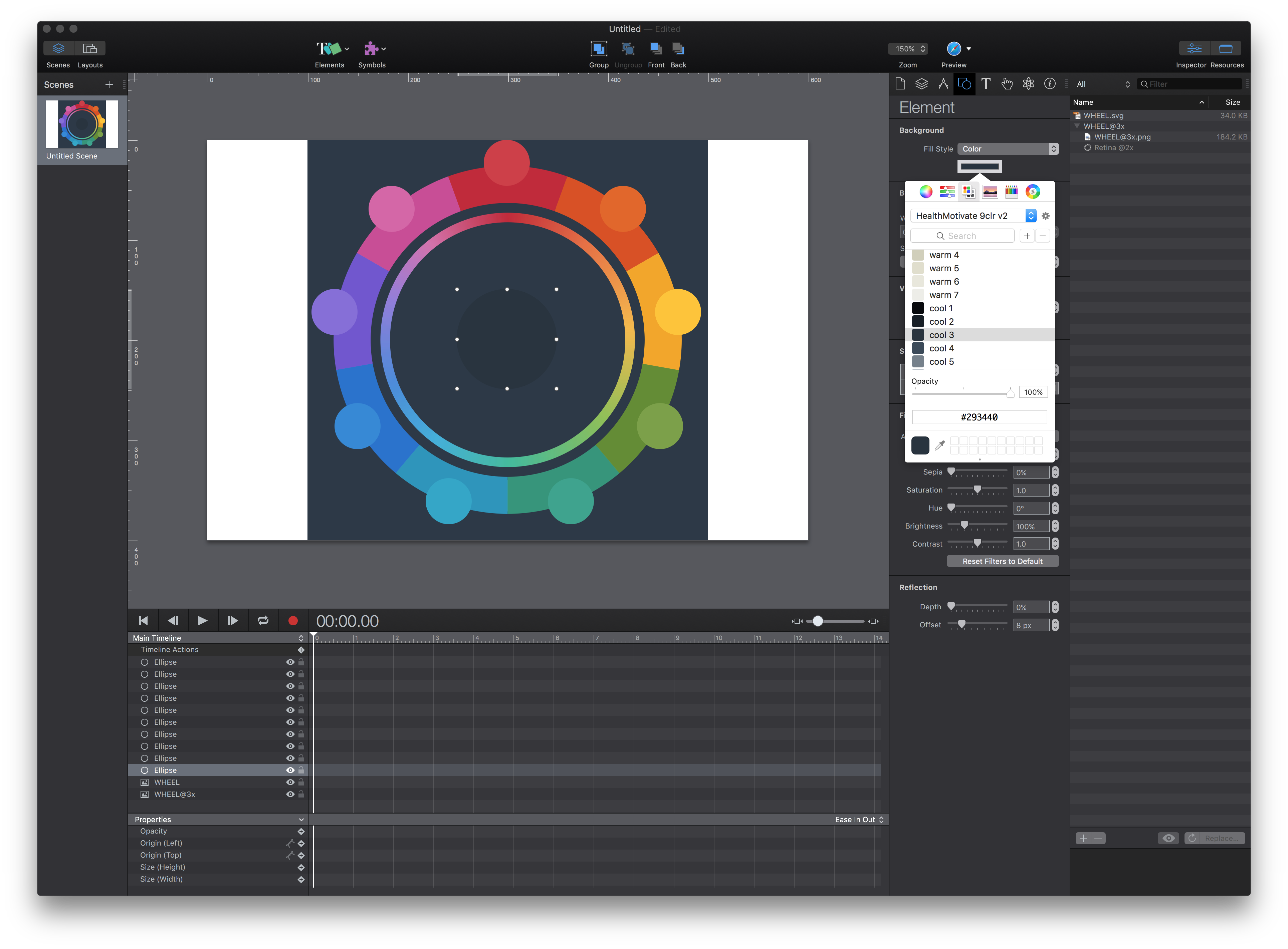
Create an ellipse in AD and fill it with a red. In AD I saved the color as a MAC system palette. There, it sets the color as #C42737.
Then in Hype I create a new doc, and again add an ellipse. For the fill, I choose the same MAC system palette (the one I just created in AD) and the same red swatch there is now the value #D13D47.
Attached you will find the four files for this test.
The AD doc
An exported eps (from AD)
The Hype doc
The system palette, created in AD.
Affinity Designer is using a specific color space. Within AD, if you hover over the color under the test-red and compare it to the one in their swatcher, it will be different when looked at using Digital Color Meter app, for example.
The goal of how Hype handles colors is to be as consistent across browsers as possible (this is difficult as some browsers are color managed and others aren’t) and to also be able to use the same values in Photoshop for a PNG and have them appear the same next to a Hype element using that color in every browser.
Unfortunately color spaces generally can’t be transformed without losing data, and there’s no facility to do an automatic conversion from one app to another. If you use these colors in photoshop for example, you’ll also wind up with them not being the same.
Are you referring to color spaces such as sRGB or AdobeRGB? I have worked with these for years and am familiar with the ways that graphics do not appear consistent from app to app. The challenge I have with this situation is the appearance is not only off, the actual values are skewed from a system palette. Imported PNGs do not match vector colors.
Is there some way Hype is interpreting the system palettes that is consistent? Is there a universal color space that web focused apps use? I thought that was sRGB. I have not had this issue in other apps focused on web technologies.


 you’re right and its been meant as a hint …