Could we have the current time indicator not jump to the start time of the layer or keyframes you’re moving?
Sometimes you click on the timeline to mark the point where you want to move your layer or keyframes to. Like a destination bookmark. However, when you select something to move it, your time marker jumps to that position in time, effectively loosing your place. It would be nice for the main time indicator to stay where you put it, and maybe instead have a ghosted secondary one that shows the time position of the item you’re currently moving. The preview window would still display that frame, but a fainter line or marker would indicate that frame on the timeline.
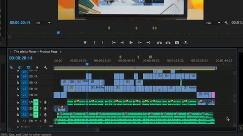
Zoom controls for the timeline could really use improvement. First of all, zooming the timeline should keep it centered on the time indicator. Right now, it’s super easy to loose your place as it expands off screen. The icons for zoom in and zoom out aren’t clear about which is zoomed vs. wide view. Clicking on one end immediately jumps to that zoom level instead of increasing or decreasing by one step. That seems counterintuitive. Standard plus and minus hotkeys would be great, as well as mouse wheel to zoom. Maybe even hold a modifier while scrubbing the mouse could work too. But yeah, please don’t scroll our current focus away when zooming, keep it focused.
And as a side note while we’re at it, is there a reason why double clicking a function in the resources panel doesn’t open it in the editor?
https://forums.tumult.com/uploads/db2156/original/2X/8/82dab4e832c87dbed17ba84a3ce70a5285e59017.mp4
[https://forums.tumult.com/uploads/db2156/original/2X/d/d8d1f6cf68be1ee2ea7a28e1004984c8dd5c421f.mp4]
(https://forums.tumult.com/uploads/db2156/original/2X/d/d8d1f6cf68be1ee2ea7a28e1004984c8dd5c421f.mp4)