It’s been awhile since I was on the forums. Old job did not allow Hype at work and now that I am COVID-Furloughed. I have time to get back to the software I love
I chose Hype to layout the newsletter website for our local historical society, and it has been a challenge from a “what you see is not what you get” process.
In older versions of Hype I would layout a mobile layout, a tablet layout and a desktop layout.
I find that this has worked better than the flexible layout feature.
I could drag out my text blocks and my element blocks and preview on a device in React and everything looked just like it did when editing.
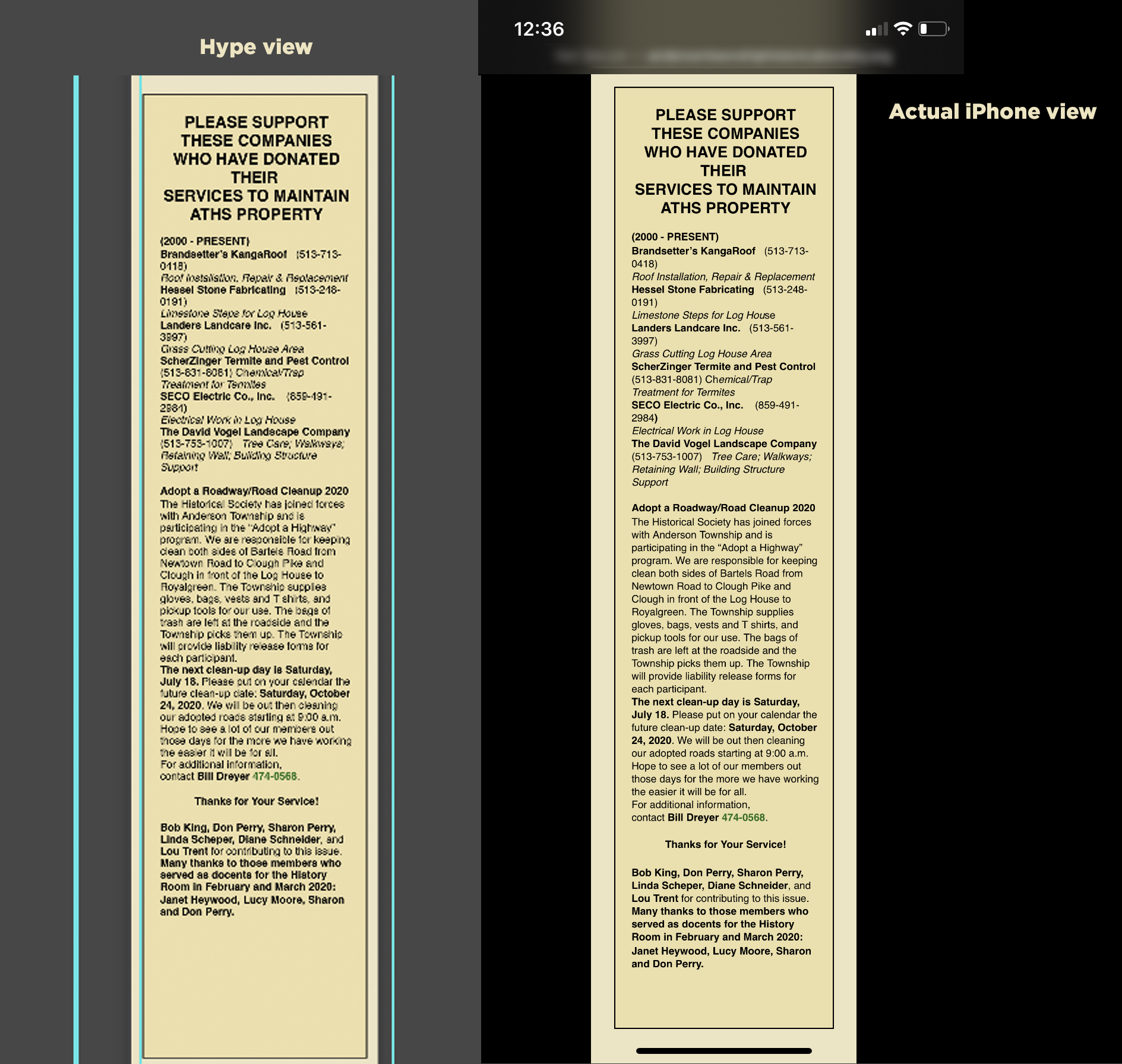
With this instance I can layout copy over an element block and in preview it will disregard the flow of the copy making it overlap or disregard any padding or margins. All in iOS devices.
So the work around is to make padding and margins much bigger than they will be on iOS. (see below)
Not sure why this is the case
Also staggering images remain on screen when you drag them on the stage. Sometimes you have to save quit and restart Hype to clear that up.
And moving images in the layout can also create a screen where all unselected images turn grey.
I am using Catalina Not sure if that is an issue.
But this was my go to program for things like newsletters because it was so easy to roll something out. But this time it has been painful.
One last observation…on Windows Edge I do not have to adjust the margins and padding. What you see in Hype on the Mac is what you get on a Microsoft Surface tablet. That’s just plain anti Mac
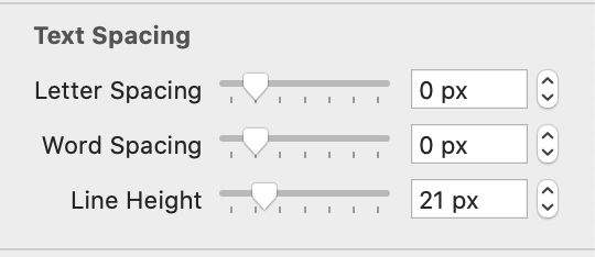
The issue might be that the line-height setting (which is by default ‘normal’) is interpreted differently by different browsers. If you adjust the line-height option in the text inspector, the pixel value will be set absolutely. No need for css:
For the issue with the text becoming different lengths, you could add (in the inner HTML of the rectangle / text element) a pure-code box. Something like:
Thanks,
I have set it to absolute values in the UI line height box. So far it is not changing the line height. The number changes but no perceivable change in the visual.
I think I will do a version of the last post and edit the CSS for the box.
It’s a shame though. This was a real bonus to Hype being able to do just about everything from the UI.
The odd thing is if you view the stage/page in Hype at 75% and then blow up to 100% you will get different visual readings as well.
It could be that there is Inner HTML with its own line height settings overriding the top-level element setting.
For that matter, would you mind sending/attaching a document that just has this element? I'd like to take a look. I don't recall line height being so different on iOS vs. Mac before and am planning to investigate if this is a regression, related to specific font choices, or something that's been there all along and not noticed as much as recently .
This rendering difference may be unrelated (how we do the zoom can unfortunately introduce different metrics - I consider this a bug), but I'd like to look at this as well to verify.

 Not sure if that is an issue.
 .
.