How to make scenes responsive on Mobile

Topic Split from :


A new question, to make a mobile responsive version using these same 5 scenes and elements is it better to make new scenes or just add a new layout with breakpoints?

"Also scene selection buttons.
I would change them to use the code for the mouse over/out like we did with the selection buttons."
I will try to make the adjustments, I believe that with your excellent explanation I will get it.

:slight_smile:

Hi Mark, me again!

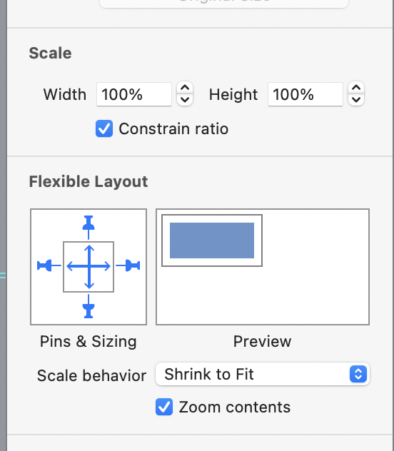
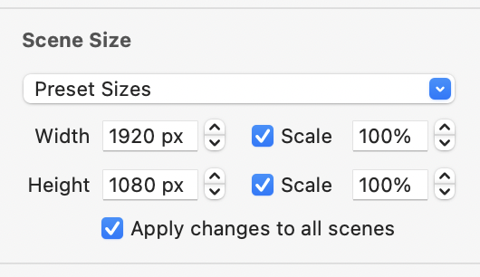
So, I uploaded the content to the web but it doesn't automatically adjust the screen. Tried enabling Scene Size to Scale, and set it up to 70%, but it does NOT reduce to fill. Could you guide me where I go wrong?

https://somacr.com.br/ezy/html5/

You probably need to use some layouts for mobile,

You can get some initial results by selecting all elements on a scene and putting them in a group.
Then set the groups Flexible Layout like so.

Screenshot 2022-09-09 at 00.30.49

and the scene to scale:

Screenshot 2022-09-09 at 00.29.47

Look at some of the posts on here that deal with scaling, layouts and responsiveness
Theres a few since many people run into this and need guidance.

2 Likes

Uau!!

I just made this simple adjustment as you guided and it worked flawlessly once again.

I do not know how to thank you!!!!

2 Likes